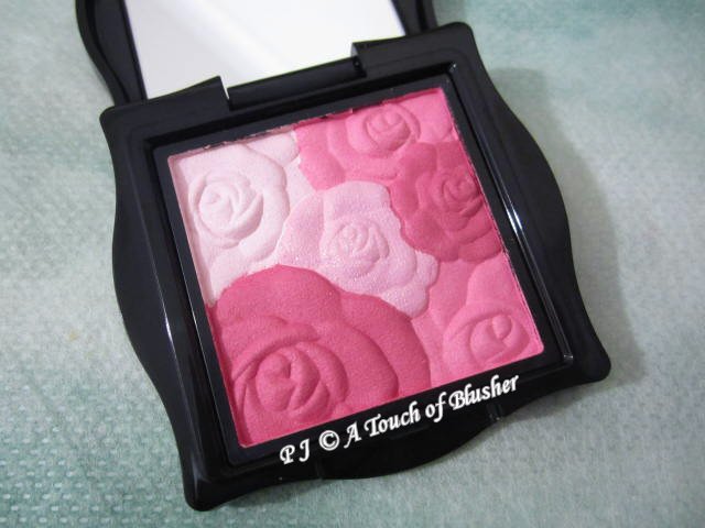
I have collected a few variations of Anna Sui‘s Rose Cheek Color and Rose Cheek Color N, and I will be sharing my thoughts on them one by one in the order of purchase. Today, we will look at Rose Cheek Color in 300.
First of all, here is some information on Anna Sui’s Rose Cheek Color and Rose Cheek Color N. Rose Cheek Color was launched in spring 2012 with six variations (100, 300, 301, 400, 500 & 600). Two limited-edition variations (302 & 601) were released in spring 2014. Then, Rose Cheek Color N was released in summer 2014 with six variations. Among them, four were re-releases (100, 300, 301 & 400) and two were new variations (303 & 602). Two limited-edition variations (01 & 02) were released in holiday 2015.
(Even though Rose Cheek Color in 300 is no longer available, it is essentially the same as Rose Cheek Color N in 300, which is currently available. The only difference is the case design.)
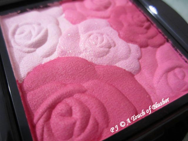
Anna Sui Rose Cheek Color in 300 (アナ スイ ローズ チーク カラー 300/ 安娜蘇 魔顏精靈薔薇頰彩 300, ¥3500) features a combination of plum pink, cherry pink, pale pink and off-white pink. All the four shades are cool-toned. The pale pink in the middle of the palette has a sparkly finish, and the other three shades are velvety matte with no shimmer. The plum pink and the cherry pink have an above-medium pigmentation level and the two lighter shades are sheer. The staying power of the plum pink and the cherry pink is particularly good.
The plum pink looks quite dark in the pan but it doesn’t look overly dark on the cheeks. The cherry pink is a medium-depth cool-toned pink with a touch of vibrancy, and it creates a feminine look. The off-white pink works well as a highlighter for the areas just above the cheek bones. The pale pink is a little too sparkly for the cheeks for my liking and I usually avoid using it.
I like this variation a lot since all the shades are cool-toned and the two main blusher shades are matte. It goes well with my purple-toned eyeshadow palettes and cool-toned pink and rose lip colors.
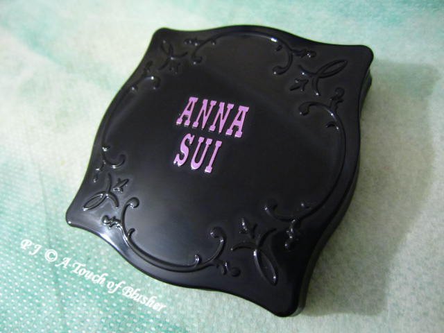
I like the design of the case as well. I like the curves, the simple filigree details and the Anna Sui logo in purple. I prefer this case design to that of the current Rose Cheek Color N, which I still think looks a little too ornate and fussy.
There will be more reviews of Rose Cheek Color and Rose Cheek Color N to come!
Related posts:
Anna Sui Spring 2016 Makeup Collection


{ 4 comments… read them below or add one }
I was at Anna Sui’s store in Soho last month and picked up a few items for old time’s sake (very fortunate for me/bank account, I look terrible in their clothes so no damage done)…
Anyway, I just can’t get over how fugly (ahem, excuse my language) their packaging are (I spent a good few minutes looking at the two lipsticks I picked up after I got home and realized that I might as well use them as mini pumice stone) nowadays…It seems that they realize it as well/kept doing the allover package revamp every two years or so…I kind of wonder what they will roll out next.
Hi Mina,
Sorry for my late reply!
I don’t really like Anna Sui’s current style of packaging either. However, some of the recent and upcoming releases don’t feature the overly ornate cut-glass look. I think the next packaging revamp is probably on its way.
Thank you very much for posting your comment again! :)
I was using Anna Sui blushes, but I found that it doesn’t stay long on my cheek. Don’t know if it is my problem. Though I love the color.
Hi Carrie,
Sorry for my late reply!
I am sorry that they don’t last well on your cheeks. The lasting efficacy of a product does vary from person to person and I certainly wouldn’t say it is anyone’s problem.
Thank you very much for your comment! :)