Sofina‘s color makeup line, Aube, was revamped in December 2008 to become Aube Couture. I had a chance to see Aube Couture in person earlier this year and I was very impressed by the Designing Impression Eyes series, which was launched in fall 2011. I currently have four palettes from the series, and 553 Purple was the first one I purchased. It is my first ever item from Aube Couture, and therefore I am highlighting it in my Stash Debut 2012 series.
One of the key traits of Aube Couture is its user-friendliness. With Designing Impression Eyes (as well as the previous Designing Eyes and the (still available) Designing Shine Eyes), the colors in the palettes are laid out to show where they go on the eyes. This helps those who are less experienced with eye makeup create a basic complete look with confidence. For those more experienced and adventurous, these five-color palettes can certainly be versatile too.
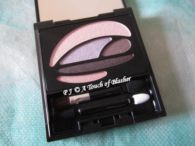
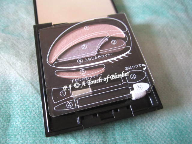
The five colors in Designing Impression Eyes in 553 Purple are (the numbers correspond to those on the transparent overlay above the eyeshadows):
1. off-white pink, moderately pigmented, highly pearly and glowy
2. light-to-medium muted lilac, moderately pigmented, softly sparkly
3. medium-to-dark plum purple, moderately-to-well pigmented, softly pearly with fine sparkles
4. deep plum black, pigmented, subtly pearly
5. off-white mauve pink (cream-t0-powder consistency), moderately pigmented, softly pearly and glowy
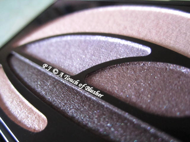
All the colors have multi-hued light-reflective particles. They all have a very smooth and silky texture and good staying power.
According to the eye chart on the overlay and the instructions on the back of the box of the palette, the five colors in the palette are used in these areas:
1. on the brow bones or the entire eyelids
2. on the inner 2/3 of the eyes
3. on the outer 1/3 of the eyes
4. along the upper lashlines
5. along the inner halves of the lower lashlines
I have to say that, when I used this palette for the first time, I wasn’t sure if I really liked it. Even though the texture of the powder was superb, I thought the purples were a little too muted for my liking. However, the more I use the palette, the more I like it. Now, I do like the combination of low-key shades and high-toned finishes. The overall look manages to be both elegant in color and dynamic in finish.
I also like the fact that the finishes of the shades are noticeably varied, and together they create a good deal of dimension for the eyes. The well-coordinated gradation of colors certainly helps create the dimensional look as well.
There are of course different ways to use these five colors. For me, the inner-outer separation of colors and the horizontal gradation of colors don’t always work for me. The vertical gradation of shades 2, 3, and 4 works better for me.
The only shade I need to be slightly more careful with is the off-white pink at the top of the palette. If I go a little heavy-handed with it, it can look too glowy and frosty. To avoid this, I use a large fluffy eyeshadow brush to sweep a very light layer of the color on the entire lids. That way, it creates a flattering veil of glow that brightens up the eye areas.
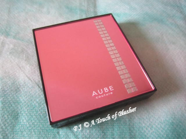
I also like the packaging of the palette. It is slightly larger and more substantial than many of the other eyeshadow palettes I have, and I like the pink lid with some sparkly details.
This palette is slowly becoming one of my favorite purple-toned palettes, and I will continue to look forward to new eyeshadow palettes from Aube Couture. The next Designing Impression Eyes palette that I will review is one of the limited-edition variations from fall 2012. Do stay tuned!
Related posts:
A Splash of Color: Lilting Lilac (3)
Aube Couture Summer 2012 Makeup Collection
(featuring Designing Impression Eyes in 558 & 559)
Aube Couture Spring 2012 Makeup Collection
(featuring Designing Impression Eyes in 555, 556 & 557)


{ 0 comments… add one now }