 (images from aquagirl-cosmetics.jp)
There is a new Japanese beauty line in town…
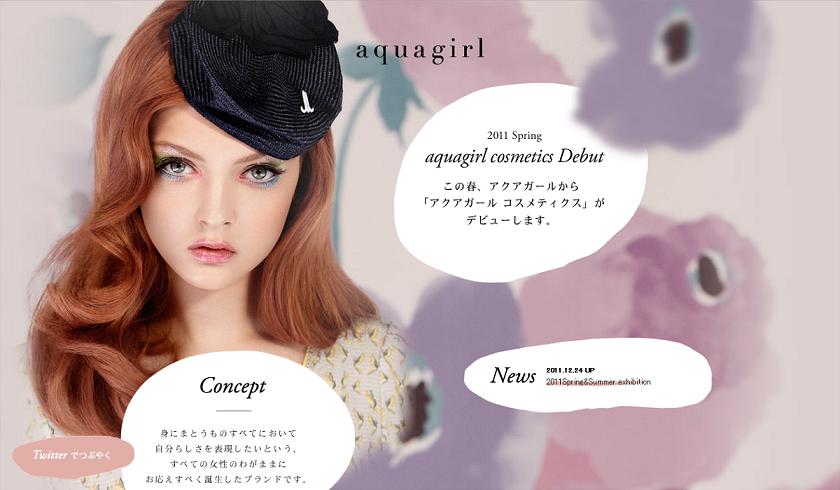
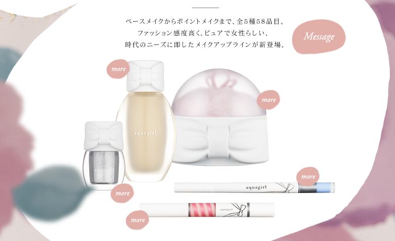
Aquagirl is a Japanese fashion brand that includes a few sub-lines. On February 18th (according to Voce), Aquagirl Cosmetics will debut in Japan. The line features base and point makeup, and the packaging style is youthful and girlie. (The big bows are quite Hello Kitty-esque.)
Aquagirl’s launch collection for spring 2011 features:
– Color Language (20 shades)
– Lasting Dual Eye Fix (8 variations)
– Elegant Kiss Rouge (20 shades)
– Brightup Foundation (2 shades, SPF 27, PA++)
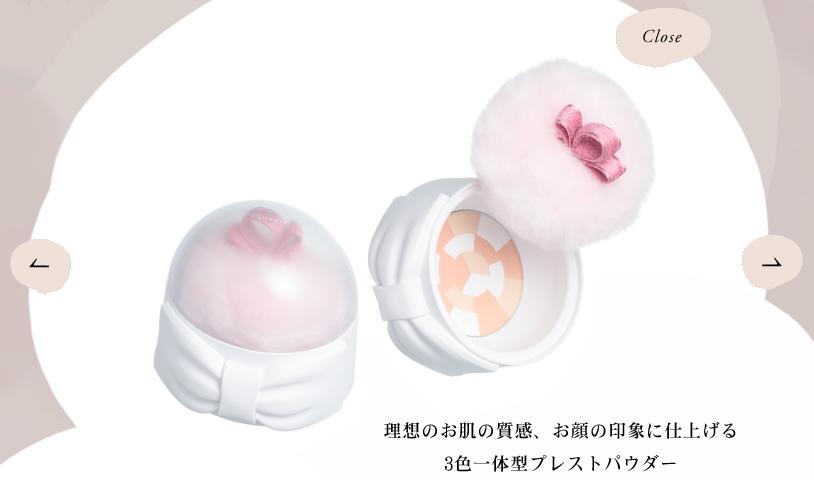
– Neo Graphic Pressed Powder (8 variations)
According to Aquagirl’s official website, one of the line’s appeals is that many of the products are multi-purposed. For example, different shades of Color Language can be used as eyeshadows, eyebrow powders, eyeliners, blushers, lip colors and parts of the base makeup. Also, depending on the variation, Lasting Dual Eye Fix can be used as an eyebrow powder or as a concealer.
See additional images of the products at a press event here and here.
The packaging does look cute, but I think it is a little too juvenile for my liking. (I do like girlie-looking products like those from Lavshuca, Anna Sui, and Jill Stuart, but I think they also have a feel of elegance to them.) While none of the items appeals to me at the moment, sometimes the packaging of a Japanese beauty line slightly morphs and evolves over the seasons and I will still keep an eye on their future releases.
Related posts:
New Japanese Base Makeup Line: Cosme Decorte Maquiexpert


{ 4 comments… read them below or add one }
Hello PJ,
you’re right, the packaging is not as nice as Lavshuca’s. But when we think back a few years, both Lavshuca and Majolica Majorca looked a bit more like this, didn’t they? So maybe packaging will really evolve, like you said. :)
Hi Julia,
Personally, I don’t feel that the previous looks of Lavshuca or Majolica Majorca are more similar to that of Aquagirl. Both brands, at the time, featured packaging with a lot more intricate details. Majolica Majorca used many golden-hued cases with a lot of design details while Lavshuca used quite a few filigree patterns and subtle curves.
(To me, even though I like the shapes of the bottles of Brightup Foundation and Color Language, the bows are just a little too big and look slightly too simplistic.)
By the way, I actually think Majolica Majorca looked a lot better than it does now. At the time, it looked cute in an elaborate and princessy way. Now, it often looks a little plain…
Thank you very much for sharing your thoughts again! :)
Dear PJ,
you are right. What I meant was that both had a lighter coloured packaging, though – I remember seeing white eyeshadow cases?
Of course, they looked much prettier than Aquagirl (although the bow is kind of cute), but I guess we’ll just have to wait and see. Or not, as I personally am already satisfied with Majolica and Lavshuca and need no other cute-ish brand. :)
Dear Julia,
I see what you mean. Yes, Lavshuca used to use paler colors and its powder foundation cases are mostly white. Majolica Majorca has used some white cases as well.
I do think the line has a lot of potential and it will certainly be interesting to see how the brand image develops.
Thank you for stopping by again! :)
{ 2 trackbacks }