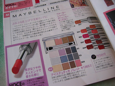
 (Maybelline’s spring 2008 collection in Japan)
(from Voce February 2008)
A trip to a Japanese drugstore is a very visual experience. Brands like Lavshuca, Majolica Majorca, Kiss, and Love Clover are instantly visually appealing and attention-grabbing. They make some high-end brands look dull.
Some western drugstore lines know that their products will be displayed alongside Lavshuca‘s Eye Color Select palettes and Majolica Majorca‘s princessy golden cases and that they have to do something in order not to lose on the starting line.
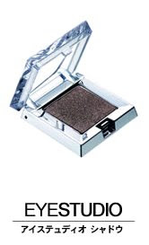
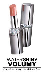
One example is some of Maybelline‘s products sold in Japan and some other countries in Asia. As far as I know, products like the EyeStudio palettes (seen above) as well as the EyeStudio singles and WaterShiny Volumy lipsticks (seen below) are not sold in North America or Europe. (But, just to be clear, other Maybelline products still look more or less the same as those sold in the west.)
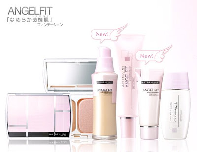
 (image from www.maybelline.co.jp)
Something worth mentioning here is that Angelfit is a base makeup range by Maybelline that is only sold in Asia. (You can check out the mini-site through the link.) I have not tried anything from the range, but, from what I have read, the powder foundation (Maybelline Angelfit Pact) has been getting very good reviews. (I believe the Angelfit range is developed in Japan as well.)
Packaging-wise, soft pink and gentle curves are used to increase the visual impact. The style of the packaging actually looks very Japanese to me.
While I would still prefer the look of Lavshuca on any day, other brands like Maybelline do show that makeup still needs a little bit of “makeup” in order to sell.
Related Posts:
Maybelline Dream Mousse Blush
(natural radiance from mousse-y sponginess)
Maybelline Dream Mousse Eyecolor
(soft, floaty, and airy)
Lavshuca Summer Gradually Compact
(one of the cutest items for summer 2008)


{ 10 comments… read them below or add one }
Japanese people are so lucky…Those are lovely ^_^. [I hate plain packaging. Essence makes very pretty stuff though, but it’s not available in all of Europe :(.]
I fell in love with the Lavshuca Summer Gradually palette (the blue/silvery one) because of your post :D. Sadly, no credit card :(, so I suppose I’ll have to fly to Japan to buy it XD. [Not really likely but one may dream <_ <.]
I love your blog :).
Hi PJ! I aboslutely love the Japanese advertisements, they *make* you want to to buy and possess those lovely items! It is strange that here in India Maybelline (as compared to the US) is actually one of the slightly higher ranged products, and not a drugstore brand.
Oh, and I’ve tagged you for the 6 quirky things about you game, so please check my blog for more details on this. Thanks :)
Hi Cris,
Thank you for enjoying reading my blog!
Japanese brands do have some of the prettiest packaging around (and they have the quality to match). It can be quite draining for the bank account sometimes!
Lavshuca’s Summer Gradually Compact does look nice, and I am glad it looks as nice as it does on the website. (Sometimes the website photos are too glossed-up and the actual items are slightly less impressive.)
I will have more photos coming up with the review later. I hope you will enjoy them!
Thank you very much for posting your comment again! Have a good weekend! :)
Hi Ilovecheese,
I completely agree with you. What I like about the websites of many Japanese beauty brands is that they are a real visual experience. The packaging of the products is visually appealing, and so is the way a company presents the products on the website.
Thank you for telling me about Maybelline in India. For me, it is always fascinating to know how differently a brand is marketed in different countries. It offers an insight into how a brand tries to position itself in a certain market.
Thank you very much for tagging me. I have been tagged before but I don’t really write tag posts. I just want to let you know that it is not personal at all. (I have never done them and I probably never will.)
Thank you for visiting my blog and leaving your comment again! Enjoy your weekend! :)
I’d love to go to Japan :) I just don’t think I’d be able to come back to the Uk without 50 suitcases full of make up – I wish European & US brands would make more visually appealing packaging!
Japanese make up on the whole look gorgeous but are usually quite pricey…the latest make up to flood singapore are korean cosmetics! Just as pretty and amazing but more affordable…like skin food and the face shop are popular ones over here!
Hi Sharlynn,
Thank you for posting your comment. I hope Chica will get to see it! :)
Hi Chica,
With western brands, I like the packaging of Chanel, Dior, and YSL. I like their chic and glamorous packaging as well as the overall brand image. On the other hand, personally, I have not come across a western brand that does cute or princessy as well as Japanese brands.
Also, I feel that the packaging of many US brands tends to be basic and functional. But I think there is certainly an appeal in that as well.
Thank you for leaving your comment again! Hope you have been enjoying the weekend! :)
Hi, I came across your post while looking for more info about Maybelline’s Affinitone range – this is what it’s called here (in Bulgaria). There are similar elements with the range you’re posting about, it’s a color-adjusting system,we have a liquid foundation, powder and blusher, and now a new mineral foundation. Even the style of the font of the packaging looks the same. But… it’s always eastern countries that get the nicer packaging :) Those above are much more refined and stylish, while owrs are a tad uneventful and even look cheap. I hope that in a few years the attention that packaging gets will be greater…
By the way, I love your blog, and I added a link to it on my blog, hope you don’t mind. Come check it out! maquilab.blogspot.com
Hi Eli,
Thank you for your kind words about my blog and for linking to it! :)
I think one of the reasons why packaging really matters in the Japanese beauty market is that the market is very saturated. Beauty items do need to look appealing (in one way or another) to get attention there. In consequence, the same packaging is often used in some other East-Asian countries.
The packaging of Maybelline products in the UK tends to be on the plain side, but I have noticed some improvements, particularly with the eyeshadow palettes. It will be interesting to see if the improvements will continue.
Thank you very much for posting your thoughts, and keep up the good work with your blog! :)