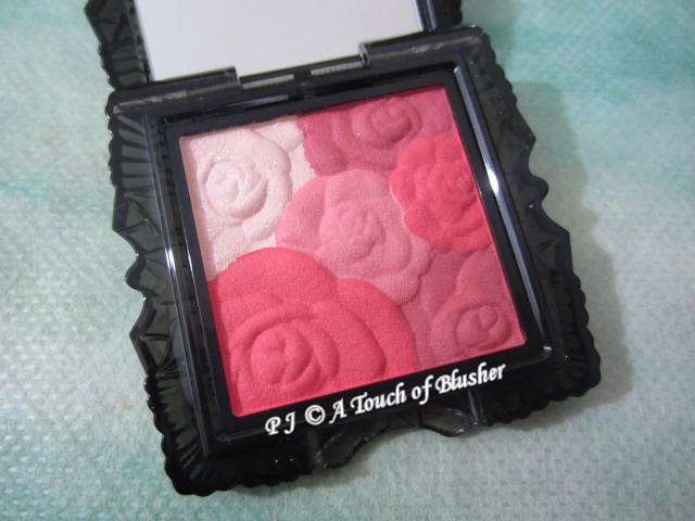
I have reviewed Anna Sui‘s Rose Cheek Colors N in 303 and 602 in the last few months, and today I will be sharing my thoughts on 400.
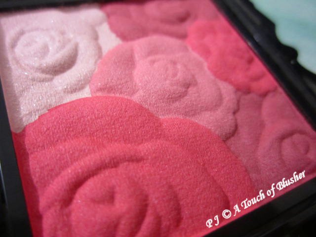
Anna Sui Rose Cheek Color N in 400 (アナ スイ ローズ チーク カラー N 400/ 安娜蘇 魔顏精靈薔薇頰彩 N 400, ¥3500) was released in Japan in summer 2014. (The color combination in this variation is the same as that in Rose Cheek Color in 400, which was released in spring 2012.) The four shades in this variation are:
- rose red, with an above-medium pigmentation level, with a velvety-to-satiny finish with a slight hint of glow
- dusty red, with an above-medium pigmentation level, with a velvety-to-satiny finish with a slight hint of glow
- cinnamon pink, with an above-medium pigmentation level, with a velvety-to-satiny finish with a slight hint of glow
- pale dusty pink, lightly pigmented, with a velvety-to-satiny finish and semi-sparse shimmer
They are all easy to apply and blend, and they all have a good staying power. I do need to be fairly light-handed with the rose red, the dusty red and the cinnamon pink due to their pigmentation levels.
The rose red, the dusty red and the cinnamon pink are the three main blusher shades in this variation. The rose red looks reasonably natural on me and it doesn’t look overly bright. The dusty red goes on more vibrant than it looks in the pan, and it is less dark and more wearable than how I expected it to be. The cinnamon pink goes on as a soft red and it looks less muted when worn. On the whole, the three shades look a lot more similar to one another when worn, with the cinnamon pink being the most wearable. When mixed, they show up as a cool-toned red. Once again, a light-handed application is definitely needed for a subtler look.
The pale dusty pink is mainly for highlighting. (Its shimmer is multi-hued.) It is not working particularly well for me as a highlighting shade because it has a dusty-red tone that makes the areas where I usually apply a highlighter (such as my T-zone) look unnaturally flushed. (It looks less pale and more reddish when worn.) Also, it has a slight ashy tone that doesn’t look very flattering.
Even though, with a light-handed application, the three main blusher shades in this palette mimic the reddish flush on the cheeks and are fairly wearable, I still prefer blusher shades that are pink-toned. Overall, this palette is not among my favorite blusher palettes from Anna Sui, but it is fun to experiment with blusher shades I don’t often purchase.
Related posts:
Anna Sui Holiday 2017 Makeup Collection


{ 0 comments… add one now }