Shiseido Benefique Theoty unveiled its new style of packaging in spring 2013. Designed in collaboration with Dutch designer Tord Boontje, the packaging is ornate, feminine, fanciful and romantic. (See more images of his work for Shiseido Benefique here.)
Cheek (Fantasy Nuance), launched in spring 2013, truly showcases the beauty of Boontje’s design, and today I will be sharing my thoughts on Cheek (Fantasy Nuance) in PK01, my first Benefique Theoty purchase.
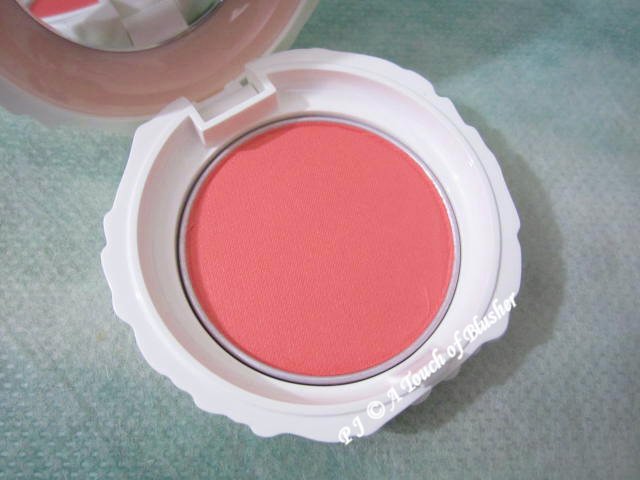
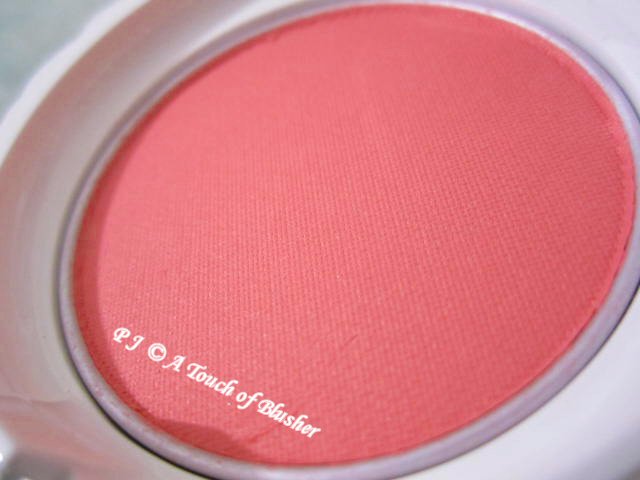
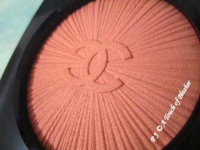
Shiseido Benefique Theoty Cheek (Fantasy Nuance) in PK01 (資生堂 ベネフィーク セオティ チーク (ファンタジーニュアンス) PK01/ 資生堂 碧麗妃 恬蜜花漾頰彩 PK01, ¥3800, refill (with puff) ¥2800) is one of the two shades released in spring 2013. (Two additional variations were released in spring 2016.) It is a coral pink with a light-to-medium pigmentation level, and it has a softly glowy finish with semi-sparse warm-toned (predominantly softly gold-toned) shimmer. The powder is soft and easy to blend, and the color lasts decently well.
In general, with blushers from Japanese beauty brands, PK shades are medium-toned or cool-toned pink-based shades, but PK01 is very warm-toned and can almost be an OR (orange) shade. I tend to prefer cool-toned pink blusher shades, but this shade is a pleasant surprise. It looks natural and imparts a warm summery glow on my cheeks, and, to my relief, the coral tone doesn’t appear orange on me.
The shimmer is more noticeable on the cheeks than in the pan. (This is quite interesting, as it is often the other way around.) I don’t mind the combination of the softly glowy finish and the semi-sparse shimmer, although I tend to prefer a shimmerless matte (or semi-matte) finish.
The blusher is designed to be applied with the puff that comes with the product. (The puff is stored inside the case. The puff and the blusher powder are separated by a piece of plastic film.) I have not tried applying the blusher with it. If you want a more intense look on the cheeks, you might want to use it to apply the product.
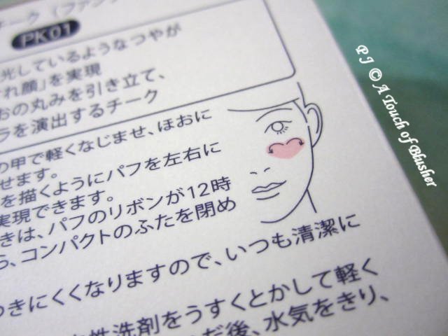
The line suggests a heart-shaped placement of the product (with sufficient blending to blur the edges, of course).
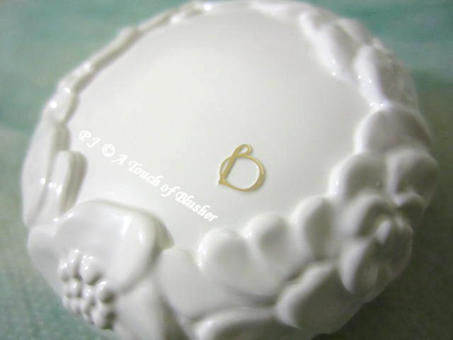
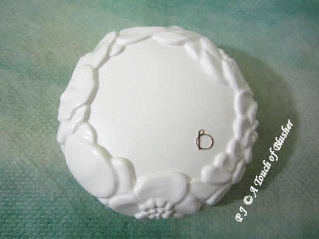
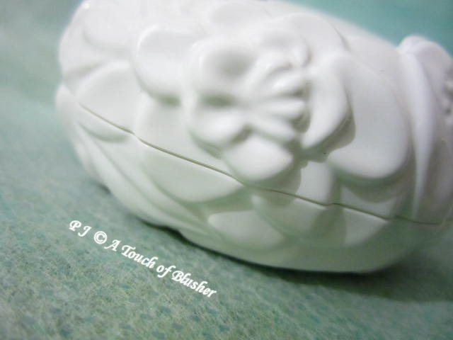
Let’s go back to the packaging of the product. The round white case of the blusher is encircled by beautifully dimensional floral motifs, and they create a soft and gentle look. What I love the most about the case design is that the floral motifs extend to the base of the case. This continuity creates a sense of fullness and completeness, and appreciating the layered details around the case evokes a sense of calmness and comfort.
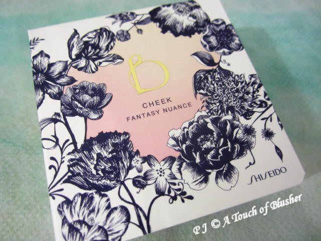
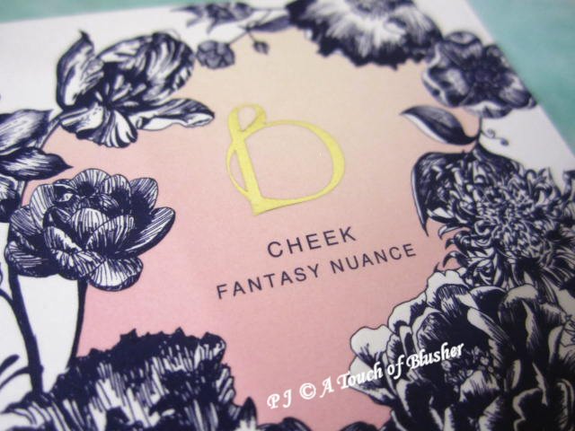
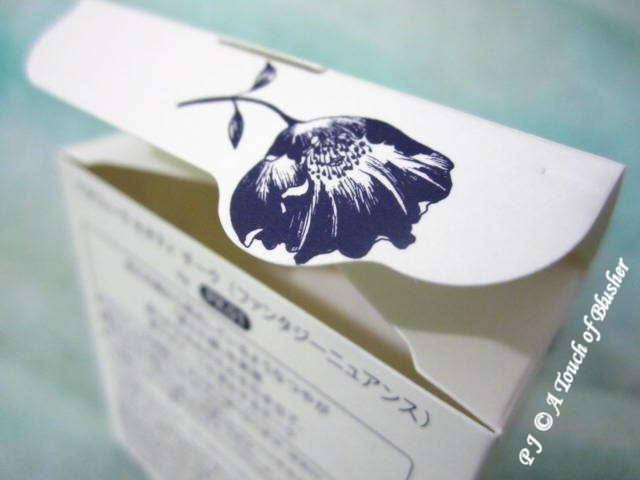
The box of the product is also a thing of beauty. It features delicate and detailed floral illustrations.
Even the top tuck flap, which is usually hidden from view, features design elements. Its irregular shape accommodates additional floral details, and these unexpected design touches provide a delightful surprise.
Overall, I like both the blusher itself and the packaging design. The warm-toned blusher is nice to wear in spring and summer, and the fact that this coral-pink shade suits me may lead me to explore similar blusher shades. The packaging design is beautifully artistic. It is ornate without being fussy, and it exudes vibrancy and serenity at the same time.
(In Japan, Benefique is available in pharmacies and beauty specialty stores. It is not available in drugstores or department stores.)
Related posts:
Benefique Theoty Fall 2015 Makeup Collection
Stash Focus: Anna Sui Rose Cheek Color in 301
Stash Focus: Jill Stuart Blush Blossom in 01 Romantic Sweet Pea


{ 0 comments… add one now }