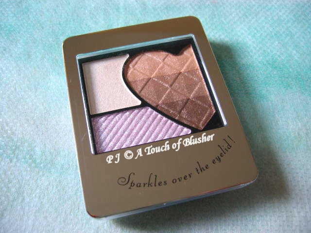
Shiseido Integrate‘s Rainbow Grade Eyes in BE303, from the line’s fall 2010 makeup collection, is actually not the first item from the line that I tried. A couple of years ago, a friend of mine kindly gave me her Diamond Eyes in VI226 to help increase my collection of lilac-toned eyeshadow palettes. I do like the palette. The powder is very smooth and almost creamy, and the colors are beautiful. Then, when I saw Rainbow Grade Eyes on-line, I thought it was time to try another eyeshadow palette from the line.
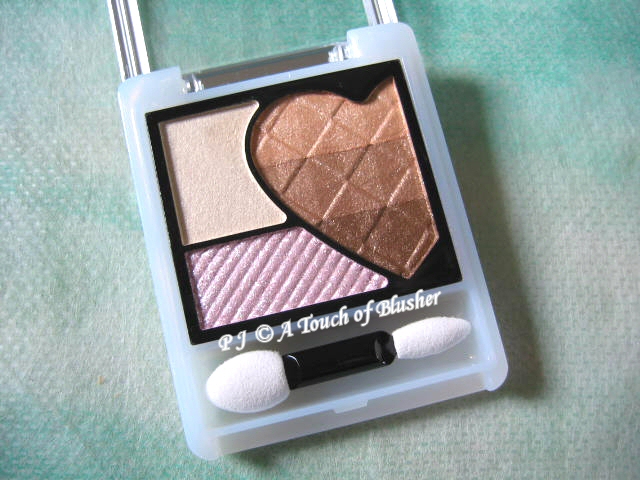
The Rainbow Grade Eyes series claims to create the perfect gradation look for the eyes as well as a multi-colored sparkly finish. The five shades in BE303 are (clockwise from top-left):
– off-white with a slight champagne-yellow tone, moderately pigmented, frosty with subtle shimmer
– off-white orange-toned beige, softly pigmented, pearly with fine shimmer
– light warm beige, moderately pigmented, pearly with fine shimmer
– medium warm brown, pigmented, softly shimmery
– pale pink, sheer, very sparkly and borderline glittery
I have to say that I wish I could like this palette a lot more, and I will explain why. But, first, the good points. All the shades, except the very sparkly pale pink, are exceptionally smooth and silky and have an almost-wet creamy feel. The texture of the three shades in the heart-shape section reminds me of the wonderfully smooth texture of the main shadowing colors of my two Coffret D’Or 3D Lighting Eyes palettes (Purple Variation and Gold Variation), which are still among my favorite eyeshadow palettes. Also, the colors go on and blend effortlessly and they have a good staying power.
However, there are elements of this palette that I find less than impressive:
The finish: First of all, the off-white highlighting shade is slightly too frosty for my liking. Secondly, the top and the middle shades in the heart-shape section do not look as dimensional as some of the similar shades that I have tried. Thirdly, the sparkles of the pale pink not only are a little too large (and therefore glitter-like) but also look slightly flat and non-dimensional.
The color: Both the top and the middle shades in the heart-shape section go on nearly a whole shade lighter than they look in the pan. The top orange-toned beige goes on as an off-white orange-toned beige. The middle shade looks like a medium beige-brown in the pan but it also goes on lighter. On the whole, I wish these two shades had a little more color and depth.
The gradation: Even though the shades in this palette do create a very seamless gradation, for me it is almost too seamless and it lacks definition. (To increase definition, I suggest skipping either the off-white orange-toned beige or the light warm beige. The colors are so smooth and blendable anyway and a seamless gradation can still be easily achieved.)
Overall, even though the quality of the powder is generally very good and it is what I would expect from a Japanese makeup line, I think that palettes like Lavshuca’s Eye Color Select in BR-1 and Lunasol’s Aurorize Eyes in Light Variation, which have a similar color combination, work considerably better for me.
Related posts:
Coffret D’Or Beauty C Curve Eyes in Peach Beige
Coffret D’Or Color Mixing Eyes in Orange Brown Mix
Magie Deco Shadow Brilliance II in Foxy Lady


{ 2 comments… read them below or add one }
Hello! :)
I share your opinion on this. I got the purple one back in Japan, and I don’t se much of a gradation. Granted, I’m not Asian and I don’t pull off the gradation effect so well, but I can’t use this the western way (you know, lid, crease etc.) either. Hm. :( And the gritty sparkles irritate my eyes. >.<
It does look cute on my dresser, though.
Hi Julia,
Thank you for sharing your perspective on the application!
I am not really a fan of the sparkles in this palette series either. While they don’t irritate my eyes, I don’t feel that they add to the overall look.
Thank you very much for stopping by again! :)