stash focus

(Albion Eprise Water Face Color in 100)

Before talking about my first ever Albion purchase, I’d like to briefly mention the brand itself.

Albion is one of the largest cosmetics brands in Japan. I have also occasionally come across passing mentions of Albion as a brand favored by the Japanese royalty. Few can really be sure of this, but it is true that Albion has always had a very upmarket image. [The Albion website is for information only and doesn’t offer on-line ordering.]

Albion’s most popular products are mainly skincare and foundation items. The Essential Skin Conditioner and Exage powder foundations are almost permanent fixtures on most best-selling and magazine readers’ favorite product lists.

One unique aspect of all Albion’s various skincare ranges is a creamy skin-softening emulsion that is applied in circular motion with a cotton pad before the toner and the moisturizer. The Albion sales assistants often remind customers that this moisturizer-like emulsion is not a moisturizer and that it is used to help the absorption of all the subsequent skincare products.

I have tried samples from Albion’s skincare routines but I personally didn’t enjoy using the skin-softening emulsions. They felt quite filmy on the skin and I didn’t feel like using any other product afterwards. Plus the circular motion during the application left my skin slightly red, not to mention that most of them had alcohol. (So do many of the toners.) But I am aware that some people swear by Albion’s unique skincare routines and can’t imagine using anything else.

So, with Albion, their makeup ranges are much more suitable for me to get a taste of the brand. I had long been interested in trying out Eprise, one of Albion’s makeup ranges. (Albion’s website is completely in Flash, so do click on the Albion link above to find the Eprise line.) As someone that loves blushers, when I saw Water Face Color from the spring 2008 collection, I almost instantly decided that this would be my first-ever Albion purchase.
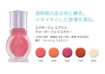
(Eprise Water Face Color)
(image from www.albion.co.jp)

This item still features alcohol, which is third on the ingredient list (after water and cyclomethicone (a kind of silicone) and before talc). But, since this is applied after my toner and daytime mosturizer/sunscreen (occasionally after a makeup base and/or a liquid foundation as well), it doesn’t irritate my skin.

The bottle is shaken before application. The blusher liquid has a watery consistency and glides with ease. (But this is not a cheek stain and has a slightly milkier consistency than a typical water-based cheek stain.) It is very easy to blend and layers well for more intensity. The finish is softly luminous and non-greasy, without any visible shimmer. After the blending is done, it almost feels as if the color came from within the skin.

#100 is quite a natural pink for me. It has a bouncy feel but doesn’t make my cheeks look overly flushed.

Another aspect that impresses me is that the color is very long-lasting. I usually use a powder foundation so this liquid blusher would go underneath it. There were twice when I had it on for about 12 hours, and the fading was very minimal and barely noticeable. I was initially slightly worried that, like a couple of cheek/lip staining items I tested, the color wouldn’t easily come off with a cleanser, but it came off swiftly and effortlessly with my RMK Cleansing Oil.

Overall, this is a very good blusher for me. A little goes a long way, so this 10ml liquid blusher will last a long time and create a lot of long-lasting rosy cheeks. I have a feeling that it won’t be long before I am interested in trying another makeup item from Albion.

Related Posts:

Chanel Irréelle Blush in Tea Rose
(one of my absolute favorites)

Boots No. 7 Cheek Colours
(home favorites)


Budget Princess: Majolica Majorca
(featuring two blushers from the line)

{ 16 comments }
(Lancôme Tonique Douceur)

Since I have quite sensitive skin, I think I am rather picky about what skincare products to use.

Just like makeup, old favorites get discontinued and we look through new candidates. I used to love Shu Uemura’s Refreshing Lotion, but it was discontinued a couple of years ago. After I used up my last bottle, the audition process started again.

Although there are a couple of toners I really like from Japanese brands not available in the UK, when it comes to skincare products, I tend to use what is available locally. It makes shopping (and restocking) a little easier.

I think Lancôme‘s Tonique Douceur has been around ever since I started to be interested in cosmetics. I am not sure if the formula has ever changed, but when I tried samples of it in the past, I did like them. After comparing it with a couple of others just to be sure, I decided to settle on Tonique Douceur.

It is alcohol-free and has a light, soothing, and refreshing feel. (I don’t really like toners with a serum-y texture or those that leave a slippery film on the skin.) I find that it eases up the mild redness of my skin and helps the skin look clearer and more transparent.

Also, the ingredient list is shorter than those of a lot of other toners I have come across. For people with sensitive skin, the fewer ingredients applied on the skin, the better.

After water and glycerin, rosa centifolia flower (rose hip) water is third on the ingredient list. According to Paula Begoun’s Cosmetics Ingredient Dictionary, rose hip has antioxidant properties. It is a pity that the toner is packaged in a transparent toner. Otherwise the antioxidant properties would last longer.

I usually don’t use cotton balls or cotton pads when applying a toner. I dispense 4 or 5 drops of a toner, spread them across my palms, and gently pat the toner onto the skin. (I put Tonique Douceur in another bottle with a pump dispenser so I don’t accidentally pour too much out.) During the application, I also like to cover my cheeks and eyes with my palms and do some deep breathing. I find it very calming.

Overall this is a toner that really suits my slightly sensitive skin, and the fact that I don’t use cotton balls/pads also makes a 200ml bottle go a long way.

(Please note that Tonique Douceur contains fragrance and preservatives. Do make sure you read through the ingredient list if you have relevant concerns.)

Related Posts:

Other steps of my skincare routine:

Makeup remover

Daytime Moisturizer

Nighttime Moisturizer

Lip Balm

{ 16 comments }

(Loving the lilacs:
Lunasol Sheer Contrast Eyes in Lavender Coral)
(under sunlight and minimal artificial lighting)

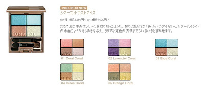
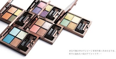
The Sheer Contrast Eyes palettes are part of Lunasol‘s spring 2008 collection. Drawing inspiration from the vibrant colors of the ocean, the collection captures the rich and diverse hues and the rippling glimmer of the world below the sea level.
(image from www.kanebo-cosmetics.jp/lunasol)
The alluring shades are based on those of the coral reefs, and the palettes are aptly named Blue Coral, Green Coral, Lavender Coral, Orange Coral, and Coral Coral.
(Lunasol’s Sheer Contrast Eyes)
(image from www.kanebo-cosmetics.jp/lunasol)

Lunasol’s eye palettes are probably the brand’s most popular items. (Last year’s @Cosme reader survey reflected this, as the top three eye palettes are all from Lunasol.) Even though Lunasol had been one of my favorite brands, I never tried their eyeshadows. With Sheer Contrast Eyes’ eye-catching lineup, I thought it was time for me to dive in.

(under artificial lighting,
where shimmer is a little more visible on camera)
There was very little decision-making involved in which palette I wanted to try, and I am very pleased with what I got. Lavender Coral is a box full of prettiness…

— bottom right: very sheer pale yellow with a subtle gold undertone and plenty of sparkles
— top right: sheer pale pink with intense but fine shimmer
— top left: well-pigmented soft cool lilac with delicate shimmer
— bottom left: semi-matte deep warm violet with sparse shimmer

(All the shimmering particles are multi-colored. The sizes of the particles vary slightly among the four shades.)

The cool lilac is obviously the main shade in this palette. Not only is it one of the most visually beautiful lilac shades I have, it suits me very well. The pale pink is very sheer and mainly goes on as shimmer, but the abundant ultra-fine light-reflective particles and the superbly smooth texture make it both a competent base and a subtle but effective highlighter. (As a highlighter, this shimmery pale pink doesn’t have that harshness that some white or silvery highlighters may have.) The deep warm violet is a good eye-lining shade and isn’t so dark that it can look grey on the skin.

My only very minor issue is with the pale yellow, as the sparkles are a little bit on the big side for my personal liking. But this is not to suggest that it looks glittery or tacky. In fact, if you like high-voltage multi-colored sparkles with a pale-gold base tone, then you might really like this particular shade.

All the shades have a smooth and silky feel and are very easy to apply. They are also satisfactorily long-lasting.

I always tend not to over-layer my eyeshadows and keep the finish relatively sheer. For me, this palette, worn in this way, really stands out, because the subtle shimmer almost creates a unique wet finish. It resembles the surface of the glimmering sea under the sun and echoes so well the ocean theme of this collection.

I also came across a user’s comment on Lunasol’s eye palettes. Obviously from a Lunasol lover, her theory is that the only way to show that we are wearing the stunning Lunasol’s eyeshadows (and not possibly anything else) is to wear them sheer. Only by wearing them sheer can we do justice to the ultimate strength of Lunasol’s eye colors, which is the magical transparency showing through the rich pigments. Wonderfully said!

Even though I have several lilac eye palettes, each one is unique and different and this one is no exception, to say the least. I’ve understood first-hand why Lunasol’s eye palettes are able to draw people into the brand, make the brand more and more coveted, and widen the age range of loyal fans. I will continue to explore the possibilities of this palette and the essence of Lunasol.

Related Posts:

Must-Try Look for Spring 2008
(loving all the variations)

Spring 2008 Makeup Trend Report
(featuring the hot colors of this season)

Loving Japanese Brands: Lunasol
(how things got started…)

Coffret D’Or 3D Lighting Eyes in Purple Variation
(as fantastic as the Lunasol one, but in a very different way)


{ 24 comments }

(full of goodness…)
.

This is the first post to highlight some of the spring 2008 makeup items that I have got. There will be more to come later!

Even though I love Anna Sui, my last purchase was almost two years ago (Face Color Accent in 400). But after I saw some photos of the three limited-edition lip glosses for the spring 2008 collection, I decided to get the blue-tinted one.

(part of Anna Sui’s spring 2008 collection)
(image from www.annasui-cosmetics.com)

I have several blue-tinted lip glosses and I love all of them. But if I have to be picky, I prefer the ones that are simply blue-tinted and with very sparse shimmering particles to the ones with more blue shimmer. I also tend to favor ones that have a deep warm aqua blue shade in the tube. (It is just for my visual pleasure…)

This lip gloss by Anna Sui has these particular aspects that I like in a blue lip gloss. It has a pleasing blue color in the tube, but it goes on very sheer. It looks like it has a lot of shimmer, but the particles look quite sparse on the lips.

The gloss has the signature Anna Sui scent. I don’t normally like scented lip glosses, but I am okay with this one.

It imparts a wet glossy shine that lasts well. As with my other blue lip glosses, this one also adds subtle depth and transparency to my lips, making them look fuller and more dimensional.

Plus, l simply enjoy looking at the warm tropical shimmery blue in the container. It is like Maldives in a tube…

.

Related Posts:

Loving Japanese Brands: Anna Sui
(my personal take on the brand)

Lunasol Full Glamor Gloss in Bright Pink
(It is not too bright at all and is one of my favorite lip glosses.)

Lavshuca Gloss Stick in PK-3
(See how Lavshuca does cute.)

{ 12 comments }

(Chanel Irréelle Duo in River-Light (left)
and Désert-Rose (right))
.

I have always liked Chanel’s Irréelle range. The powder is delicately pigmented, and the texture is silky smooth and easy to work with.

I bought Désert-Rose when the Irréelle Duo range was launched in fall 2005. It is a very wearable basic duo. The pink goes on subtly and has peach and gold undertones. The chocolate brown is a nice shade for lining the eyes. Both have exceptionally fine multi-color shimmering particles. This is a great duo to be used alone or with other items to create a soft daytime look.

I bought River-Light (out in spring 2006) during the summer of 2006. (That summer was all about finding the nicest minty green and turquoise. More discoveries from that era later on my blog…) Overall this duo is slightly more matte than Désert-Rose. The minty green on the left is quite sheer and is noticeably less shimmery than the pink in Désert-Rose. It goes on with a very slight touch of pale blue undertone, which makes this shade very appealing to me. The beautiful light turquoise on the right doesn’t have any distracting yellowish shimmer seen in many other turquoise-based eyeshadows. This duo can be very suitable for people who haven’t tried turquoise and want to start with a more delicate turquoise hue.

I love both duos equally, but I use Désert-Rose much more often since it is very naturally flattering and easy to use. On the other hand, I reach for River-Light when I want some gentle vibrancy for my eye makeup. (Even when I am not using it, the two soft green/turquoise shades are simply beautiful to look at in the case……)

.

Related Posts:

Chanel Irréelle Blush in Tea Rose
(one of my favorite blushers)

Spring 2008 Makeup Trend Report
(featuring Chanel’s spring 2008 collection)

Chanel Ombre d’Eau Eyeshadow
(A joint report with Beauty Anonymous)

The Perfect Black: Chanel
(my personal take on Chanel)


{ 6 comments }

(Paul & Joe Face Powder in 03 Ambre)

I bought Paul & Joe‘s Face Powder in Harrods in London during the winter sale just a few weeks ago. At 50% off (13 pounds), it was a good bargain. (You can read about some of the huge savings people can make on cosmetics in the UK during the seasonal sales.)

The reason why it was reduced is that Face Powder was replaced by Face Powder N last year, so the Paul & Joe counters (both in Harrods and Fenwick) were clearing out this previous version. (The comparison between the two versions will be made towards the end of this post.) I hadn’t tried the loose powder by Paul & Joe before so I thought I’d try it at this reasonable price.

Like Anna Sui’s loose powder, the case is quite bulky, but I absolutely don’t mind. (I do like my makeup items to have a substantial look and feel.)

(the case and the puff)

Also, like Anna Sui’s loose powder, the cap simply rests on the loose powder container. This can also make transporting the case tricky. I have heard about many “accidents” where the whole case is tipped over and half of the powder ends up on the floor. (Basically, this loose powder is one of the best candidates for the centerpiece on your glamorous dressing table. It is probably not even suitable for trips around your home.)

(The cap simply goes on the silvery rim.)

The similarity to the Anna Sui powder continues. The refill is in a closed round paper container. The top is cut off to reveal the powder.

(I followed the dotted lines…)

Then, the powder container goes back into the loose powder case. The sift is simply placed on top of the powder.

(It is finally done…)

I know that many people really don’t like this design, all the way from the case to the refill and the sift. It all seems quite fiddly. I personally don’t have problems with them. I think it has that delicate “handle with care” quality that can really appeal to me sometimes.

What I do have a problem with is the powder puff. Imagine your puff for your loose body shimmer and this is basically it. First of all, it is too hairy and fluffy for an even application. All I can do is very lightly dust the powder on the face. There is no way I can press the powder onto the skin evenly and have the powder diffuse the look of the pores. Secondly, the core of the puff is solid, so I can’t rub the two sides of the puff against each other to make the puff drink in the powder evenly. The powder can only sit on top of all the fluffy hair, and this simply doesn’t help with an even application. So, I use one of my other loose powder puffs instead.

Onto the finish of the powder itself. I have often heard that Paul & Joe’s base makeup line (primers, foundations, concealers, and loose powder… particularly the foundations) is all about creating a sheer and ultra-natural look. This is certainly what this loose powder offers. Because 03 Ambre is quite a good match with my skin-tone, it goes on almost invisibly, as it imparts a very light air of luminosity. The powder does have shimmer, but it is quite fine and sparse. The finish is very gentle and subtle and is not visibly either matte or glowy.

If you like an ultra-natural barely-there look, then this loose powder is worth trying. But I usually like my loose powder to give me a matte finish and to have a good pore-diffusing and sebum-controlling ability.

While at the counter, I noticed that the new version of loose powder (Face Powder N) is almost completely shimmer-less. It will probably give me the matte finish I like. Also, the shade in #02, which is the closest to the #03 Ambre that I have, seems, in a good way, slightly less pinkish and more yellowish. This would be the shade I would go for if I decide to try the current version. Also, it seems that #03 (of the new version) is one of the darkest loose powder shades from a Japanese cosmetics brand. If you have darker skin-tones and find it difficult to find a loose powder from a Japanese brand, then this shade might be worth a look.

Over all, Paul & Joe Face Powder is all about subtlety. I will definitely continue to enjoy using it sometimes, but I will reach for some of my other loose powder options when I need a truly finished look.

(One note: I think the Paul & Joe Face Powder, which I am reviewing here, might have also been replaced by Face Powder N in some other countries. But, some of the authorized Paul & Joe on-line sellers in the UK, which are listed on the Shop Info page of the English Paul & Joe Beauty website, are still carrying the Face Powder. I believe some of them ship internationally.)

Related Posts:

Paul & Joe Foundation Primer N
(a very effective and well-rounded primer)

Paul & Joe Lip Gloss N in Black-Tie

(my favorite Holiday 2007 item)

Loving Japanese Brands: Paul & Joe
(my personal take on Paul & Joe)

Lavshuca Face Powder
(my current favorite loose powder)

{ 6 comments }

(RMK Cleansing Oil N)
(image from www.rmkrmk.com/global/)

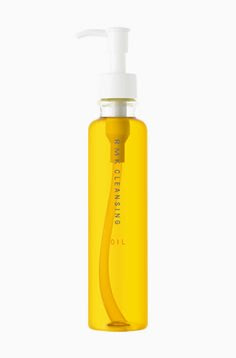
RMK Cleansing Oil N is the cleansing oil of my choice before and after I was using the cheaper Boots Botanics Essential Oil Wash Off Cleanser, and this is one of my favorite makeup removing products.

To be specific, Cleansing Oil N, out a couple of years ago, is the new version of Cleansing Oil. But I don’t feel that there is any substantial difference between the two versions. Both are equally great.

Like most other cleansing oils, this one cleanses very effectively and melts all water-proof makeup. But three aspects of this cleansing oil stands out for me:

1. It emulsifies very well upon rinsing. There are several cleansing oils I have tried that don’t emulsify very well and leave a greasy film. Even after using a face wash, sometimes my face still feels somewhat greasy. This one leaves the skin very cleansed and fresh. Very occasionally I even forget to wash my face with a face wash immediately afterwards.

2. It is very gentle for my eyes. A couple of cleansing oils that I actually really like can leave my eyes dry if they get into the eyes while dissolving eye makeup. This one is very gentle for the eye area and never feels irritating.

3. With mainly olive, avocado, and grape seed oil, the texture is very light and it spreads wonderfully easily. I find that I don’t need as much per appplication, compared with other cleansing oils.

I am very glad that RMK became available in the UK several years ago, so there was no doubt which cleansing oil I was going to switch (back) to after the Boots Bonatics Oil Cleanser was discontinued.

(Note: Currently, UK is the only place outside Asia where RMK products are available.)

Updated on January 27, 2008:

In the comment section, Jami from Bionic Beauty asked about the ingredient list of this cleansing oil. So here is the full ingredient list of RMK’s Cleansing Oil N that I happen to have saved for future reference. (Please click on the photo for a much larger version.)

(the full ingredient list of RMK Cleansing Oil N,
on the back of the outer packaging)

Related Posts:

I also can’t live without:

Garnier Hand Cocoon

Dove Body Silk

{ 23 comments }

(Kanebo Coffret D’Or 3D Lighting Eyes)
(image from http://www.kanebo-cosmetics.jp/coffretdor)

Kanebo’s new makeup line, Coffret D’Or, was launched on December 16, 2007 in Japan. (The line is also available in Hong Kong and Taiwan as far as I know.) It is replacing the color makeup line T’Estimo and the base makeup line Revue.Upon seeing the first few images from the line a couple of months ago, I was not very enthusiastic. I thought the packaging was not particularly outstanding and the range of shades was not immensely imaginative.

However, as I saw more and more sneak-peek photos of the collection, Coffret D’Or’s debut lineup started to grow on me. I decided that I would try something from the line.

In many Japanese brands, I think the eyeshadow palettes play an important part in defining the image of the brand, in terms of both packaging and shade combinations. Their 3D Lighting Eyes in 04 Purple Variation really caught my eye. So there was no question which item I would want to try first.

I like the packaging of the palette. It is like a small gift box wrapped in jeweled ribbons. (Many Japanese brands are able to do cute and elegant at the same time without ever appearing tacky.)

04 Purple Variation faces severe competition with my other lilac-based palettes.


The individual shades deserve a detailed mention. First of all, the upper white strip consists of two finishes. (In the photo, you can see that the left half is slightly whiter than the right half.) The right half is a medium pigmented white with very fine multi-color sparkles. The left half is sheerer and has slightly larger multi-color sparkles. The two parts are meant to be used together
as a base (swept across with a brush or a wide sponge-tip) but they can still be used individually. I think the reason the two halves are packaged like this is to showcase the variation of sizes of sparkles and the multi-dimensional effect that they can create together (the namesake 3D effect, I suppose).

On the second row, from left to right:
— a dusty pink with very smooth shimmer and very fine sparkles (medium pigmented)
— a sheer and very pale blue with mild shimmer and slightly larger multi-color sparkles (not glitters)
— a well-pigmented muted violet with sparse multi-color sparkles

The dusty pink has a very mild warm mauve undertone and the pale blue has a hint of cool pale lilac undertone.

The palette is a joy to use. The texture of the powder is very smooth, the shades go on very easily, and blending is effortless.

What some people like about eyeshadow palettes of some Japanese makeup lines is that there are step-by-step instructions on how to use a palette to create the look that it is designed to create and to achieve the look in the promotional image.

(instructions on the back of the outer packaging)
(Please click on the image to see a larger version)


These instructions are very useful for people who may be wary of using 4 or 5 colors on the eyes at the same time and for people who might not feel comfortable asking sales assistants for application tips.
Before I explored other possibilities, I decided to follow the instructions to see what this palette can do for me. I was very pleased. The main idea of this range of palettes is to use the B shade (please refer to the photo above), which is slightly darker and less sparkling, in the outer 2/3 above the eyes to create subtle shadowing and the C shade (paler and more sparkling) in the inner 1/2 above (which overlaps the B shade) and below the eyes to make them pop.

I put the two photos together so you don’t need to refer back and forth:


The finish look is very soft, natural, and sensual, as the B and C shades are both relatively light. But the palette manages to very effectively enhance the dimension of the eyes. I think the delicate variation in shades, pigmentation, shimmer, and sparkles in this palette is a success. Every single element in this palette is doing something that you can see.
 

Out of the five promotional looks (modeled by five Japanese actresses as brand ambassadors for the line), I think the look presented by Tokiwa Takako best demonstrates the eye-sculpting effect of this range of eyeshadow palettes:


(Tokiwa Takako for Coffret D’Or)
(image from http://www.kanebo-cosmetics.jp/coffretdor)


(Please note that Tokiwa Takako is using the 3D Lighting Eyes in 05 Gold Variation.)

The instructions seem to aim for a fresh and elegant daytime look. For a more intense evening look, smudging the violet shade further (instead of using the shade to simply line the eyes) will add more drama. (I tried that and it worked very well too.)

Overall, I adore this palette and the soft and understated look that it creates. The shimmer is smooth and velvety, and the multi-color sparkles are delicate but vibrant.

If you prefer a lot of impact for the eye makeup, then this range of palettes might not appeal to you as much. But perhaps Coffret D’Or will bring out more intense color combinations later this year. Judging by the quality of this palette, I think it is worth the wait…

Updated on January 28, 2008:

If you are interested, there are reviews of 02 Blue-Green Variation on My Women Stuff and Mostly Make Up.

My other lilac-based palettes, along with a very short comparison (please click on the links for full reviews):

Jill Stuart Brilliance Eyes in 04 Gem Amethyst
(The shades are sheerer and there are larger sparkles.)

T’Estimo Frame Impact Eyes in 03

(The lilac shades are cooler and there is a wider range of lighter and darker shades for a more intense look.)

Lavshuca Eye Color Select in PU-2
(This palette from Lavshuca’s fall 2007 collection is overall a slightly darker and warmer version of the Coffret D’Or one.)

Please feel free to leave your comment if you’d like to ask me for more comparisons among these palettes and shades!

{ 22 comments }

(Dior 5-Color Eyeshadow Palette in #250 Seascape)

.

Dior’s 5-Color Eyeshadow Palettes, along with the rest of Dior’s makeup line, have been through numerous packaging changes. But I have noticed that this particular color combination has been existing for at least 5 or 6 years.

I got #250 Seascape in 2006 with my Boots points, and I think this is a really beautiful and colorful eyeshadow palette. With blue and purple being on-trend this season (have a look at my spring 2008 makeup trend report), I thought I’d give this palette a mention.

The palette features:

Top left: a soft grey with a very slight ashy-blue undertone and soft purple iridescence
Top right: medium aqua blue
Bottom left: warm medium purple
Bottom right: pale mint green
Center: white with silvery sparkles

The shades are well pigmented and very smooth to apply and blend. They go on quite matte but have a satiny and luminous finish. The central white shade, though, feels a little gritty, probably because of the sparkles. On the other hand, the blue is one of my favorite blue eyeshadow shades.

With both the blue and the purple being quite vibrant, the palette can create a variety of looks, depending on where to place these two colors on the eyes. When I simply want a simple and fresh look, a wash of the mint shade can really brighten my eyes. It can also be used as a base to bring out the lively blue and purple.

Dior’s eyeshadows are known for the great texture and many palettes feature wearable but unique color combinations. Also, their seasonal releases are often good indications of what colors are currently trendy. But I have noticed that the finish of some of the latest palettes (with the powder in quilted patterns) is getting more and more shimmery. While the shimmery finish still looks smooth and flattering, I do hope their future releases will maintain a balance between satiny matte and shimmery finishes.

.

Related posts:

Dior’s Spring 2008 Makeup Collection
(Anything catching your eye?)

The Allure of Blue Eyeshadows
(See my other blue eyeshadows)

A Splash of Colors – Lilting Lilac
(soft, feminine, and wearable)

{ 8 comments }

(cuticle oil from Paul & Joe (left)
and Ayura (middle and right))

I have to admit in the beginning that, to moisturize my cuticles, I prefer very emollient and dense cuticle creams and that I also use very thick lip balms on my cuticles. In general, cuticle oil, on its own, does not do a lot for me.

But I do have a weakness for cute-looking cuticle oils. A big reason why I bought these three is that they look so adorable. They are like little treats, and I don’t really use them regularly. But, when I do, I use them as a nail/cuticle conditioner underneath my hand cream and cuticle cream.

The Ayura one in the middle is what started this weakness. It was a limited-edition item included in a set a few years ago and it was never sold on its own. The three layers of oil (of pink, peach, and lime-green shades) are mixed together before use. It is well-absorbed and smells divine. (This cuticle oil was a one-off creation based on the scent of Spirit of Ayura, one of my favorite fragrances.) I stopped using it after I decided I wanted to keep these colorful layers close to their entirety.

When Ayura’s nail items changed their packaging a couple of years ago, they released After Bath Nail Essence (a general item, not limited-edition). It is not an oil and has a serum texture. The inclusion of alcohol in this prevents it from being more moisturizing, and I make sure I apply a hand cream right afterwards.

The Paul & Joe Nail Treatment Oil (pictured left) has the same light oil texture as the Ayura limited-edition one. It penetrates well and conditions the nail area nicely before I apply my hand cream and cuticle cream.

The link to the Paul & Joe Nail Treatment Oil above shows the new version (Nail Care Oil), out on February 1st. I will be checking it out and see how different it is from the one I have…

Related Posts:

Can’t Live Without: Garnier Hand Cocoon
(one of my favorite hand creams)

Ayura Spring 2008 Collection
(a new look for my all-time favorite brand)

Paul & Joe Foundation Primer N
(tried and tested…and loving it)

{ 2 comments }