stash focus

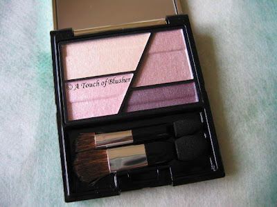
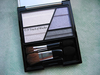
(Coffret D’Or Trance Deep Eyes in Grey Variation)

Two weeks ago, I talked about Rose Variation from Coffret D’Or‘s Trance Deep Eyes series for fall 2008. Today I am reviewing Grey Variation.

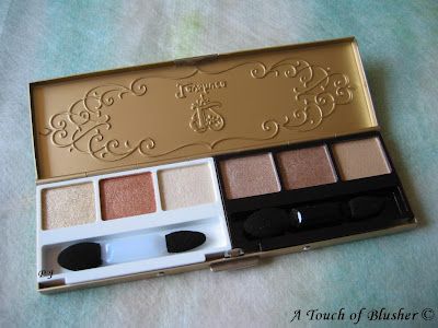
Grey Variation features a cool lilac as the shadowing shade along with a medium grey for lining the eyes. The four colors are (clock-wise from top-left):

A off-white (sheer, mildly shimmery)
B cool medium lilac (moderately pigmented, shimmery)
C medium-to-dark grey (well pigmented, luminous matte under the sparse shimmer)
D off-white silver (moderately pigmented, very sparkly)

(As with Rose Variation, all shades have fine multi-colored shimmer and a good staying power.)
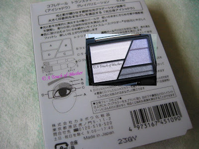
(Please click on the image for a larger version.)

Compared with Rose Variation, Grey Variation is my preferred one since the cool medium lilac brings out the dimension of the eyes a lot more. This dimension-enhancement is twofold:

– The lilac is darker than the warm dusty pink (the shadowing shade) in Rose Variation. The dusty pink can be a little too subtle, particularly for the evening.

– The lilac’s tone changes when looked at from different angles (while the depth of the color remains the same). When seen straight-on (as seen in the photo), the lilac has a cool tone. However, when seen from the side (when the palette is held almost horizontally in front of my eye-line), the shade takes on a slightly warmer tone (particularly under sunlight). But I didn’t manage to really capture the difference on camera. (There is also such a tone variation with the dusty pink in Rose Variation, but it is extremely minimal.)

What is great is that this tone variation also shows up when worn and it gives a good eye-sculpting effect (even when the color is worn lightly). (But please note that this variation is different from (and much subtler than) the iridescence that we see in, for example, Lancôme’s L.U.C.I. collection in spring 2008.)
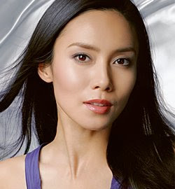
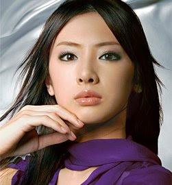
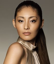
(image from www.kanebo-cosmetics.jp/coffretdor)


(Coffret D’Or TV commercial, via YouTube)

It is also worth mentioning that this palette does appear similar to Maquillage Clean Contrast Eyes 2 in SV844. However, the lilac in the Maquillage palette is quite pale and is a lightening color, whereas the lilac here is darker and performs as a shadowing shade.

As I mentioned, at the moment I prefer Grey Variation to Rose. But, compared with Purple Variation from the 3D Lighting Eyes series, I think I still like Purple better and I’d say I like Grey as much as I like Gold.

Overall I am quite happy with the two I have from the Trance Deep Eyes series. In an earlier post, I mentioned that I was also considering Beige Variation. It is still on my shopping list, but not anywhere towards the top. There is no limited edition in either of the two palette series, so for now I’ll look forward to spring 2009.

Updated on September 4th, 2008:

Please check out this blog post for swatch and FOTD photos of this palette.

Related posts:

Lunasol Sheer Contrast Eyes in Lavender Coral

Chanel Quadra Eye Shadow in Stage Lights

A Splash of Color – More Lilting Lilac

{ 10 comments }

(Coffret D’Or Trance Deep Eyes in Rose Variation)

Coffret D’Or‘s Trance Deep Eyes range, released in June, is the second eye palette series after the successful 3D Lighting Eyes. I have been pleased with my two 3D Lighting Eyes palettes (in Purple and Gold Variation) so the new range is a must-try for me.

Rose Variation is essentially a warm-pink palette with an aubergine lining shade. The four shades are (clock-wise from the lightest):

A off-white with shimmer (sheer, mildly shimmery)
B warm dusty pink with pearly shimmer (moderately pigmented, shimmery)
C dark aubergine with sparse shimmer (well-pigmented, luminous matte under the sparse shimmer)
D off-white pink with shimmer (moderately pigmented, very sparkly)

(All the shimmering particles are multi-colored. All shades have good staying powder.)

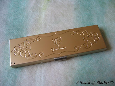
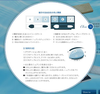
The cases are the same as those of the 3D Lighting Eye palettes, and, again, the instructions are printed on the back of the outer packaging:

(Please click on the image for a larger version.)

The main difference between the instructions of 3D Lighting Eyes and those of Trance Deep Eyes is that the second lightest shade in Trance Deep Eyes is applied all over the lid, not just towards the inner corner (as in 3D Lighting Eyes).

(image from www.kanebo-cosmetics.jp/coffretdor)

When I saw the colors in person for the first time, I thought the dusty pink looked very similar to the pink in Purple Variation. (I was somewhat expecting this when I saw the new palettes on the official website.) However, even though they do look very similar in the containers, the one in Rose Variation goes on warmer. It is also more subtle. (The pink hue does not show up very much under warm artificial lighting.)

When I follow the instructions, the overall finish is quite sparkly, largely down to the very shimmery/sparkly off-white pink applied over the lids. Even when I only apply it towards the inner corner of the eyes, I think the look can still be a little too sparkly for daytime (when I prefer a very softly shimmery look).

Color-wise, the white base shade (A) and the off-white pink (D) go on almost the same, as they only differ in the amount of shimmer. Therefore, I don’t think Rose Variation is as versatile as Purple Variation, which also creates more dimension for the eyes. But I’d think Rose Variation is probably the most wearable palette (out of the four Coffret D’Or palettes I currently have) for most people, as it is very hard to go wrong with these shades.

Between Purple and Rose Variation, I prefer Purple Variation, which has the beautiful combination of dusty pink and cool lilac. Also, the finish is subtly shimmery rather than sparkly. But if you like beaming sparkles and are not happy with what you get from 3D Lighting Eyes, the Trance Deep Eyes range might be worth a look.

I will be reviewing Grey Variation later this month.

Related Posts:

Fluffy Shine Eyes from Coffret D’Or’s Fall 2008 Collection

Coffret D’Or Full Styling Rouge Lipsticks

Foundation Face-Off – Lunasol vs. Coffret D’Or

{ 4 comments }

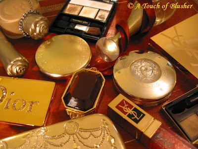
I used to like gold more as a (glamorous and opulent) makeup packaging color scheme than as a shade to be worn. But I have tried a couple of gold-toned eye palettes this summer, and I have been enjoying seeing how various shades of gold can do for my eyes.

It seems that gold will be leading the makeup trend for fall and winter 2008, and I think there will be more dazzling hues of gold all the way through the holiday season.

Base
Anna Sui Fluid Foundation
Majolica Majorca Skin Remake Powder Foundation
Versace Concealer & Highlighter Duo

Eyes
Coffret D’Or 3D Lighting Eyes in Gold Variation
Lavshuca Summer Gradually Compact in Shiny Sandy Beach
Elégance Purity Eyes 11

Cheeks
Anna Sui Face Color Stick 302

Lips
Dior Sparkling Lip Gloss Duo
YSL Golden Gloss 03 Golden Pink

Multi-purposed
Dior Golden Dior Luminizing Makeup Jewel
YSL Gold Celebration Palette “Star Glow”

Fragrance
Dior J’Adore Eau de Parfum

Other splashes of color:

Lilting Lilac (Part 1 and 2)

Terrific Turquoise

Citrus Orange

Aqua Blue

New-Leaf Green

Girlie Pink

{ 4 comments }

(L’Oréal True Match Super-Blendable Powder
in W3 Golden Beige)

Ever since L’Oréal’s True Match Super-Blendable Powder was chosen by Paula Begoun as one of the best makeup products in 2005, I have been interested in it. At that time, it was not sold in the UK. But it has been available here for a while now, and I recently decided to give it a try.

I am quite disappointed with it as a powder foundation. Even though the talc-based powder is very smooth and the finish is nicely matte and natural, it has very little coverage and only mildly evens out the complexion.

I think the reason why L’Oréal is able to claim that this powder can “adjust to the color” of the skin is that it is so sheer. On the plus side, it is hard to go wrong with the color selection, as most people can probably work with a couple of different shades.

For me, it works a lot better as a pressed setting powder. The smooth texture doesn’t look chalky over my ZA Two-Way Powder Foundation, and the silky matte shimmer-free powder covers pores and mattifies the shine fairly well. (I have oily skin and shine tends to be an issue.) This is a good alternative to loose powder when I want to set my foundation very quickly.

The enclosed sponge (not a puff) is thinner than most foundation sponges I have seen, but it still works well with the powder.

My slight complaint of this product is the awkward compact design. The top tier is the powder itself, and the sponge and the mirror are underneath. The product can be fiddly to use when you are out and about and want to do a quick touch-up.

Overall, this can still be a good powder foundation if you only go for a sheer coverage. If you want more coverage, this will almost certainly not work for you. But if you are looking for a well-formulated and reasonably priced pressed powder to set your foundation, this should be a strong contender.

Related Posts:

My Foundation Face-Off articles:

Jill Stuart vs. SUQQU

Lunasol vs. Coffret D’Or

Chanel vs. SUQQU

{ 8 comments }

(I have been testing them as you are reading this post…)

It is a little hard to believe that half of 2008 is almost gone. (I feel that this year has just begun a couple of months ago and that we are still taking about spring collections…) But here is what to look out for in July:

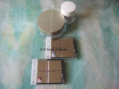
– If you have been gathering reviews of the new Coffret D’Or Trance Deep Eyes palettes, do come back in July. I will bring you reviews of 01 Rose Variation and 04 Grey Variation. I will also review Coffret D’Or’s loose powder. (It’s a keeper!)

– You will be seeing a new three-part series, Beauty City Mini-Guide. Since I often receive e-mails from readers asking for suggestions on beauty shopping when travelling, I have decided to present some of my personal experiences as blog articles. Each of them will focus on one particular city.

If you would like to make sure you don’t miss any of these future posts, please consider subscribing to my blog via e-mail or a feed reader. Thank you very much!

Tomorrow: Review of items from NARS Cosmetics

{ 4 comments }

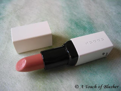
(SUQQU Creamy Lipstick in 22 Benikoji)

Ever since I visited the SUQQU counter (English site here) in London’s Selfridges for the first time, the brand has a special place in my makeup-loving heart.

The quality of some of their makeup items is sublime. Apart from their base makeup products, which SUQQU is renowned for, the texture of their eyeshadows and blushers (and the way the powder melts into the skin) is unparalleled. (I am just waiting for a lilac palette to be released…)

(However, some SUQQU’s skincare products feature excessive alcohol. I personally don’t recommend them.)

Today I am focusing on the SUQQU Creamy Lipstick I have. I very briefly mentioned it earlier, but I think this item more than deserves its own post.

The defining characteristic of SUQQU’s Creamy Lipsticks is the wonderfully rich emolliency. It feels very creamy (but not heavy) on the lips and the color glides on with tremendous ease. Out of all my lipsticks, this one is the most moisturizing. (But I do still always apply a lip balm underneath all lipsticks and lip glosses. It has been a habit of mine for years.) Even when my lips are sometimes not as conditioned as they normally are, especially in winter, the color still goes on quite evenly.

#22 Benikoji is a soft beige pink. I don’t really like nude lipsticks, and this shade is probably as nude as I would ever go. It is moderately pigmented but can be layered for more intensity, and it has no multi-colored micro shimmer that a lot of lipsticks from Japanese brands have. It goes on slightly lighter and imparts a beautiful sheen that does not look greasy. The soft sheen looks classy and understated.

The moisture, finish and color are all long-lasting. Also, for me, apart from the lovely color, this lipstick makes the lips both look and feel ultimately conditioned.

The Creamy Lipstick costs 5250 yen in Japan (about 50 USD) and 24 pounds in the UK. It is expensive, but, for the outstanding quality, I think it is worth it. I have not been planning on getting another color (since I would love to have a SUQQU eye palette first), but I would still be interested in getting a slightly darker and cooler lipstick color.

If you are going to Japan, Thailand, or the UK this summer (SUQQU is currently only available in these three countries), do have a look at SUQQU’s items. You can find all the current SUQQU retail points in the three countries here.

– Please head over to Autumn Masquerade for a brief review of Blend Eyeshadow palette in #06 Touryoku from SUQQU’s spring 2008 collection.

– If you are interested (and read Chinese), please check out this great post on various SUQQU makeup products, including the Creamy Lipstick. I fully agree with the writer that, again, even though this lipstick is expensive, it is absolutely worth it.

Related Posts:

SUQQU Breaks Records
(a brand profile with my personal take)

SUQQU Makeup Base Creamy & Brightup

SUQQU Spring 2008 Collection

{ 0 comments }

(Maquillage Lasting Climax Rouge in RS310)

Since I tried Maquillage‘s Clean Contrast Eyes in SV844, I had wanted to try something else from the line. I decided to go for one of their lipsticks and picked up Lasting Climax Rouge in RS310, from Maquillage’s spring 2008 lineup.

RS310 is medium warm rose and goes on a little more vibrant. It has a natural and slightly glossy finish. It goes on easily and the color and finish last well. While it is not the most moisturizing lipstick I have, it is not drying. (So far, my SUQQU lipstick is probably the most moisturizing lipstick I’ve had.)

I was expecting the Lasting Climax Rouge range to be quite sheer, and I was surprised by the medium pigmentation level when I tried the sample card, which contained five shades (but didn’t contain RS310). RS310 also has a medium color pay-off, while its pigmentation level is slightly lower than that of Coffret D’Or Full Styling Rouge Color.

In terms of the finish, compared with Coffret D’Or Full Styling Rouge Color and Lavshuca Jewelry Lips, this one is slightly glossier and has a tad more micro-shimmer. But it doesn’t have a frosty/metallic finish, which I don’t like.

Shade-wise, it is lighter, warmer and slightly more vivid than Coffret D’Or Full Styling Rouge Color in RS-241 and Lavshuca Jewelry Lips in PK-1. It is quite a girlie color.

Overall, as an RS (Rose) shade, Lasting Climax Rouge in RS310 is relatively vibrant, and I feel it is more of a cool PK (Pink) shade than a typical RS shade from Japanese brands. (Many RS shades I have seen are more muted.) I personally prefer to wear it for the evening (without layering it too much). For daytime, I simply gently dab it on for a mild stained look.

For another review (written in Chinese, with this very shade worn on lips), please check out this post.

Updated on June 6th, 2008:

Please check out the review of RD359 on Autumn Masquerade.


————

Thoughts on photographing lipsticks: I have personally observed that capturing the actual color of a lipstick is a lot trickier than showing that of, for example, an eyeshadow. I think it is because the lipstick itself is more dimensional. A friend of mine commented that it might also be because it is in a semi-liquid form. (Interestingly, I don’t really have this issue with lip glosses. Maybe it is because they are inside solid containers.) The lipstick color in the photo you see above is closest to its actual color under sunlight. (I don’t tend to digitally fine-tune color, brightness, or contrast of my photos for my reviews.)

The two photos below are taken within minutes of the one above. As you can see, in terms of the lipstick color, the first one looks slightly warmer (than the one above), while the second one looks darker and cooler.


(You can see that, in the second one, less light is reflected back to the camera and the lipstick shade looks darker. When it comes to photographing other makeup items, there is usually not this degree of difference (when the amount of light reflected back to the camera slightly varies).)

Based on my experiences, I have also come to understand why a lipstick (in the container, not worn on a model’s lips), compared with other makeup items, can look so different in different magazines or even in different features in the same issue of a magazine.

————

Other Shiseido-Related Posts:

Maquillage Summer 2008 Collection

Can’t Live Without – ZA Two-Way Foundation

Budget Princess: Majolica Majorca


{ 15 comments }

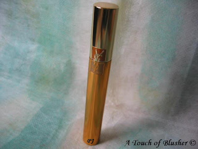
(YSL Mascara Volume Effet Faux Cils in 1 High Density Black)

Two weeks ago, I wrote about Clinique’s Naturally Glossy Mascara, which is one of my favorite mascaras due to its natural subtlety. Today the mascara I am talking about is almost the polar opposite.

YSL‘s Mascara Volume Effet Faux Cils does add length, but it is mostly about volume. The heavy-duty densely creamy mascara coats lashes effectively, making them look thicker with minimal efforts. Very little layering is required to achieve a good deal of volume.

The shade in 1 High Density Black is a fairly black shade without greyishness. The intense shade adds to the dramatic effect.

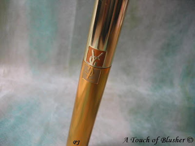
(Perhaps one of the most beautifully packaged mascaras…)


What I have found is that I do have to be quite light-handed with the application. Otherwise it will clump a little. I think the best way to apply this mascara is to use soft upward strokes. The zig-zag technique, which is usually useful in building up volume, will create clumps with this mascara. Also, the mascara seems to dry fairly quickly, so a speedy application is more ideal.

Overall, I think this mascara is designed to perform efficiently with very simple, swift and soft strokes. Some initial practice does pay off in the end.

Like Clinique’s Naturally Glossy Mascara, this mascara has also been around for years, and I am not surprised. If you are after (instant) volume for your lashes, then this mascara might be worth considering.

Related Posts:

YSL Golden Gloss
(gold for packaging, gold for lips)

YSL Gold Celebration Palette
(from Holiday 2006)

Keep It Gold – YSL
(my personal take on YSL)

{ 16 comments }

(Lavshuca Summer Gradually Compact in Shiny Sandy Beach)

After teasing you with a photo of Lavshuca‘s Summer Gradually Compact two weeks ago, I have been trying on the colors. Today I am sharing my thoughts with you.

First let’s look more closely at the shades:


From left to right:
A pale yellow gold with pale gold sparkles (sheer; sparkling)
B medium bronze gold (well-pigmented; very shimmery)
C off-white with very pale champagne gold undertone (sheer; shimmery)
D light-to-medium taupe-brown (moderately pigmented; shimmery)
E medium brown (moderately pigmented; subtly shimmery)
F light beige (very sheer; satiny matte)

(All shades, except F, have very fine multi-colored micro-shimmer.)

(image from www.kanebo-cosmetics.jp/lavshuca)

You can see the instructions on Lavshuca’s website above, and the same instructions are printed on the back of the outer packaging.

In this palette (as well as the other one, Windy Aqua Beach), C, D, and E are the main shades. C is used as a base, D is the main shading color, and E is the eye-lining shade. The matte F is used to accentuate and add depth to the crease and the inner corner of the brow bone. (A tops up the sparkles, and B adds warmth where you want it.)

Here are some of my thoughts:

– The three main shades work very well for me. I don’t like neutral colors to be too warm, and D and E have a coloration very suitable for me. (I have a light-to-medium skin tone.)

– What I love the most about this palette is the soft watery-shimmer effect, which is great for summer. If the shades were too pigmented, the finish would be overly metallic, which I rarely like. (Only B (bronze gold) is very pigmented, while the others are either moderately pigmented or sheer.)

– The eye-lining shade E is only about a shade darker than the main shading color D. For me, E works well as a subtle daytime eyeliner and it blends seamlessly with D. But some people will probably want to use a separate eyeliner for extra depth.

– Both the colors and the shimmer stay on very well, and there is virtually no powder/shimmer fallout.

– I do have two slight complaints. The bronze gold (B) is a little bit too warm for my liking. Also, the shade-enhancing color (F) is very sheer and doesn’t show up on me very much.

Overall I am very happy with the palette. It is a great summer item for a soft and casual look. The soft shimmer does remind me of a glistening sandy beach under the afternoon sun. It might not be the most versatile palette due to the lack of a very dark shade, but for me it is wonderfully wearable.

Please see this post for swatches and the shades worn on the eyes. (Notice that Kate’s Gel Eye Liner in BR-1 is used in the photos.)

If you are also interested in the other palette, Windy Aqua Beach, please head over to Autumn Masquerade to see photos and a review.

Updated on May 26th, 2008:

If you are interested, please head over to My Women Stuff for another review of Shiny Sandy Beach.

Related Posts:

Coffret D’Or 3D Lighting Eyes in Gold Variation

(The gold in this palette is more wearable for me.)

Golden Dior Luminizing Makeup Jewel
(More gold!)

Lunasol Summer 2008 Collection
(another great-looking summer collection)

{ 8 comments }

(Kanebo Coffret D’Or 3D Lighting Eyes
in 05 Gold Variation)

I like a bit of variety in my makeup collection. I tend to pick up one shade from an eye palette series and that is it. No matter how much I like what I have, I often look elsewhere for my next gem. There usually has to be a compelling reason for a second purchase.

I have quite a few eyeshadows in blue, purple, turquoise, and pinks. But when it comes to neutral tones, what I had were mostly either very pale or quite dark. It didn’t bother me before, since I like a bit of color. But, sometimes, to go with what I wear, soft neutrals are by far the best choices. So, weeks ago, I finally decided not to make do with dusty pink and soft peach and get some nice neutrals.

The color I decided to look for is a medium gold with subtle shimmer (not overly metallic shimmer) that is not bronze or orangey, and I planned to pick up a palette with the shade and other coordinating ones.

As I was looking through my recent Biteki and Voce seasonal makeup catalogues, I remembered that, when Coffret D’Or was launched last December, I was allured by the 3D Lighting Eyes palette in Gold Variation used on Tokiwa Takako. (The full-page ad appeared on Biteki (February 2008) and showed the makeup look a lot more clearly than the (same) image below.)

(Tokiwa Takako for Coffret D’Or)
(image from http://www.kanebo-cosmetics.jp/coffretdor)

Also, the texture and the finish of my Purple Variation appealed to me so much that I thought it would be great to pick up a second one. So I did.
(The sun was out, so I decided to take a few more shots.
Later I found that this photo shows the actual shades a lot better.)

From left to right:

The top two:
– a sheer off-white with fine sparkles
– a moderately pigmented pearlescent white with fine shimmer

The bottom three:
– a medium gold with smooth shimmer and fine sparkles (moderately pigmented)
– a very shimmery sheer pale champagne gold with slightly larger sparkles
– a subtly shimmery well-pigmented medium brown with some fine sparkles (which goes on a little cooler than it looks in the pan)

(All the sparkles and shimmer are multi-colored.)

The texture of the powder is wonderfully soft and silky. The application is effortless and blending is a breeze.

The look it creates is just like what you see in the ad above. The soft gold and the coordinating pale champagne enhance the dimensions of the eyes very effectively, but the whole look is still elegant and understated. (The soft gold is exactly what I wanted. It is a subtle but effective shading color.)

The colors from 3D Lighting Eyes are very long-lasting. Once I wore Purple Variation (without any eye primer) and my eye makeup surprisingly more or less survived heavy wind and rain (the kind where an umbrella is basically useless…well, it’s the unpredictable British weather…).

I am very pleased that I got this palette so that I can enjoy all the great things about 3D Lighting Eyes when I am not wearing lilac for the day!

(For the clear instructions on where each shade is applied, my thoughts on the eye-sculpting concept of the 3D Lighting Eyes series, the look of the palette case, and the other color variations, please refer to my post on the Purple Variation.)

Related Posts:

Coffret D’Or Late Summer/ Early Fall Collection
(with link to swatches)

Lunasol Sheer Contrast Eyes in Lavender Coral

Shiseido Maquillage Clean Contrast Eyes in SV844

{ 8 comments }