makeup – lip color

With Japanese cosmetics, apart from the new lines springing up every now and then, an existing line sometimes revamps the packaging to keep things fresh.

Before being replaced by Aube Couture, Aube went through a few packaging revamps. About every two years, we would get a whole new Aube look. As the brand attempted to look and be more and more youthful and approachable, I have to stay I generally liked the packaging less and less. There was something about some of the older cases that really appealed to me.

I think I purchased Rouge Dressious in RS376 in 2001. At the time, the next Aube look had been introduced. It still featured dark-blue cases (with a gloss finish), but I think some of them (especially the lipstick cases) looked almost too streamline and simple. The old products, such as Rouge Dressious, were on their way out for good, and I thought I’d at least get one item and have it join my permanent collection.

(RS376 is an elegant deep rose-red.
The actual color looks cooler than it does in the photo.)


I don’t think this is how Aube looked when it was first launched, but it was how it looked when I first got interested in Japanese cosmetics and this is still by far my favorite Aube look. As “Aube” means “dawn” or “leaf” in French, I think the motif at the waist of the lipstick case was probably meant to be a leaf (even though it also looked like a tulip).

I absolutely love the gold details against the frosted dark-blue case. The case looks so classy and elegant and it also has a somewhat assertive air about it.

Now, Aube Couture is all about easy-to-use wearable makeup to create everyday looks, and the soft and amiable packaging was designed to help convey the brand message. But I think I will still miss the Aube that was glamorous, regal and sensual all at the same time.

Related posts:

From My Treasure Chest (1) – Dior Princess Ring

User-Friendly Makeup: Aube Couture

Aube Couture Early Fall 2009 Collection

{ 4 comments }


For summer 2009, Barry M has released four new shades of Lip Paint, and today I am featuring 144 Cerise Pink and 147 Peachy Pink.

Cerise Pink is a deep magenta and Peachy Pink is, as the name suggests, a pale coral peachy pink. Cerise Pink has a satiny finish while Peachy Pink has an almost-matte look. Both shades are very pigmented and create a rich and intense look.

Both last well and have a decent amount of moisture. I find that deep magentas like Cerise Pink and very vibrant cool pinks generally last well and I usually need to take extra care to make sure that I remove them thoroughly. (I find that many of them do have pigments that tend to stain the lips a little.)


Peachy Pink
goes on quite pale and has more of an edgy and editorial look than an everyday look. (It is pale even among nude-toned lipsticks.) To wear a shade that is both matte and pale like Peachy Pink (which is considerably paler than many people’s natural lip color), make sure your lips are optimally moisturized so it doesn’t settle in lip lines and look patchy on dry lips.

These two shades give lips a strong look in different ways. Between the two, I think Cerise Pink suits more skin tones and is slightly more wearable, while Peachy Pink is quite a unique shade within lipsticks in the same price range.

(Note that both shades look slightly darker and warmer on Barry M’s website.)

Related posts:

Coffret D’Or Full Styling Rouge

Lavshuca Jewelry Lips

SUQQU Creamy Lipstick

What’s Next in Japanese Cosmetics?

{ 2 comments }

(SUQQU Blend Eyeshadow in #10)


Last week, I reviewed three of the five Contour Shadows, which are the main items of SUQQU‘s spring 2009 collection. Today, I will highlight several items from the rest of the collection.

The Blend Eyeshadow range (SUQQU’s 4-color eye palette range) was launched in fall 2007 with five variations. Three more were introduced in spring 2008, and another three were added to the range this season. Pictured above, Blend Eyeshadow #10 is a very wearable neutral palette. The shades include (anti-clockwise from bottom right):

– luminous cream white with very sparse and fine shimmer (used as a base)
– softly pearly warm taupe with a very faint mauve undertone and fine multi-colored shimmer
– pearly cool silver with a very faint cool lilac undertone and fine multi-colored shimmer
– predominantly matte dark chocolate brown

The base shade does a good job at brighting up the eye area and making it even-toned (which helps create a base for a clean (rather than muddy) neutral eye look). The warm taupe and the cool silver are moderately pigmented for a delicate and elegant finish. The powder is soft and easily blendable.

When it comes to the texture, the brown eyelining shade reminds me of the purple in Shiseido Maquillage’s Forming Shiny Eyes in 52. Compared with the other shades in their respective compacts, the two shades don’t have as much movement and the powder seems slightly dryer. I think they are formulated like this so that they stay in place for longer.

I find that the warm taupe and the cool silver can work together to create subtly different hues. When I apply a soft layer of the silver underneath the taupe, the taupe looks cooler. As it can sometimes be difficult to get the tones of neutral shades exactly right for a certain complexion or a certain makeup look, this palette, perhaps inadvertently, offers a good solution for at least certain complexions for which taupes are generally suitable.

Overall the colors in this palette are very easy to wear, and the palette is versatile in its own ways.

(SUQQU Blend Lipsticks in #18 (left) & #16 (right))

The Blend Lipstick range was also launched in fall 2007. Various shades were added to the range over the last few seasons and five more were introduced for spring 2009. (Please have a look at my review of Blend Lipstick #14 from SUQQU’s fall 2008 collection.)

Both Blend Lipsticks in #16 and #18 are cooler than #14. #18 is a very pretty cool pink that goes on slightly more vibrant than it looks in the tube. Like Contour Shadow in 02, it really reflects the sakura theme of the collection and it is definitely a very lovely spring-like color. #16 is a light medium pink that applies lighter than it looks in the tube. If you are looking for a nude lipstick with a hint of pink, this shade is worth looking into.

Between the two, #18 seems to be a little more pigmented and can be easily layered for more intensity. # 16 is more about a soft nude look.

Both shades are subtly glossy and create a sophisticated finish. Like all the lipsticks from SUQQU, they have a very creamy texture and glide on effortlessly. (As I mentioned before, SUQQU’s lipsticks are some of the most moisturizing lipsticks that I have come across so far.)

Most of SUQQU’s makeup products radiate sheer quality and sophistication, and these certainly do too. The items reviewed here (along with the Contour Shadows, apart from EX-02) are part of the permanent lineup and are not limited editions. If you do have a chance to stop by a SUQQU counter in Japan, Thailand (Bangkok), and the UK (Selfridges, London), do enjoy testing out these items.

Related posts:

My Personal Take on SUQQU

SUQQU Creamy Lipstick in 22

SUQQU Makeup Base Creamy & Brightup

{ 8 comments }

As promised in my two-year anniversary post, I am launching a new series. “From My Treasure Chestwill take you through some of my favorite items in my makeup collection. It will give me a chance to share with you my thoughts on some of my makeup items that I got before I started my blog.

(This series is mainly an extension from my posts on Clarins’ Palette Impression and Aube’s Astral Rouge. It is also partly inspired by Betsy’s Archive series at Autumn Masquerade and The Muse’s posts on past holiday collections at Musings of a Muse. Do check out their wonderful posts.)

I decided to start the series with possibly my favorite Dior limited-edition item, Dior Princess Ring.

Dior Princess Ring was part of Dior’s summer makeup collection in 2005. It was not the first seasonal limited-edition item I bought from Dior, but it was probably the one I bought with the least planning and hesitation. I hadn’t come across any information on the collection before I saw them at a Dior counter, and I immediately went for the pink one (#001), which included a plum lip color and a pink lip gloss. (The blue one (#002) featured two eyeshadows.)


I remember that statement jewelry was very popular in that year, which is possibly partly why Dior came up with this design. As the princess cut is my favorite cut, I particularly like the shape of the ring. The tiny crystals and the mirror in the middle nicely bounce the light off, making this ring a lovely item to play with under the light.


The satisfyingly heavy and substantial-looking ring also comes with a short chain so the ring can double as a bag charm (although the face of the ring always faces downward when the chain is attached to a bag).

After the Princess Ring (and a few previous items), Dior continued to release “wearable” makeup products, which I have collected quite a few of, but this one has remained my favorite. Every season, I look forward to the new limited-edition star item, but, at the same time, I like this ring so much that, in a way, I almost don’t want Dior to come up with something even more lovely…

(However, I should be seeing Dior’s Lady Dior in person in a couple of days, and I do have high hopes for something that is about twice as expensive as the Princess Ring…)

Related posts:

Dior Night Diamond (Holiday 2008)

Dior Golden Dior (Summer 2008)

Dior DiorLight (Holiday 2007)

{ 8 comments }

(image from Shiseido)

For me, Japanese makeup is constantly innovative and progressive, and, on the whole, it is leading the rest of the field. Today I’d like to talk a little bit about the product development of point (color) makeup, and I’ll probably touch upon base makeup in a later post.

If you have been following Japanese cosmetics for the last decade, you will probably remember that, in the late 90s, a lot of the innovations were about creating lipsticks with a beaming watery shine. It was all about “gloss in a stick”. I still remember some ads from Shiseido PN featuring Arisa Mizuki with very glossy lips. The image you see above, from Shiseido PN’s spring 1999 collection, is what I remember the most from that period of time, and it really reflected what was then going on with Japanese makeup.

After the millennium, the development moved onto eyeshadows. The pigmentation level became more varied and there were more textures available (mousse, cream, liquid,…), both of which offered more choices for us. Also, the texture of the powder as well as blendability the staying power improved quite substantially. As far as trend is concerned, Japanese eyeshadows were getting more and more shimmery. They created dimension for the eyes, but it became increasingly difficult to find matte eyeshadows from Japanese brands. (It is almost hard to believe that Sofina’s Aube used to release eyeshadows that were completely matte.)

Now, we are back to lipsticks, as we have come full-circle within the last decade. While it was mainly about the finish ten years ago, it is now about the inner strengths. Major brands like Shiseido and Kanebo have been working on improving lipsticks’ moisture level and lasting power. Marketing-wise, lipsticks are often taking center stage as key items in seasonal collections, whereas, only a few years ago, they seemed almost secondary to all the eyeshadow palettes.

Lavshuca spring 2009 collection features
Dramatic Memory Rouge, which incorporates
“moisture wrapping oil” for continual moisture
and “fit stay oil” for lasting color
(image and info from www.nikkei.co.jp)


Unlike eyeshadows, I don’t think we are going to see a shift in the finish of lipsticks. (It seems that most Japanese customers still prefer moderately-pigmented lipsticks with a mildly glossy shine.) But we will hopefully be experiencing lipsticks that are even more lip-conditioning and with even better lasting power. So far I haven’t seen the drastic difference across major brands that I saw in eyeshadows (in terms of texture and staying power), but this is where the advancement of technology can potentially work its trick. We’ll see what happens.

Precursors of tomorrow:

Maquillage Lasting Climax Rouge

Coffret D’Or Full Styling Rouge Color

SUQQU Creamy Lipstick

{ 12 comments }

(continued from Part 1)

Today I am continuing the review of SUQQU’s fall collection and will be looking at the blusher and a lipstick from the collection.

.

.

Blend Cheeks in 05 Kasanebeni

This face color duo includes a pale warm pink blusher and an off-white highlighter. Both shades are predominantly matte and have very minimal shimmer.

The blusher shade is sheer and the finish is very subtle. If you like pigmented blushers or if you have a medium or dark complexion, I definitely wouldn’t recommend this item. Even among Japanese blushers, which are generally sheerer than most western blushers, this one is still on the sheer side and is sheerer than SUQQU’s blusher singles.

However, if you are heavy-handed and tend to over-apply blushers, then this can be a good choice (especially if you like to go dramatic on eyes and lips and want a very subtle blusher). Also, I remember that a reader asked me for suggestions on very pale and subtle blushers for her very fair complexion. If you are looking for the same type of blushers, I would suggest this one as well.

One thing also worth mentioning is that the brush in this compact is very soft and a pleasure to use. The hair is obviously not as dense as SUQQU’s Cheek Brush (which costs £80), but the luxurious softness is very similar.

.

.

Blend Lipstick in 14 Kaki

It seems to me that the products in the Blend series (Blend Cheeks and Blend Lipsticks) are sheerer than those in the original SUQQU lineup. I suppose the idea is that the colors would blend into and enhance the facial features. Kaki is quite a sheer warm pink with very minimal shimmer, and it is less pigmented than the SUQQU Creamy Lipstick that I have.

It is creamy and moisturizing (as moisturizing as the Creamy Lipstick), which, to me, is probably the most important thing about a lipstick. The finish is subtly glossy, which looks understated and elegant. The color and the gloss last relatively well.

In terms of color and level of pigmentation, this is among my favorite lipsticks, and, in terms of texture, it shows again that SUQQU makes some of the best lipsticks around.

Both items here create an understated look. They might not offer drama or intensity, but they will suit most people who want high quality for their wearable everyday makeup.

.

More wonderfully wearable items:

Lavshuca Cheek Color in PK-1

Lunasol Full Glamour Gloss in 04 Bright Pink

Chanel Irréelle Duo in Désert-Rose

{ 0 comments }

(image from YSL)

YSL‘s Golden Gloss range is among my favorite lip gloss ranges (along with Lunasol’s Full Glamour Gloss). Supporting the Breast Cancer Awareness Month in 2008, YSL has released a limited-edition Golden Gloss in 27. Just like the rest of the Golden Gloss range, this wearable shimmery peach-pink shade contains 24-carat gold.

30% of the purchase of this product will be donated to the National Breast Cancer Coalition Fund.

BBN_BCA

{ 7 comments }

(image from www.rmkrmk.com)

The Kanebo-owned RMK is the creation of Japanese makeup artist Rumiko. Its main consumer group includes those in their thirties and late twenties who tend to go for trendy colors with a sophisticated edge. For fall 2008, RMK’s ’80s Color collection places emphasis on neutral shades for the eyes and injects vibrancy into them. Today I am reviewing items from this collection.

(Jelly x Powder Eyes in 01 Natural Coral Beige
and 04 Silver Gold Beige)

Jelly x Powder Eyes in 01 & 04

Jelly x Powder Eyes is a new creation from RMK for fall 2008. Those familiar with RMK might know that the brand has been carrying Jelly Eye Color (available in 6 (mainly pastel) shades) for some time. For this season, new eye duos are created with one shade of the same (jelly) texture and another complementing powdery shade. (The jelly shade is on top and the powdery shade is at the bottom.)

The two shades in the duo are designed to be layered. The jelly shade goes on first as a base color and the powder is layered on top. As you can see, the base shade is not necessarily lighter than the powder shade. As with 01, 02, 03, and 06, the jelly shade is the main shadowing color and the powder adds a veil of shimmer.

01 (Natural Coral Beige, left in photo) and 04 (Silver Gold Beige) are the lightest two duos of the six, and both have a nice light-neutral finish that will flatter those with fair and light complexions. The coral in 01 Natural Coral Beige can look too orange when worn alone, but, paired with the pale beige, the overall finish is a delicate shimmery warm gold.

Both shades in 04 Silver Gold Beige are quite sheer, but the shimmery particles in the gold powder shade are larger and much more sparkly than those in the pale beige in 01. I think this would be a good duo for evening makeup, as it creates a sparkly pale gold finish that looks nice alone or over darker neutrals.

I really like the texture and the staying power of the jelly shades. They are dense but are very easy to apply. (A great way to apply them is simply to use the sponge tip (marked J as seen in the photo), which dispenses and blends the powder effortlessly.) They basically feel like a gently wet powder that quickly dries up to a smooth finish with an impressive staying powder. I strongly recommend using a cleansing oil or a bi-phase eye/lip makeup remover to remove them.

(Jelly x Powder Cheeks in 02 Soft Rose
and 03 Soft Coral)

Jelly x Powder Cheeks in 02 & 03

Again, Jelly Powder Cheeks are existing items, and RMK has come up with three new colors and paired a sheer powdery shade with each of them to create Jelly x Powder Cheeks. The jelly shades are easily applied with fingertips and the powder sets the color. The powder can also be applied slightly above the cheek bone to create definition for the face. (Both shades in the duo have shimmer.)

02 (Soft Rose) can look very dark (and almost too shimmery) when swatched on the back of the hand, but the finish is surprisingly natural on the cheeks and the shimmer doesn’t look obvious. (This is again a typical example of blushers from Japanese brands.) I usually use matte blushers and I can happily live with the subtle shimmer. The soft rose tone should suit most skin tones, and there is a natural transparency to the finish (as if the flush came from within the skin). 01 (Soft Coral) is my less preferred one, as it is a little too warm for me and does not have enough pink undertone to look natural.

Because of the creamy texture, I recommend putting on the jelly shade before your powder foundation or after your liquid/cream foundation.

(Irresistible Lips C in 22 Natural Rose)

Irresistible Lips C in 22

RMK revamped its lipstick lineup a couple of years ago and launched three ranges. With Irresistible Lips B as the core range, Irresistible Lips M offers a satiny-matte finish while Irresistible Lips C creates a natural watery shine. (I bought 03 (a bright neon pink) from the Irresistible Lips C range when it was launched. I might review it a bit later. Before that, you can catch a glimpse of it here.)

22 Natural Rose is a muted rose-toned red that looks very elegant and is a great shade for fall and winter. It goes well with neutral eyeshadows as well as plums and warm purples, which are very on-trend for fall 2008.

What I like about Irresistible Lips C is its controllable color pay-off. One layer gives an ultra-natural tinted look that softly unifies the lip tone, an extra layer instantly imparts more color and shine, and a third layer creates extra volume for the lips with rich color. Typical of lipsticks from Japanese brands, all the different degrees of color pay-offs offer the beautiful sense of transparency (with no overly opaque finishes). The color wears well and doesn’t dry out the lips. The added scent is unusual among Japanese lipsticks (which are usually scent-free), but I like the very light cassis scent, which is never over-powering.

Overall, I think this is a very wearable collection and the shimmery neutral-toned colors are far from boring. It is particularly worth looking into if warm neutrals are your type of eyeshadow colors, and you will find shades for cheeks and lips that go very well with them.

(RMK is currently available in Japan, Korea, Taiwan, Singapore, Thailand, Maylasia, Hong Kong, and Macau. UK is the only country outside Asia where RMK is available. Please check here for all the RMK retail points.)

Related Posts:

Can’t Live Without – RMK Cleansing Oil N

Japanese Beauty Brands in the UK

Beauty City Guide – London

{ 6 comments }


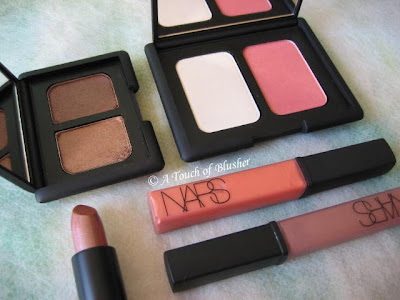
NARS always has a chic and fashion-forward image and a wide range of shades to go with it. Today, the review focuses on how well some of the brand’s warmer shades perform.

– Lip Glosses in Supervixen & Sunset Strip

Supervixen (bottom right) is a cool medium brown. It appears to have a very subtle mauve undertone, but it doesn’t show on the lips. Sunset Strip is peachy tangerine that is slightly more pigmented than Supervixen and has a frostier finish. Both have very subtle multi-colored shimmer.

Their texture is on the dense side and they don’t glide as easily as many other glosses. Also, if you like a very glossy finish, it will take a bit of layering. One layer gives a subtle sheen, two layers create a mild shine, and it takes three layers to achieve a full and glossy look. But, once applied, the staying powder is fairly good.

– Lipstick in Viva Las Vegas

Viva Las Vagas is a moderately pigmented warm brown with a bronze undertone. It has a very frosty finish that I rarely like, as I find that it often makes the lips look dry and can accentuate lip lines. (I tend to go for lipsticks with a soft satiny finish or a slightly wet/moist look, and I prefer minimal shimmer to intense metallic/frosty shimmer.)

I once tried laying the brown-toned Supervixen Lip Gloss on it (to take away the frosty finish), and I find that they actually work very well together. Shade-wise, they complement each other. Also, one layer of the gloss over the lipstick instantly creates a glossy finish. Even though the finish is very rich and luxurious, I would often prefer to have one product that does the job instead of two as I tend not to layer too many products on my lips.

– Duo Eyeshadow in Kalahari

Kalahari creates quite a sultry neutral look. Before I used the duo for the first time, I thought the shade on the left might be a little too dark for the lids. But I was surprised that, even though it is indeed darker than the neutrals I would go for, it is still natural and not overly heavy. The neutral brown (neither too cool or too warm) has a very subtle rose-gold iridescence and the overall finish is softly shimmery and flattering.

The slightly darker shade on the right is much warmer and has a more metallic finish. I wear it close to the lash line as a very subtle liner. Both shades have a very soft texture, while the darker shade seems particularly silky and has an effortless glide.

– Highlighting/Blush Duo in Albatross/Torrid

Albatross, the highlighter shade, has a metallic sheen, and I find that it is too metallic as a highlighter for the face. Even when it is very lightly dusted onto the skin with a fluffy brush, it can still make pores (and possibly fine lines) appear more obvious. However, with a soft gold undertone, it can work as a base for warm-toned eyeshadows.

Torrid is a warm-red blusher. In the container, it looks quite shimmery, but the gold-toned shimmer doesn’t look apparent when worn and the satiny finish looks natural on the skin. For me, it is a fairly wearable summer blusher and I think it will suit people with a warm complexion very well. (I tend to wear neutral-to-cool pinks, and this warm-red is probably as warm (and red) as I would go.)

Overall, I think the powder-based products here perform better. They have a very good texture and stay on well. The various finishes of the products reviewed above might not suit everyone, particularly the very metallic lipstick and highlighter. If you are planning to try out items from NARS, I would suggest looking especially into the finishes to make sure that they are flattering for you.

(
All the products reviewed above are fragrance-free.)

Related Posts:

Coffret D’Or 3D Lighting Eyes in Gold Variation

Dior Golden Dior Makeup Jewel


Lavshuca Summer Gradually Compact

{ 0 comments }

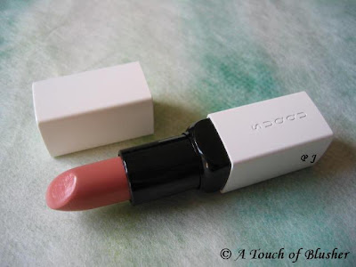
(SUQQU Creamy Lipstick in 22 Benikoji)

Ever since I visited the SUQQU counter (English site here) in London’s Selfridges for the first time, the brand has a special place in my makeup-loving heart.

The quality of some of their makeup items is sublime. Apart from their base makeup products, which SUQQU is renowned for, the texture of their eyeshadows and blushers (and the way the powder melts into the skin) is unparalleled. (I am just waiting for a lilac palette to be released…)

(However, some SUQQU’s skincare products feature excessive alcohol. I personally don’t recommend them.)

Today I am focusing on the SUQQU Creamy Lipstick I have. I very briefly mentioned it earlier, but I think this item more than deserves its own post.

The defining characteristic of SUQQU’s Creamy Lipsticks is the wonderfully rich emolliency. It feels very creamy (but not heavy) on the lips and the color glides on with tremendous ease. Out of all my lipsticks, this one is the most moisturizing. (But I do still always apply a lip balm underneath all lipsticks and lip glosses. It has been a habit of mine for years.) Even when my lips are sometimes not as conditioned as they normally are, especially in winter, the color still goes on quite evenly.

#22 Benikoji is a soft beige pink. I don’t really like nude lipsticks, and this shade is probably as nude as I would ever go. It is moderately pigmented but can be layered for more intensity, and it has no multi-colored micro shimmer that a lot of lipsticks from Japanese brands have. It goes on slightly lighter and imparts a beautiful sheen that does not look greasy. The soft sheen looks classy and understated.

The moisture, finish and color are all long-lasting. Also, for me, apart from the lovely color, this lipstick makes the lips both look and feel ultimately conditioned.

The Creamy Lipstick costs 5250 yen in Japan (about 50 USD) and 24 pounds in the UK. It is expensive, but, for the outstanding quality, I think it is worth it. I have not been planning on getting another color (since I would love to have a SUQQU eye palette first), but I would still be interested in getting a slightly darker and cooler lipstick color.

If you are going to Japan, Thailand, or the UK this summer (SUQQU is currently only available in these three countries), do have a look at SUQQU’s items. You can find all the current SUQQU retail points in the three countries here.

– Please head over to Autumn Masquerade for a brief review of Blend Eyeshadow palette in #06 Touryoku from SUQQU’s spring 2008 collection.

– If you are interested (and read Chinese), please check out this great post on various SUQQU makeup products, including the Creamy Lipstick. I fully agree with the writer that, again, even though this lipstick is expensive, it is absolutely worth it.

Related Posts:

SUQQU Breaks Records
(a brand profile with my personal take)

SUQQU Makeup Base Creamy & Brightup

SUQQU Spring 2008 Collection

{ 0 comments }