makeup – eyeshadow

(Calvin Klein Eye Shadow in 06 Ivory)

Back in May, I wrote about Calvin Klein Cosmetics to mark the start of my Bring It Back! series. I mentioned I was aware that some on-line shops still carried the line and that I was concerned about the quality (since the line has been discontinued for quite a while).

But, during my trip to Nottingham in June, I was roaming around in a shopping mall and I came across some Calvin Klein makeup products in a cosmetics store! The store had a slightly similar feel to The Company Store in London, which is the Estée Lauder Group outlet store.

I checked the quality of some of the stock, and I was relatively happy. As most of the colors were too dark for my liking, I picked up this matte ivory shade, which is good as a base for other eyeshadows. It can also work as a subtle brow-bone or face highlighter.

This is the only Calvin Klein Cosmetics item I have, and it is a very welcome addition to my white eyeshadow collection!

Related post:

Fashion City: Nottingham, UK
(Read about a fabulous fashion show I attended there.)

{ 28 comments }

(Dior Diorissime Palette for fall 2007)


(with Dior Detective Chic palette from fall 2006)

In recent years, Dior has successfully merged fashion and cosmetics by bringing fashion elements into the design of seasonal limited-edition items. The Diorissime palette for fall 2007 is yet another example.

The design of the beautiful case is based on both the classic and the current Dior designs:

(Dior Pink Leather Lady Dior Bag)
(photo from fashion.dior.com)


(Dior Pink Leather Cannage Bag)
(photo from fashion.dior.com)


The one I got is 002 Seduction Drama:

(after some testing…)

From left:

Eyeshadows
deep copper, medium grey, medium brown, sheer light beige
(All have metallic shine.)
Lip Colors
sheer frosty pink with subtle green shimmer
pale blue-tinted gloss with minimal shimmer

I went for 002 (Seduction Drama) instead of 001 (Daylight Madonna) because I wanted to have a couple of darker neutrals to play with and because I am a fan of blue-tinted lip glosses. (But 001 Daylight Madonna does feature some cute pink shades as well as soft neutrals.)

As with all the Dior eyeshadows, the texture is so smooth and blending is a dream.

I was worried that the deep copper shade (on the very left) would be too warm for me as an eyeliner shade. But, blended with the grey, it becomes a very natural brown.

The grey shade is a great addition to my eyeshadow colors. It goes well with my very dark eyes and lashes, not to mention it is a trendy color for fall 2007. (Replace this with the medium brown next to it for the classic neutral look.)

The frosty pink lip color has a texture between a very creamy lipstick and a syrupy lip gloss. Very glossy and shimmery. The blue-tinted gloss goes on completely sheer. It feels like a very moisturizing lip balm which happens to have a lot of shine.

While 001 Daylight Madonna is more for daytime, 002 Seduction Drama is definitely for evening glamor.

I have been loving most of Dior’s seasonal limited-edition items. This one will also be joyfully displayed on my dresser top!

More on fall 2007 makeup:

Fall 2007 Makeup Trend Report
(Have you noticed the same trends?)

Lavshuca Eye Color Select PU-2
(I am loving this!)

Read more about the fall 2007 collections from Anna Sui, Guerlain, Lunasol, Jill Stuart, and Esprique Precious.

{ 14 comments }

(clockwise from top:
El
égance Purity Eyes 11
Dior 5-Color Eyeshadow 250 Seascape
Lavshuca Eye Color BG-1
Lavshuca Eye Color Select BU-1)


Blue eyeshasows divide views. People either embrace them or stay away from them…

The shades of human complexion, from pale beige to dark brown, are all warm tones. Blue is perhaps the furtherest away from human skin-tones. So what can blue eyeshadows do for us?

By definition, they create contrast. They add depth, create dimension, and enhance definition. Blue eyeshadows make eyes pop.

A dust of light blue eyeshadow wakes up the eyes and makes them look brighter and more energetic. It seems to me that there are many more beautiful choices of easily wearable light-blue eyeshadows in Japanese cosmetics. Could it be that consumers in Japan understand the essence of blue more than the rest of the world?

Play It Safe
If you haven’t tried blue, want to give it a go (please do!), but don’t really know which “safe” shade to go for, I think a good starting point is to look at your own skin-tone. The darker your skin-tone is, the darker shade of blue for you. (When in doubt between two shades, try the lighter one.)

Make It Work
To make the best of blue, layer different shades of blue to maximize blue’s potential to create dimension for your eyes. For a glamorous or edgy look, try teaming blue with neighboring shades like green and lilac (as in Dior’s 5-Color Eyeshadow palette in 250 Seascape, seen above).


Take It Forward
The trendy way to wear blue for fall 2007 is to wear it with a coordinating grey, which is the color of the season and acts as a great accent color. Pair pastel blue with silvery grey and dark blue with charcoal grey. Below, we see a subtle, modern and almost effortless way to wear blue, which really brightens the eyes:

(cover, Biteki August 2007)

On the whole, blue is a great friend for our faces. A blue-tinted primer cancels out sallowness, a blue-tinted lip gloss creates depth and makes lips appear more plumped, and a sheer pastel-blue loose powder (which you can find in Shu Uemura) can give a luminous transparency to your face.

Some people think blue is back because the 80’s is back (and some people stay away from it exactly because of this). But I think blue is ever so wearable today because there is a great variety of textures (powder, cream, mousse,…), finishes (from velvety matte to ultra-shimmery), and shades.

This is what I think about blue, one of my favorite colors. What’s your view and observation?

(A big thank-you goes to Tammy, who started a mini discussion on blue eyeshadows under my post on Kanebo’s Kate and inspired me to write a post about them.)

More for the fans of blue:

Lavshuca Eye Color Select in BU-1
(a closer look at the Lavshuca palette seen in the photo above)

Blue-Tinted Lip Gloss?
(Well, I am not giving up until everyone has tried it…)

Sofina Raycious Foundation
(with fine blue-based particles to liven up your complexion)

{ 12 comments }

(Lavshuca Eye Color Select PU-2)

Part of the Lavshuca Fall 2007 collection, this is the only new Eye Color Select palette for this season. In a way, it replaces the discontinued PU-1. (Also, a new line of eyeshadow palettes, Grade Color Select, has been released this fall.)


(top-left: pale lilac, with shimmer
top-right: lilac taupe, with shimmer and fine glitters
bottom-left: warm lilac, with shimmer
bottom-right: dark plum purple, with minimal shimmer)

This palette creates a sensually elegant look. For me, the bottom-left warm lilac shade is the star of this palette and the key to its elegance. A medium plum lilac, it has a warm neutral edge and is particularly wearable for me, as warmer purples suit me slightly better than cold blue-ish ones. It is a very beautiful soft and natural color.

All the shades are a great match and blend seamlessly together. Overall, I love this palette!

The instruction for all the Eye Color Select palettes indicates that the top-right shade, the one with fine glitters, can be worn as a base or on top of the finished look to add sparkles. But for this palette, I find that the top-right lilac taupe is slightly too dark to be used as a base shade. It goes on much darker than it looks in the palette and is almost darker than the bottom-left shade.

I actually think it works very well as a replacement of the bottom-left shade for a very sophisticated look. The fine glitters are not really a problem here. They bring a touch of vibrancy to this neutral color and don’t look over-powering.

In comparison, another purple palette, T’Estimo Frame Impact Eyes 03 (read my earlier post for a full review) is able to create a slightly edgier look. It has a wider range of purples and includes a dark purple cream eyeliner.

(Kanebo T’Estimo Frame Impact Eyes 03)


Released this spring with relatively colder lilac shades, this T’Estimo one is fresh and upbeat, while the Lavshuca one is soft and sensual. I do love both!

Next week, I will review another item of the Lavshuca Fall 2007 collection, Color Conc Rouge.

{ 8 comments }

(Clockwise from upper left:
Erth Minerals Foundation in 2.3

Eyeshadows in Fern, Night, and Snow

Bronzer in Glow,

Eyeshadows in Rose and Carbon )

More and more mineral makeup lines have been trying to grab a share of the market, apart from major players like Bare Escentuals. Erth Minerals (not “Earth”, to be clear…) is one of them.

Their website describes their foundations as matte and offering excellent coverage, which attracted my attention. After trying them out, I actually wouldn’t describe them as either. They are semi-matte and provide medium (on the sheer side) coverage. There is no obvious shimmer and the finish is all very natural.

For me personally, one drawback is the staying powder. On my oily skin, the foundation started to melt in about two hours (in the less-than-warm British summer). I would not recommend this for people with oily skin or with oily T-zone.

On the other hand, Moth Veil is a good finishing powder for me. Soft and silky, it mattifies my skin and conceals pores nicely (after my usual foundation). Only one shade is available, but I think it is translucent enough to suit most skin-tones.

Their eyeshadows work nicely on me too (I don’t have particularly oily eyelids). All the shades I’ve got are sheer and with multi-color sparkles. My favorites are Snow (pearly white), Rose (very pale pink), and Carbon (dark charcoal, can be doubled as an eyeliner). The sparkles make Snow and Carbon particularly beautiful, while Carbon is great for the smoky-eye look.

I need to point out that the eyeshadow in Night, which appears to be a pastel blue in the container (seen in the photo), looks almost completely grey when applied. Even though the website describes the shade as “deep blue”, it is just too much of an ashy grey to be called blue. This can make on-line ordering confusing.

Since it is also the case with von Natur Lip Shimmer in Sweet Violet (a rosy purple in the container, a brownish brick-red when applied), I wonder whether the blue pigment used in mineral makeup in general is simply not delivering. (I have never experienced this kind of color inconsistency with brands not marketed as mineral makeup.) If you have any similar experience, I would very much like to know about it.

On the whole, mineral makeup, with its simple composition, does not irritate my sensitive skin, but it takes much longer to apply. No surprise, it is the case with Erth Minerals. If you want your foundation to give you a good coverage and your colors to be vibrant, you might need to look elsewhere. But if you prefer your makeup to be sheer and natural (and with shimmer for the eyes), then Erth Minerals will be worth considering.

Related posts:
Von Natur Mineral Powder Foundation
Von Natur Mineral Color Makeup

{ 9 comments }

(pictured: my Dior items,
including the Dior Detective Chic palette from fall 2006)

There is no way that I am NOT going to get this palette!

This is the new limited-edition Diorissime Palette from the Dior Fall 2007 makeup collection, and I love it. I have my own reasons:

1. It has some lovely neutral shades that I have recently been very interested in.

2. It has a blue-tinted lip gloss.

3. It is even prettier than the Dior Detective Chic palette (or see photo above) from fall 2006.

4. It is pink! (Well, I don’t have a link to pink, but I do love pink. I’ll do a post on pink in my “I Love Color” series later on.)

It is as if the palette were made for me……

In the UK, the Dior fall 2007 collection will be out in early August.

{ 0 comments }

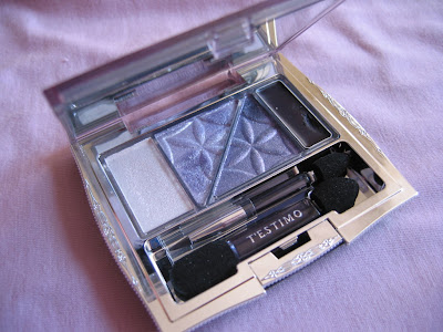
(pictured: my Kanebo T’Estimo Frame Impact Eyes in 03)
.

I have mentioned a couple of times that I am loving lilac/mauve/lavender eyeshadows. After I have tried Jill Stuart’s Brilliance Eyes palette (04 Gem Amethyst), I went for this Kanebo T’Estimo palette (part of the T’Estimo spring 2007 collection). This is actually the first T’Estimo item I bought, and I love it!

Mono-color gradation eye palettes have been very popular in Japan in 2007. Apart from Kanebo T’Estimo, Jill Stuart, and Lavshuca (Eye Color Select), there are also similar creations from Shiseido Maquillage (Clean Contrast Eyes) and Sofina Aube (Jewelry Shower Eyes).

This one by T’Estimo is gorgeous. (The range includes 4 palettes.) The far right slot is a cream eyeliner. This is the only cream eyeliner that I have at the moment, so I don’t know how it compares with popular ones by Stila, MAC, and Bobbi Brown. But I have no problem with it myself. It goes on smoothly and doesn’t smudge. (I am also okay with the little applicator for the liner. Though fiddly at times, it allows me to get very close to the mirror.)

The middle two shades are actually very different from each other. (From almost all the photos I have seen, they appear to be quite similar.) The right one of the two is much darker, as you can probably see from one of the corners near the eyeliner (the part my brush has been dipping into).

So, from the highlighter (with a touch of lilac sparkles) to the deep purple eyeliner and with the two perfect shades in between, this palette is great for creating both a fresh daytime look and a smoky evening look.

I’ll compare it with Jill Stuart’s Brilliance Eyes (in 04 Gem Amethyst), as both are purple-based palettes:

Pigmentation:
The T’Estimo one is certainly more pigmented, especially the shade next to the eyeliner. The Jill Stuart one is noticeably sheerer.

Shimmer:
Both are full of it, but the Jill Stuart one is more glittery than just shimmery (with larger multi-color sparkles). I think for big glitters, people either love it or hate it. But, used effectively, the Jill Stuart one can really make the eyes pop and give your eyes a floaty and airy ambiance.

Shade:
The T’Estimo palette has a wider range of shades (from the lightest to the darkest). It is much easier to achieve a smoky-eye look with it.

Versatility:
Even though the colors in the Jill Stuart palette are sheerer, it might be more suitable for evening makeup (unless you don’t mind big glitters in daytime). The Kanebo one is perhaps more versatile in this respect.

So, there you go. I love both and I have tried mixing colors from the two. They complement each other well and I can create even more looks and more sophisticated finishes. Fantastic!

{ 2 comments }

Today I came across a photo of NARS fall 2007 collection.

Named “Modern Odyssey”, NARS’ latest collection features muted and sophisticated shades, including a duo with lovely neutral tones.

To be honest, if I’d seen this photo this time last year, I wouldn’t have been interested at all….

Years ago, I started my love for makeup with universally flattering neutral shades. Later on, I developed a taste for soft and shimmery pastel shades and slightly bolder colors. Cool tones like aquamarine, turquoise, lilac, and cool-pink are my favorites.

But it seems that now I am consciously re-embracing neutral tones. Recently I have been experimenting with neutral eye makeup with shades from different brands. Mixing and matching is great fun (and it makes me look at my past purchases in a new light), but I would very much like to get a couple of nice neutral-tone eyeshadow palettes, possibly from all the new fall 2007 releases. (Guerlain and Lavshuca are on my list at the moment.)

I will never desert my lovely pastel eyeshadow palettes (I love my Lavshuca and Jill Stuart), but do look out for some fresh development on my new-found fondness for neutrals!

{ 0 comments }

(Pictured: my Chanel Contraste Lumiere in Aquarelles)

I always like a nice palette. I like the weight, the size, and the sleekness of it. I am always looking for palettes with great colors inside and a look to match.

I have always loved Chanel, but, apart from one Les 4 Ombres eyeshadow palette, this is the first one I bought. I am glad that I have waited for something virtually perfect for me. I have been enjoying experimenting with pink and lilac eyeshadows for a few months now, so it is exciting to see both colors in the palette. Also, the lip glosses have various cool-pink tones that really suit me. Out of almost all the seasonal palettes from Chanel in the past couple of years, this is definitely my favorite.

(four lip glosses and two eyeshadows)

The colors of the two eyeshadows really compliment each other and they can be worn in many different ways. The finish is sheer and semi-matte with some very subtle shimmer. The lip glosses give a wonderfully natural sheen to the lips. All these sheer hues are great for a touch of color in the hot summer.

I think summer is actually a great time to wear cool tones. So give them a go!

(There is another version of the palette (in Mordorees), which features various warm tones for a sun-kissed complexion.)

Related posts (palette galore!):

YSL: Gold Celebration Palette “Star Glow” (Scroll down to see the photo.)
Clarins: Palette Impression
Jill Stuart: Brilliance Eyes Palette
Lavshuca: Eye Color Select Palettes

{ 0 comments }


White eyeshadows are some of the key items this season. In Shu Uemura’s Spring 2007 makeup look, white is the only color around the eyes. This season, a white eyeshadow is not only used as a browbone highlighter but also all round the eyes to create a clean, sophisticated and edgy look.

I have some eyeshadow palettes that feature a white eyeshadow but I decided to experiment different finishes, so over the last couple of weeks, I have bought some more:

1 Rimmel Color Rush Mono Eye Shadow (241 Matte White)
2 Rimmel Color Rush Mono Eye Shadow (244 Moonstone)
3 Boots Natural Collection Eyeshadow (Sea Shell)
4 Boots No. 7 Stay Perfect Eyeshadow (25 Opal)
5 Lancome Color Design (904 Pearly Angel)

(I was tempted to buy Maybelline Dream Mousse Shadow (in 00 Vanilla Veil) just to try a different texture, but the finish was a bit too glittery for my liking.)

Finish-wise, 1 & 3 are completely matte, and 2 & 4 have a pearly finish. 5 also has a pearly finish but with minimal glitter.

Between 1 & 3, 1 is completely white, while 3 is a very pale beige, which doesn’t show very much on my skin.

Out of these five, I am particularly impressed with the texture of the two Rimmel ones. Very smooth and velvety.

So far, I like 1 the most. The matte white looks very good on me and I think the matte finish is the concept in Shu Uemura’s seasonal look as well.

Don’t go overboard with white eyeshadows, though. It should look like there is a soft and flattering spotlight around your eyes, which makes your eyes pop.

Also, sporting too much of a glittery white eyeshadow all around the eyes can backfire spectacularly under heavy pale florescent lighting…You don’t want the reverse-panda look!

I think it is best to use a matte white eyeshadow as an overall base and to use any pearly or glittery white eyeshadow sparingly and strategically (on the browbones or in the inner corners of the eyes), especially when you have to switch between daytime and nighttime looks.

White eyeshadows have always been very basic items, but now you can use them to create a whole new (and flattering) look!

{ 5 comments }