makeup – eyeshadow

(Dior 5-Color Eyeshadow Palette in #250 Seascape)

.

Dior’s 5-Color Eyeshadow Palettes, along with the rest of Dior’s makeup line, have been through numerous packaging changes. But I have noticed that this particular color combination has been existing for at least 5 or 6 years.

I got #250 Seascape in 2006 with my Boots points, and I think this is a really beautiful and colorful eyeshadow palette. With blue and purple being on-trend this season (have a look at my spring 2008 makeup trend report), I thought I’d give this palette a mention.

The palette features:

Top left: a soft grey with a very slight ashy-blue undertone and soft purple iridescence
Top right: medium aqua blue
Bottom left: warm medium purple
Bottom right: pale mint green
Center: white with silvery sparkles

The shades are well pigmented and very smooth to apply and blend. They go on quite matte but have a satiny and luminous finish. The central white shade, though, feels a little gritty, probably because of the sparkles. On the other hand, the blue is one of my favorite blue eyeshadow shades.

With both the blue and the purple being quite vibrant, the palette can create a variety of looks, depending on where to place these two colors on the eyes. When I simply want a simple and fresh look, a wash of the mint shade can really brighten my eyes. It can also be used as a base to bring out the lively blue and purple.

Dior’s eyeshadows are known for the great texture and many palettes feature wearable but unique color combinations. Also, their seasonal releases are often good indications of what colors are currently trendy. But I have noticed that the finish of some of the latest palettes (with the powder in quilted patterns) is getting more and more shimmery. While the shimmery finish still looks smooth and flattering, I do hope their future releases will maintain a balance between satiny matte and shimmery finishes.

.

Related posts:

Dior’s Spring 2008 Makeup Collection
(Anything catching your eye?)

The Allure of Blue Eyeshadows
(See my other blue eyeshadows)

A Splash of Colors – Lilting Lilac
(soft, feminine, and wearable)

{ 8 comments }
(my Miss Elégance item and catalog)


Owned by Albion, one of Japan’s largest cosmetics companies, Miss Elégance is the little sister of and a more girlie alternative to Elégance, which is gloriously glamorous in a slightly old-school kind of way. On the other hand, Miss Elégance, a bit like Cynthia Rowley, is soft, fresh, and cute. I love the delicate floral theme on the packaging and as part of the brand image.

Price-wise, Miss Elégance was in the medium-low range in Japanese cosmetics, as the price-point was between brands like T’Estimo and budget lines like Majolica Majorca. It was generally an affordable line of makeup items.

I found out that it had been discontinued in Japan earlier this year (on May 31, 2007) as I was planning my shopping list for Japan. I was quite disappointed. Miss Elégance didn’t have the same cache as Dick Page’s Inoui ID (discontinued earlier this year as well, which stunned many of its fans.) But I really like the fact that the brand was always very low-key and unassuming, as I don’t think it was that widely available and was advertised that much.

The Miss Elégance item I have is Powder Color in 16, which I bought in Tokyo years ago. It is a nice medium brown which I bought during my neutral-tone phase. It is smooth and nicely pigmented, but, as you can see, I have been very precious about it and haven’t used it very much. (I love the two flowers on the eyeshadow. So pretty.)

(Miss Elégance Powder Color in 16)

The case looks equally lovely, to say the least:

(the Powder Color case,
with floral and jewel detail)

The Powder Color was available in 35 shades, which offered a wide range of neutral and vibrant hues:

(Miss Elegance Powder Color –
for eyes and cheeks)

The floral motif continues to grace the packaging, as seen here with Liquid Rouge (love that lavender shade):

(Miss Elegance Liquid Rouge)

Elégance has been doing relatively well over the years against all the new competitors. On the other hand, it was a pity that Miss Elégance was discontinued. Maybe, Albion will bring out something new in the next few years. Who knows, but I’d certainly hope so!

Related posts:

All About Japanese Cosmetics
(Do you like Japanese cosmetics as well?)

Other Bring It Back posts:

Nina Ricci

Helena Rubinstein

{ 6 comments }

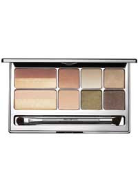
(Prescriptives Colorscope Refillable Palette
for Eyes and Cheeks in Cool)
(image from www.prescriptives.com)


Prescriptives has come up with two wearable and good-value makeup palettes for holiday 2007. The palette in Cool I am reviewing here includes six pink and plum-based shades for eyes and two shades for cheeks.

For the eyeshadows, I have categorized them into highlighting, main, and eye-lining shades:

Highlighting
Chiffon: cream white with pearlescent shimmer, suitable as a base or a highlighter

(Chiffon)


Main (from left to right/ light to dark) –
Shell: pale dusty pink with pearlescent shimmer
Hocus: light taupe with pearlescent shimmer
Aubergine: brownish plum with metallic shimmer

(Shell, Hocus, and Aubergine)


Eye-lining
Indigo: dark charcoal grey with minimal shimmer
Plum: brownish plum with minimal shimmer

(Indigo and Plum)


(Color-wise, Aubergine is almost as dark as Plum, but it has a lot more shimmer and, for me, it doesn’t bring much depth to my eyes as an eye-lining shade.)

The six shades blend well and can be easily coordinated to create simple and sophisticated daytime looks and intense evening looks.

Cheek Colors:
Petal: a matte warm pink
Highlighter Cool Light: a very pale pink with frosty shimmer

(Petal and Highlighter Cool Light)

Petal is a very wearable blusher shade. Highlighter Cool Light can be worn with Petal to bring a veil of shimmer to the matte finish of Patel. Another great way to wear this cheek highlighter is to layer it right on the center of cheeks to make the cheeks pop and to bring out the dimension of the face.

All the shades are quite well pigmented, with Highlighter Cool Light being sheer and shimmery. (These are all regular shades and not limited-edition ones. The silver stripes on the cheek colors featured in the palette in the top photo are spray-ons.)

The palette comes with a nicely big mirror. The limited-edition double-ended eyeshadow brush features a soft medium brush for eyeshadow application and a slightly slanted flat-tip brush, which is good for blending. You will need another brush to line your eyes with the darker shades.

The sizes of the eyeshadows and blushers are the same as the usual sizes they come in. The palette itself is refillable, so you can also add in your favorite shades to customize your own palette. (The slots for blushers will hold two eyeshadows each.)

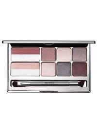
The palette also comes in Warm:

(Prescriptives Colorscope Refillable Palatte
for Eyes and Cheeks in Warm)
(image from www.prescriptives.com)


Overall, the palettes offer good ranges of shades and further flexibility of customization. Retailed at 38 pounds in the UK, it is relatively good value considering all the shades are worth around 100 pounds when bought separately. This is also a good starter palette to consider if you are interested in trying wearable shades by Prescriptives.

Related Posts for Holiday 2007:

Lavshuca Christmas 2007 Makeup Palette

(cute and affordable)

DiorLight Jewelled Necklace
(sparkling with Swarovski crystals)

Paul & Joe Lip Gloss N
(perfect berry-red lip gloss)

{ 8 comments }

(Lavshuca Christmas 2007 Makeup Palette)

I have written about my first impression of this palette when I heard about it and upon receiving it. Now that I have tested the colors, I can share with you more of my thoughts. (But I haven’t tried the lip color yet because I don’t want to mess up the heart shape…)

(No, I still haven’t put them in the case…)

The palette includes three eyeshadows, a lip color, and a lip gloss. The eyeshadow shade I like the best is the shimmery white one on the left. It is fairly well-pigmented with nice multi-color shimmer and it joins my white-eyeshadow lineup as a major member.

The pink in the middle appears to be very pale when it goes on and it doesn’t look very different from the white shade. The only two differences between the two are that the texture of the pink one seems chalkier and that it has less shimmer.

The dark shade at the right is a dark charcoal grey that works well as an eyeliner and for a smoky-eye effect. It has some sparkles but they don’t look obvious when it goes on.

The lip gloss looks very pretty in the container, again with multi-color shimmer. But the shimmer looks much more subtle when applied. I was trying to layer it to see if I could create a glossy finish, but it doesn’t seem possible. The finish is similar to that of a shiny lip balm, as it imparts a very natural sheen, which looks more balmy than watery.

As I mentioned before, holiday palettes (especially those from Japanese brands) are mostly about packaging and wearability. In terms of these two, this palette has done well. (Plus it is relatively affordable.) I am sure there are people who think the shades are not very interesting. But, for me, I will always consider picking up nice wearable shades which are beautifully packaged. Overall this is a nice little gem to have.

Related Posts:

Chanel Contraste Lumière Palette
(great palette for eyes and lips)

Loving Japanese Brands: Lavshuca
(my personal take on the successful Kanebo line)

Lavshuca Cheek Color
(Need a blusher to go with the palette?)

{ 2 comments }

(Lavshuca Holiday 2007 Palette)

I just got my Lavshuca holiday 2007 palette a couple of days ago. The first thing I did was to take some photos so I could show you this cute palette.

I have not actually used it yet. (Unlike the DiorLight necklace that I also just got, I WILL be using this.) I will post a review after I have used the eyeshadows and the lip colors.

I was surprised to find that all the bits were outside the case when I received this. This is Lavshuca’s first eye-and-lip palette so they seem to be having a bit of fun with it. Also, since the case is not transparent, it makes sense to present everything like this so the customers in the drugstores can instantly see all the colors and the front of the case. Overall I like the whole presentation.

The case is made of cardboard but it is relatively sturdy.

(the case and the colors presented separately)

(Complete the puzzle!)


Obviously all the bits go into the case. But, I think perhaps some people will be quite happy just to leave them where they are so everything can be displayed as it is in the cute box. Umm…it is not a bad idea actually……


Related posts:

Straight onto my Shopping List: Lavshuca Holiday 2007 Palette
(my first impression of the palettes along with the new lip glosses)

Chanel Contraste Lumière Palette
(another great eye-and-lip palette)

{ 8 comments }

(Chanel Ombre d’Eau in #50 Bay)

.

Today, Beauty Anonymous and I are joining together to bring you our thoughts on Chanel’s Ombre d’Eau Eyeshadows. I will focus on #50 Bay and there is a review of #10 Glacier and #20 Fountain over on Beauty Anonymous.

A couple of years ago, I was in a phase of neutral shades for eyes. Chanel’s Ombre d’Eau Bi-Phase Eyeshadow grabbed my attention, with many wearable shades. (They are called Ombre d’Eau Fluid Iridescent Eyeshadow in the US.)

I bought (or, to be more precise, used my Boots advantage points on) #50 Bay, which is a warm bronze with quite a lot of fine iridescent shimmer to create an almost soft metallic finish.

Before taking out the sponge applicator, I shake the container vigorously to mix the pigment and the liquid. (There is a small stainless steel ball inside to help the mixing. It reminds me of using a Liquid Paper correction pen.)

The sponge applicator makes the application easy and fuss-free. The slanted facet of the sponge helps sweep the color onto the eyelids, and I can also line the eyes with the tip of the angled sponge (without blending afterwards). (It won’t be a very thin line. The thinnest line you can create is around 2-3mm.)

Once the color is applied on the eyelids, speedy blending is vital as the liquid does dry up rather quickly. If you leave it to dry, the slip disappears. When the color is in place, it is quite long-wearing.

One thing I have recently observed is that the pigment is not water-resistant at all. I was surprised to find that, when I applied the color on the back of my hand and place my hand under running water, the color was completely gone, with no rubbing, within seconds. (On the other hand, it is usually hard to rub off a powder eyeshadow just with water alone.)

But on my eyelids, under usual circumstances, I have never noticed fading, creasing, or transferring.

Overall, I enjoy using it. Even though the shimmer can be slightly too much for daytime, the fact that most of the shades are very low-key still makes them wearable in any time of the day.

Do head over to Beauty Anonymous, where you can read about two other lovely shades: #10 Glacier and #20 Fountain.

.

Related posts:

– Read about my personal take on Chanel.

– I compare Chanel Mat Lumière & SUQQU Powder Foundation Glow. See who wins!

– Find out why I won’t buy Les 4 Camélias de Chanel.

{ 4 comments }

(Maybelline Dream Mousse Eyecolors)


On the whole, I tend to save money for slightly pricier products with both wonderful quality and exquisite packaging. But, every now and then, I come across little gems like Maybelline’s Dream Mousse Eyecolors and I feel glad that they are very affordable. (I do like these chunky glass pots as well.)

What I like about Dream Mousse Eyecolors is that the finish is very flattering and the subtle shimmer effectively adds a little bit of dimension to the eyes.

If you want an intensely pigmented and shimmery finish from this collection of eyeshadows, then you will probably be disappointed. But if you want something natural and effortlessly pretty, then do give them a try.

(Divine Lilac & Fabulous Turquoise)


I have two shades, Divine Lilac and Fabulous Turquoise. (Divine Lilac is called Lilac Cloud in the US.) I have reviewed several lilac-based eyeshadow palettes, but Divine Lilac is actually the first lilac eyeshadow I purchased and it kick-started my collection of lilac eyeshadows. The shade is on the warm side, which, for me, is very wearable and flattering.

Fabulous Turquoise is a new shade that I just bought a few weeks ago (before I bought MAC’s Haunting). When I saw this in the shop, I was reminded of so many turquoise eyeshadows that I had tested before that had disappointing green and yellow shimmers. (Rimmel‘s Colour Mousse Eye Shadow in Splash and Bourjois‘ Mono Eyeshadow in Turquoise Ensoleillée…I am mainly talking about you two…) So I was ready for another turquoise disappointment. But I was delightfully surprised, as this is a nice real turquoise. The delicate finish and flattering shimmer are both present, and I immediately decided to bring it home.

For me, Divine Lilac is a wonderful everyday shade, while anything turquoise is always a bolder color and I wear Fabulous Turquoise sparingly.

It seems that a couple of new shades are quietly added to the Mousse Eyecolor lineup each season, so I will always check back to see if there are other mousse treats waiting for me.

Related Posts:

If you love lilac:

Kanebo T’Estimo Frame Impact Eyes in 03

Lavshuca Eye Color Select PU-2

If you love turquoise:

Alexander McQueen for MAC Eyeshadow in Haunting

{ 10 comments }

(Alexander McQueen for MAC
Eye Shadow in Haunting…
Loving the McQueen logo)

I have bought this on Monday and I have tried it on today. I think I am liking it…

As I said on my last post on this eyeshadow, I spent quite some time deciding whether to get this or not. The main reason is that I have a similar shade, the turquoise shade in Dior’s two-color eyeshadow in DiorLagoon. While in the store, I went over to the Dior counter to put the turquoise shade on the back of my hand and then put Haunting next to it. They looked very similar and I decided at the time not to buy it and left the store.

But, under the natural sunlight, I immediately noticed a difference. Haunting is more blue than DiorLagoon and is a tad lighter. As a lover of turquoise shades, I decided that this particular shade was different enough to justify the purchase, so I went back to get it.

(This is actually my first MAC eyeshadow
in several years…)


One of the things I have noticed from comparing the actual item with how it looks on the promotional images is that Haunting is darker when seen in person. I thought it would be a light aqua-ish turquoise but it is basically a proper turquoise with a subtle blue undertone.

I tried it on today and I do like it. I like the very slight blue undertone compared with the usual turquoise shades. I also think MAC’s Satin is a finish I like. It has a smooth and mildly luminous finish, not shimmery or glittery.

So I am glad I got this. Also, I like the Alexander McQueen Fall 07 print on the lid. Very chic!

Update (October 15, 2007)

Beauty Anonymous also picked up Haunting. Do have a look at her review!

Some of my other eyeshadows:

The Allure of Blue Eyeshadows
(Do you think blue is a scary color to wear?)

Calvin Klein Eyeshadow in 06 Ivory
(an unexpected discovery)

Lavshuca Eye Color Select in PU-2
(another of my recent favorites)

{ 2 comments }

(Alexander McQueen for MAC
Eye Shadow in Haunting)

The Alexander McQueen for MAC collection is exclusive to Harrods in the UK and was out on October 3. The eyeshadow in Haunting was the item I looked forward to the most. I stopped by Harrods today and decided to buy it after being so indecisive about whether to get it or not. (I shall explain more later.)


I will post a review of this after I try it on. Do come back!

(See images of the items and the swatches of the collection on Specktra.Net Forum.)

Related Post:

MAC Holiday 2007 – Antiquitease
(already on my shopping list…)

{ 4 comments }

(Bella Il Fiore Powder Room)
(from bellabeauty.net)


Considering the size of
Bella Il Fiore‘s Powder Room (10.5cm x 9.5cm x 6.5cm), the fact that there are 6 lip colors, 4 blushers, and 9 eyeshadows is fairly impressive. Apart from that, all the compartments fit snugly together and never feel fiddly.

It comes in a matching pink/black box (right):

(love the packaging…)

(all out in display)


The 6 lip glosses are my favorites in this set. They have a glassy vinyl finish and last well. All shades have understated shimmer and fair color density (not too sheer). I like the fact that the selection includes both warmer and cooler shades.

(six lip glosses)

The blushers are velvety and well-pigmented. They all have shimmer but it is not too over-powering. Some of these shades are good for bronzing and shading as well.

(the blushers)

The easy-to-wear eyeshadows are also smooth and pretty well-pigmented. The only matte shade is the cream-white toward bottom right. All others have fine shimmer. All the shades go on as they are in the pans, except that the olive (upper right) goes on much greyer.

(the eyeshadows)

Overall, this set should work for people with both warm and cool skin-tones, although the blushers will work much better for warm skin-tones and I would love to see one cool pink blusher among the four. Other than that, this nicely packaged set is versatile and is suitable for both daytime and evening. I have been enjoying playing with all the shades (as well as opening and closing all the drawers)!

Related Posts (some of my favorite palettes):

Dior Diorissime Palette

Lavshuca Eyecolor Select in PU-2

Jill Stuart Brilliance Eyes in 04 Gem Amethyst

{ 4 comments }