makeup – eyeshadow

(French graffiti artist Fafi at Henri Bendel)
(from www.nypost.com)

The Fari for MAC collection might have a bright and funky image with its fair share of vibrant colors. But, there are some very wearable shades and several bright-looking items that are not too difficult to work with. Even though the packaging is obviously targeted at a young audience, I feel that many shades have a more universal appeal.

Here are my favorites from the Fafi for MAC collection:

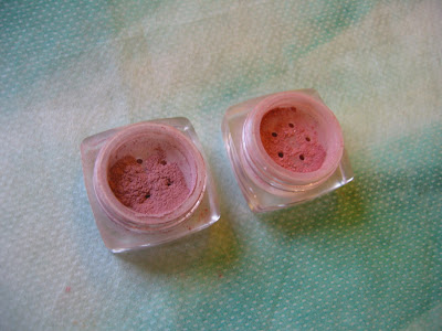
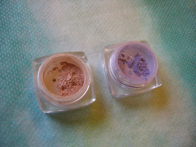
(Clock-wise from upper right:
Powder Blush in Hipness & Fashion Frenzy,
Lipstick in Fun ‘n’ Sexy & Strawbaby,
and Lipglass in Totally It)


My favorite items by far are the two blushers (Powder Blush in Fashion Frenzy & Hipness). Fashion Frenzy, my preferred one out of the two, has the kind of cool pink shade that I know would suit me. But because it is on the vibrant side and the blush is very pigmented, I do have to be very light-handed with it. (I also like the turquoise Fafi logo on the lid against the pink blusher.) Hipness initially appeared to be a peachy shade that might not suit me, but I was pleasantly surprised by its wearability as it turned more pink after a few hours’ wear. Both blushers have a fair lasting power.

Totally It is my favorite Lipglass from this collection. It is a bright pink with cherry pink and purple shimmer. Even though two of the other Lipglasses, Cult Fave and Sugar Trance, have more wearable shades, the shimmer is too frosty for my liking. On my lips, one sheer layer of Totally It actually looks relatively natural and this is how I’d wear it most of the time. With a second layer, the brightness of the pink really intensifies. Apart from the lovely pink and purple shimmer, I also enjoy the lasting shine.

The Lipstick in Strawbaby is a very wearable warm-rose with some delicate blue-green shimmer and should suit most skin-tones. On the other hand, Fun ‘n’ Sexy is a similar bright pink to the Totally It Lipglass with purple and bright pink shimmer.

I think the wearability of many items in the Fafi for MAC collection also appeals to some younger customers that have just started to experiment with makeup and want something easy to use. The Fafi Eyes palette in #1 is a very basic palette that would suit a beginner in makeup, and it actually reminds me of Chanel’s 4-color eyeshadow palette in Influences, which is one of the first eye palettes I bought. (The actual shades and finishes do vary, but the concepts are similar.)

(left: MAC Fafi Eyes #1;
right: Chanel Quadra Eye Shadow in Influences)


Despite MAC Paint Pots‘ rich colors and long-lasting quality, I am not really a fan of them. The colors are difficult to blend and none of the finishes featured in the Fafi for MAC collection (cream, satin, and frost) looks optimally flattering. This is a bit of a shame, because Rollickin’ and Girl Friendly could have potentially been shades I’d constantly reach for. (Rollickin’ is a turquoise with pale gold shimmer, which is better than the distracting yellow and green shimmer commonly seen in turquoise eyeshadows. Girl Friendly is a dusty rose-petal pink that is subtly elegant.)

Overall, the Fafi for MAC collection offers something for most people, from eye-catching lip shades to subdue neutrals for eyes. I still find it hard to like most of the packaging and the Fafinettes, but the two lovely blushers (which, for me personally, pleasantly don’t feature the Fafinettes) will potentially be very active members in my blusher family.

Related Posts:

MAC for A-Mei Collection
(perfectly in tune with her heritage)

Alexander McQueen for MAC Eyeshadow in Haunting
(loving this turquoise)

{ 12 comments }

(Dior Eyeshadow Duo in DiorLagoon)

I started this blog in November 2006. If I had started it several months earlier, many of my initial posts would have probably been about finding the best turquoise eyeshadow for myself.

That was a major quest in the summer of that year. I got Dior’s Seascape a couple of months earlier. While loving the purple and the blue, I decided I wanted a nice turquoise. Not a soft pastel turquoise…a real turquoise. So the search began.

I soon found that many turquoise shades had yellow and/or green shimmer. While I see how it balances the blue undertone of the shade and makes the finish more dynamic, I think it is a little distracting, and I really just wanted a nice straightforward rich turquoise. (Bourjois’ Mono Eyeshadow in Turquoise Ensoleillée is one that has the yellow/green shimmer that doesn’t appeal to me.)

After auditioning many turquoise contenders during that time, I found myself going back to Dior.

Apart from the fact that Dior’s eyeshadows are consistently silky and easy to blend, I like the satiny finish in the eyeshadow duo range. DiorLagoon features a cream white with soft pearlescent sheen and a semi-matte turquoise which is slightly more matte than the cream white. It is a true turquoise with no trace of yellow/green shimmer. Both shades are nicely pigmented and last well.

It has become my gold standard for turquoise shades as it still remains one of the nicest I have ever seen.

Related Posts: (featuring two other lovely turquoise shades)

Maybelline Dream Mousse Eyecolor in Fabulous Turquoise

(my second turquoise eyeshadow)

Alexander McQueen for MAC: Eyeshadow in Haunting

(with a little more blue undertone)

Loving Dior

(my personal take on Dior)

{ 12 comments }

Stila Eyeshadow Mega-Galore

by PJ on Thursday, February 14, 2008

in -Stila, makeup, makeup - eyeshadow

Even though I am not really a Stila fan, I was still drawn into this beautiful collection of Stila eyeshadows. There is a wonderful variety of colors, but almost every shade is nicely wearable.

On the other hand, my lilac love continues and I’ve come across this very pretty and feminine Eyeshadow Quad in Montmartre:

(Stila Eye Shadow Quad in Montmartre)
(image from www.stilacosmetics.com)

I still don’t think I’ll be picking this up, but this is probably the closest I have ever got to purchasing a Stila item in the last couple of years…

Related Posts:

Sofina Raycious Foundation Cases 2000-2007
(tracing the evolution)

My Anna Sui Foundation Case Collection
(Bring back the gold cases!)

{ 2 comments }

(image from www.isetan.co.jp)

Sometimes, western brands release limited-edition items only for the Japanese market. (Have a look at another stunning eye palette released exclusively for Japan.)

I think this Givenchy Prismissime Eyes palette (#56) will probably be released globally, but I have not come cross it elsewhere. (#55 Tempting Chocolate is one of the latest Prismissime Eyes palettes.)

Currently, within Japan, it is available exclusively in Isetan Department Store in Shinjuku in Tokyo. (It has one of the best beauty departments I have ever seen.) It will be available in the rest of Japan later.

The striking combination of lovely pastels and intense dark shades intrigues me. Notice that the very on-trend lilac takes center stage among pastel pink and light aqua blue, and I love how the soft pastels really stand out from the darker shades.

Based on the first impression, I think this palette is seasonal as well as versatile!

Related Posts:

Dior’s Totally Dior Cannage
(another exclusive item for Japan)

Spring 2008 Makeup Trend Report

(featuring Givenchy’s spring 2008 collection)

Kanebo Coffret D’Or 3D Lighting Eyes
(one of my latest eye palette acquisitions)

{ 4 comments }

(Loving the lilacs:
Lunasol Sheer Contrast Eyes in Lavender Coral)
(under sunlight and minimal artificial lighting)

The Sheer Contrast Eyes palettes are part of Lunasol‘s spring 2008 collection. Drawing inspiration from the vibrant colors of the ocean, the collection captures the rich and diverse hues and the rippling glimmer of the world below the sea level.
(image from www.kanebo-cosmetics.jp/lunasol)
The alluring shades are based on those of the coral reefs, and the palettes are aptly named Blue Coral, Green Coral, Lavender Coral, Orange Coral, and Coral Coral.
(Lunasol’s Sheer Contrast Eyes)
(image from www.kanebo-cosmetics.jp/lunasol)

Lunasol’s eye palettes are probably the brand’s most popular items. (Last year’s @Cosme reader survey reflected this, as the top three eye palettes are all from Lunasol.) Even though Lunasol had been one of my favorite brands, I never tried their eyeshadows. With Sheer Contrast Eyes’ eye-catching lineup, I thought it was time for me to dive in.

(under artificial lighting,
where shimmer is a little more visible on camera)
There was very little decision-making involved in which palette I wanted to try, and I am very pleased with what I got. Lavender Coral is a box full of prettiness…

— bottom right: very sheer pale yellow with a subtle gold undertone and plenty of sparkles
— top right: sheer pale pink with intense but fine shimmer
— top left: well-pigmented soft cool lilac with delicate shimmer
— bottom left: semi-matte deep warm violet with sparse shimmer

(All the shimmering particles are multi-colored. The sizes of the particles vary slightly among the four shades.)

The cool lilac is obviously the main shade in this palette. Not only is it one of the most visually beautiful lilac shades I have, it suits me very well. The pale pink is very sheer and mainly goes on as shimmer, but the abundant ultra-fine light-reflective particles and the superbly smooth texture make it both a competent base and a subtle but effective highlighter. (As a highlighter, this shimmery pale pink doesn’t have that harshness that some white or silvery highlighters may have.) The deep warm violet is a good eye-lining shade and isn’t so dark that it can look grey on the skin.

My only very minor issue is with the pale yellow, as the sparkles are a little bit on the big side for my personal liking. But this is not to suggest that it looks glittery or tacky. In fact, if you like high-voltage multi-colored sparkles with a pale-gold base tone, then you might really like this particular shade.

All the shades have a smooth and silky feel and are very easy to apply. They are also satisfactorily long-lasting.

I always tend not to over-layer my eyeshadows and keep the finish relatively sheer. For me, this palette, worn in this way, really stands out, because the subtle shimmer almost creates a unique wet finish. It resembles the surface of the glimmering sea under the sun and echoes so well the ocean theme of this collection.

I also came across a user’s comment on Lunasol’s eye palettes. Obviously from a Lunasol lover, her theory is that the only way to show that we are wearing the stunning Lunasol’s eyeshadows (and not possibly anything else) is to wear them sheer. Only by wearing them sheer can we do justice to the ultimate strength of Lunasol’s eye colors, which is the magical transparency showing through the rich pigments. Wonderfully said!

Even though I have several lilac eye palettes, each one is unique and different and this one is no exception, to say the least. I’ve understood first-hand why Lunasol’s eye palettes are able to draw people into the brand, make the brand more and more coveted, and widen the age range of loyal fans. I will continue to explore the possibilities of this palette and the essence of Lunasol.

Related Posts:

Must-Try Look for Spring 2008
(loving all the variations)

Spring 2008 Makeup Trend Report
(featuring the hot colors of this season)

Loving Japanese Brands: Lunasol
(how things got started…)

Coffret D’Or 3D Lighting Eyes in Purple Variation
(as fantastic as the Lunasol one, but in a very different way)


{ 24 comments }

(item used: Maquillage
Clean Contrast Eyes 2 in SV844)
(image from www.shiseido.co.jp/mq)


In the last couple of years, I have been enjoying wearing eyeshadows of various lilac hues. I find them easy to wear for both daytime and evening, and they look flattering in a natural way.

For spring 2008, I have been excited to see some major cosmetics brands (many of them Japanese) featuring lilac eyeshadows. (You can read more about spring 2008 makeup trend in one earlier post.) I thought I’d share with you some of the looks that I have come across that represent distinct variations of this season’s trendy look.

One of my favorite lilac looks this season is from Shiseido Maquillage (above). Accompanied by a silvery grey to create a soft contrast, the lilac shade in Clean Contrast Eyes 2 palette in SV844 is relatively pale. I think the whole look is clean and very pleasantly fuss-free.

(item used: Coffret D’Or
3D Lighting Eyes in 04)
(image from www.kanebo-cosmetics.jp/coffretdor)

Kanebo’s Coffret D’Or also has a lilac palette in their debut collection for spring 2008 (which I have reviewed earlier). It is also a very subtle look (above), mainly because, apart from the violet for lining the eyes, the other shades are a pale blue and a dusty pink that have a subtle lilac undertone and not true lilac themselves. But all the shades in this palette complement one another so well that this palette is joy to use.

Next we see a more classic lilac look from (Kosé’s) Cosme Decorte AQ‘s latest look:

(item used: Cosme Decorte AQ
Pure Grace Eyeshadow palette in 030)
(image from www.cosmedecorte.com)


This is lilac as an ultra feminine and elegant shade for the eyes. But it is not stealing the show, as it is worn with a beautiful cherry-red lipstick (Pure Grace Lipstick in RO620) to create a superbly exquisite and polished look.

Now, we see a very colorful way to wear lilac.

(cover of Voce’s March 2008 issue)
(image from www.joseishi.net/voce)

(from Biteki’s latest TV commercial)
(image from www.biteki.com)


Biteki’s latest TV commercial
(via Dailymotion)
Coincidentally, both Voce and Biteki, two of the top cosmetics magazines in Japan, are featuring lilac worn with green under the eyes in their March 2008 issues. As you can see, the look can be edgy or feminine. (At the moment, I don’t know what items are used to create these two looks, but I will certainly update this post when I have more information.)

In contrast to the elegant look from Cosme Decorte above, where all the shades are of a cooler tone, RMK incorporates warm shades for lips and cheeks for spring 2008.

(item used: RMK
Shiny Mix Eyes in 03 Silver Purple)
(image from www.rmkrmk.com/global)

I think this is quite a modern way to wear lilac. At first I was not sure if I liked it, but then I realized that another possible way to look at it is to see it as a more intense version of Maquillage’s spring 2008 look.

(images from RMK & Maquillage)

So, of all the looks that we have seen, which one is your favorite?

Related Posts:

A Splash of Color: Lilting Lilac
(from my “I Love Colors” series)

Lavshuca Eye Color Select in PU-2

(warm and sophisticated)

Jill Stuart Brilliance Eyes in 04 Gem Amethyst
(my first lilac eye palette)

{ 36 comments }

(Chanel Irréelle Duo in River-Light (left)
and Désert-Rose (right))
.

I have always liked Chanel’s Irréelle range. The powder is delicately pigmented, and the texture is silky smooth and easy to work with.

I bought Désert-Rose when the Irréelle Duo range was launched in fall 2005. It is a very wearable basic duo. The pink goes on subtly and has peach and gold undertones. The chocolate brown is a nice shade for lining the eyes. Both have exceptionally fine multi-color shimmering particles. This is a great duo to be used alone or with other items to create a soft daytime look.

I bought River-Light (out in spring 2006) during the summer of 2006. (That summer was all about finding the nicest minty green and turquoise. More discoveries from that era later on my blog…) Overall this duo is slightly more matte than Désert-Rose. The minty green on the left is quite sheer and is noticeably less shimmery than the pink in Désert-Rose. It goes on with a very slight touch of pale blue undertone, which makes this shade very appealing to me. The beautiful light turquoise on the right doesn’t have any distracting yellowish shimmer seen in many other turquoise-based eyeshadows. This duo can be very suitable for people who haven’t tried turquoise and want to start with a more delicate turquoise hue.

I love both duos equally, but I use Désert-Rose much more often since it is very naturally flattering and easy to use. On the other hand, I reach for River-Light when I want some gentle vibrancy for my eye makeup. (Even when I am not using it, the two soft green/turquoise shades are simply beautiful to look at in the case……)

.

Related Posts:

Chanel Irréelle Blush in Tea Rose
(one of my favorite blushers)

Spring 2008 Makeup Trend Report
(featuring Chanel’s spring 2008 collection)

Chanel Ombre d’Eau Eyeshadow
(A joint report with Beauty Anonymous)

The Perfect Black: Chanel
(my personal take on Chanel)


{ 6 comments }

(Prescriptives Magic Liquid Powder in Red Neutralizer,
Creamy Eye Color in Moonstone,
Plush Blush for Cheeks and Lips
in Ibiza Sunset (left) and Balinese Peach (right))


Here is the report of my latest Prescriptives trials. Please enjoy!

Creamy Eye Color in Moonstone

(Prescriptives Creamy Eye Color)
(image from www.prescriptives.com)


This product has quite a thick cream texture. It dries up very quickly upon application, so swift blending is vital. Moonstone is a white with a pearly sheen and some shimmering particles.

What impresses me the most is how the color and shimmer stay put. Once it dries, the color really sets on the lids. It doesn’t smudge or move. Also, with Moonstone’s bright hue, I am surprised to see that the finish stays fresh for hours. Throughout the day, it always appears that I’ve just put it on and there is very little fading.

Plush Blush for Cheeks and Lips in Balinese Peach and Ibiza Sunset


(Plush Blush for Cheeks and Lips)
(image from www.prescriptives.com)


On the Prescriptives website, this product is accurately described as providing “a sheer wash of dewy color” for the cheeks. The finish is indeed very sheer. Even for someone like me, who likes medium-to-sheer blushers, I think they are a bit too sheer. (The color won’t show very well unless you have a very light skin-tone.) What the product adds is mostly a dewy sheen to the cheek area. Used for the lips, they offer a semi-matte finish with a soft metallic sheen. Again, there is only a very sheer veil of color.

Balinese Peach has a slight tinge of warm pink, while Ibiza Sunset is a very sheer warm gold with a little more shimmer.

Magic Liquid Powder in Red Neutralizer

(Magic Liquid Powder in Red Neutralizer)
(image from www.prescriptives.com)

This product claims to minimize lines, pores, and wrinkles and to mute redness. For me, it doesn’t minimize pores. (It certainly doesn’t minimize my pores nearly as well as some of my other loose powder.) Also, it doesn’t neutralize redness. It does provide a golden sheen, which is supposed to even out redness. But, at least on my face, it doesn’t do what it is supposed to do. The powder mainly gives a bit of soft luminosity to the skin. For me, I’d like my loose powder to do more.

Part of the powder does melt in contact with skin and provides a pleasantly cooling sensation. Usually I use a powder puff to apply loose powder, but, with this, the application is much more successful with a fluffy powder brush.

Other Prescriptives Reviews:

Flawless Skin and AnyWear Foundations

Magic Illuminating Potion in Red Neutralizer, Better Off Fast-Acting Makeup Remover, and Site Unseen Brightening Concealer

Related Posts:

Lavshuca Face Powder in Lucent

(It has everything I want from a loose powder!)

Makeup Essentials: White Eyeshadows
(Brighten your eyes with them!)

Anna Sui Face Color Accent

(Beautifully packaged and gives you rosy cheeks.)

{ 0 comments }

(Ferro Ultimate Foundation)


Ferro Cosmetics is one of the many mineral makeup lines in the market today. I have been particularly interested to see if their Ultimate Foundation does create a matte finish and a medium-to-full coverage, which I personally look for in a foundation.


— Ultimate Foundation
(pictured above)


“Full coverage with matte finish” is what is stated on the packaging, so the stakes are high. Upon application, this foundation, out of all the mineral makeup foundations I have tried so far, is the only one that gives a truly matte finish. It is also the one that has the best coverage and the most convincing pore-diffusing property. (The medium-to-full coverage is more easily achieved with a dense flat-top brush, which, compared with a kabuki brush, also gets to the awkward areas around the nose and the eyes more thoroughly.)

However, while the matte finish does maintain for a couple of hours, one drawback is the finish later in the day. As my face gets oily, an unnatural metallic sheen starts to appear and it is hard to blot it completely off with my usual blotting paper.

This seems to be a general problem with mineral foundations. My observation is that the powder itself doesn’t really absorb facial sebum and that the sebum tends to float on top of the foundation. (But if you don’t have oily skin, then this might not be a concern.)

— Blushers

(Blusher in Bashful (left) and Pinkie Swear (right))


Bashful looks like a dusty pink in the container and it goes on as a nice cool pink. Pinkie Swear looks like a soft warm pink and it goes on with an orange undertone. While Bashful would be a good shade for me all-year-round, Pinkie Swear would probably be a wearable summer shade.

The powder is well-pigmented, so a tiny bit goes a long way. The finish is nicely luminous. The staying power is fair but I do wish it could be slightly better.

Eyeshaodws

(Eye Candy Pearl in Secret (left),
and Eye Candy Shimmer in February (right))

Eye Candy Shimmer in February is a very pretty lilac shade with noticeable shimmer and fine sparkles. A very trendy shade for spring 2008.

Eye Candy Pearl in Secret has a champaign hue with a pale skin-beige undertone. I think it is a good multi-purpose item. It is a great shade to be worn alone to brighten up the eyes. It can also be used sparingly in the immediate under-eye area for the same purpose. I also think this is a nice and subtle highlighting shade for the brow bone and the T-zone.

Both shades are quite well-pigmented and long-lasting. (As with other loose powder eyeshadows (mineral or non-mineral), the eye areas should be properly primed with enough moisture so the color shows up better and stays on longer.


— Bronzer


(Glow Bronzer in Glow Baby)

Glow Baby is a natural bronzing shade with a luminous finish for people with light and light-to-medium skin-tones. It can also be worn as a blusher for people who like beige-tone blushers. (A couple of other shades, like Spring Kiss and Autumn Kiss, are perhaps too orange for most skin-tones.)

Compared with the other mineral makeup lines that I have tried, I think the quality of Ferro is fairly good. I particularly like the two eyeshadows and the blusher in Bashful that I mentioned above. But, at the moment, I still can’t see myself switching to mineral foundations. They seem to share many traits that don’t go along with my oily skin. As a whole, they pale in comparison with many other non-mineral foundations that I have used. Only time will tell if there will be improvements in this particular aspect…


Other mineral makeup reviews:

Von Natur (Part One)

Von Natur (Part Two)

Erth Minerals

{ 10 comments }

(Kanebo Coffret D’Or 3D Lighting Eyes)
(image from http://www.kanebo-cosmetics.jp/coffretdor)

Kanebo’s new makeup line, Coffret D’Or, was launched on December 16, 2007 in Japan. (The line is also available in Hong Kong and Taiwan as far as I know.) It is replacing the color makeup line T’Estimo and the base makeup line Revue.Upon seeing the first few images from the line a couple of months ago, I was not very enthusiastic. I thought the packaging was not particularly outstanding and the range of shades was not immensely imaginative.

However, as I saw more and more sneak-peek photos of the collection, Coffret D’Or’s debut lineup started to grow on me. I decided that I would try something from the line.

In many Japanese brands, I think the eyeshadow palettes play an important part in defining the image of the brand, in terms of both packaging and shade combinations. Their 3D Lighting Eyes in 04 Purple Variation really caught my eye. So there was no question which item I would want to try first.

I like the packaging of the palette. It is like a small gift box wrapped in jeweled ribbons. (Many Japanese brands are able to do cute and elegant at the same time without ever appearing tacky.)

04 Purple Variation faces severe competition with my other lilac-based palettes.


The individual shades deserve a detailed mention. First of all, the upper white strip consists of two finishes. (In the photo, you can see that the left half is slightly whiter than the right half.) The right half is a medium pigmented white with very fine multi-color sparkles. The left half is sheerer and has slightly larger multi-color sparkles. The two parts are meant to be used together
as a base (swept across with a brush or a wide sponge-tip) but they can still be used individually. I think the reason the two halves are packaged like this is to showcase the variation of sizes of sparkles and the multi-dimensional effect that they can create together (the namesake 3D effect, I suppose).

On the second row, from left to right:
— a dusty pink with very smooth shimmer and very fine sparkles (medium pigmented)
— a sheer and very pale blue with mild shimmer and slightly larger multi-color sparkles (not glitters)
— a well-pigmented muted violet with sparse multi-color sparkles

The dusty pink has a very mild warm mauve undertone and the pale blue has a hint of cool pale lilac undertone.

The palette is a joy to use. The texture of the powder is very smooth, the shades go on very easily, and blending is effortless.

What some people like about eyeshadow palettes of some Japanese makeup lines is that there are step-by-step instructions on how to use a palette to create the look that it is designed to create and to achieve the look in the promotional image.

(instructions on the back of the outer packaging)
(Please click on the image to see a larger version)


These instructions are very useful for people who may be wary of using 4 or 5 colors on the eyes at the same time and for people who might not feel comfortable asking sales assistants for application tips.
Before I explored other possibilities, I decided to follow the instructions to see what this palette can do for me. I was very pleased. The main idea of this range of palettes is to use the B shade (please refer to the photo above), which is slightly darker and less sparkling, in the outer 2/3 above the eyes to create subtle shadowing and the C shade (paler and more sparkling) in the inner 1/2 above (which overlaps the B shade) and below the eyes to make them pop.

I put the two photos together so you don’t need to refer back and forth:


The finish look is very soft, natural, and sensual, as the B and C shades are both relatively light. But the palette manages to very effectively enhance the dimension of the eyes. I think the delicate variation in shades, pigmentation, shimmer, and sparkles in this palette is a success. Every single element in this palette is doing something that you can see.
 

Out of the five promotional looks (modeled by five Japanese actresses as brand ambassadors for the line), I think the look presented by Tokiwa Takako best demonstrates the eye-sculpting effect of this range of eyeshadow palettes:


(Tokiwa Takako for Coffret D’Or)
(image from http://www.kanebo-cosmetics.jp/coffretdor)


(Please note that Tokiwa Takako is using the 3D Lighting Eyes in 05 Gold Variation.)

The instructions seem to aim for a fresh and elegant daytime look. For a more intense evening look, smudging the violet shade further (instead of using the shade to simply line the eyes) will add more drama. (I tried that and it worked very well too.)

Overall, I adore this palette and the soft and understated look that it creates. The shimmer is smooth and velvety, and the multi-color sparkles are delicate but vibrant.

If you prefer a lot of impact for the eye makeup, then this range of palettes might not appeal to you as much. But perhaps Coffret D’Or will bring out more intense color combinations later this year. Judging by the quality of this palette, I think it is worth the wait…

Updated on January 28, 2008:

If you are interested, there are reviews of 02 Blue-Green Variation on My Women Stuff and Mostly Make Up.

My other lilac-based palettes, along with a very short comparison (please click on the links for full reviews):

Jill Stuart Brilliance Eyes in 04 Gem Amethyst
(The shades are sheerer and there are larger sparkles.)

T’Estimo Frame Impact Eyes in 03

(The lilac shades are cooler and there is a wider range of lighter and darker shades for a more intense look.)

Lavshuca Eye Color Select in PU-2
(This palette from Lavshuca’s fall 2007 collection is overall a slightly darker and warmer version of the Coffret D’Or one.)

Please feel free to leave your comment if you’d like to ask me for more comparisons among these palettes and shades!

{ 22 comments }