makeup – eyeshadow

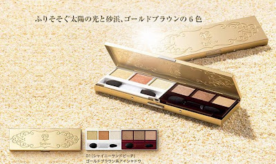
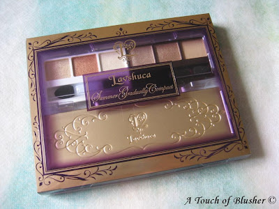
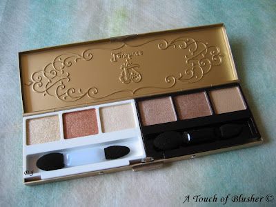
(Lavshuca Summer Gradually Compact in Shiny Sandy Beach)

After teasing you with a photo of Lavshuca‘s Summer Gradually Compact two weeks ago, I have been trying on the colors. Today I am sharing my thoughts with you.

First let’s look more closely at the shades:


From left to right:
A pale yellow gold with pale gold sparkles (sheer; sparkling)
B medium bronze gold (well-pigmented; very shimmery)
C off-white with very pale champagne gold undertone (sheer; shimmery)
D light-to-medium taupe-brown (moderately pigmented; shimmery)
E medium brown (moderately pigmented; subtly shimmery)
F light beige (very sheer; satiny matte)

(All shades, except F, have very fine multi-colored micro-shimmer.)
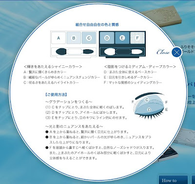
(image from www.kanebo-cosmetics.jp/lavshuca)

You can see the instructions on Lavshuca’s website above, and the same instructions are printed on the back of the outer packaging.

In this palette (as well as the other one, Windy Aqua Beach), C, D, and E are the main shades. C is used as a base, D is the main shading color, and E is the eye-lining shade. The matte F is used to accentuate and add depth to the crease and the inner corner of the brow bone. (A tops up the sparkles, and B adds warmth where you want it.)

Here are some of my thoughts:

– The three main shades work very well for me. I don’t like neutral colors to be too warm, and D and E have a coloration very suitable for me. (I have a light-to-medium skin tone.)

– What I love the most about this palette is the soft watery-shimmer effect, which is great for summer. If the shades were too pigmented, the finish would be overly metallic, which I rarely like. (Only B (bronze gold) is very pigmented, while the others are either moderately pigmented or sheer.)

– The eye-lining shade E is only about a shade darker than the main shading color D. For me, E works well as a subtle daytime eyeliner and it blends seamlessly with D. But some people will probably want to use a separate eyeliner for extra depth.

– Both the colors and the shimmer stay on very well, and there is virtually no powder/shimmer fallout.

– I do have two slight complaints. The bronze gold (B) is a little bit too warm for my liking. Also, the shade-enhancing color (F) is very sheer and doesn’t show up on me very much.

Overall I am very happy with the palette. It is a great summer item for a soft and casual look. The soft shimmer does remind me of a glistening sandy beach under the afternoon sun. It might not be the most versatile palette due to the lack of a very dark shade, but for me it is wonderfully wearable.

Please see this post for swatches and the shades worn on the eyes. (Notice that Kate’s Gel Eye Liner in BR-1 is used in the photos.)

If you are also interested in the other palette, Windy Aqua Beach, please head over to Autumn Masquerade to see photos and a review.

Updated on May 26th, 2008:

If you are interested, please head over to My Women Stuff for another review of Shiny Sandy Beach.

Related Posts:

Coffret D’Or 3D Lighting Eyes in Gold Variation

(The gold in this palette is more wearable for me.)

Golden Dior Luminizing Makeup Jewel
(More gold!)

Lunasol Summer 2008 Collection
(another great-looking summer collection)

{ 8 comments }
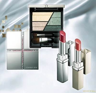
(part of the Coffret D’Or late summer/ early fall collection)
(image from www.kanebo-cosmetics.jp/coffretdor/)

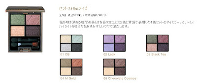
Coffret D’Or has updated its website with information on the late summer/ early fall collection. (Please see my previous post for some quick detail and a link to swatches.) It is another beautiful collection, with lipsticks, eyeliners, and eyebrow pencils, but my eyes have been drawn to the new Trance Deep Eyes palettes.

First, let’s remind ourselves of 3D Lighting Eyes, released in December 2007:

(Coffret D’Or 3D Lighting Eyes)
(image from www.kanebo-cosmetics.jp/coffretdor/)

01 Pink Variation
02 Blue Green Variation
03 Silver Variation
04 Purple Variation
05 Gold Variation

Now check out the new variations:

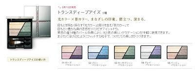
(Coffret D’Or Trance Deep Eyes)
(image from www.kanebo-cosmetics.jp/coffretdor/)

01 Rose Variation
02 Blue Variation
03 Khaki Green Variation
04 Grey Variation
05 Beige Variation

I think I am definitely going to try the new palette series, but the question is which one I want. Or, to be precise, which ONES?

This time, no single palette is jumping out at me, and I am liking three at the moment. After looking at the swatches, I have been lured by Rose, Grey, and Beige Variations. Here are my initial thoughts:

Rose Variation: The top-right shading color looks similar to the cool dusty pink in my Purple Variation, which is one of my recent favorite eyeshadow shades. I would love to try the new palette to see how everything works.

Grey Variation: My first reaction is that it looks similar to my Maquillage Clean Contrast Eyes in SV844, which I like. But there are differences. Maquillage SV844 has a medium grey, which Grey Variation doesn’t have. Also, from the swatches, it seems that the lilac is very slightly warmer than that in SV844. This could be my next lilac palette!

Beige Variation: I am happy with my Gold Variation and my Summer Gradually Compact from Lavshuca, but the top-right soft taupe seems lovely and far from plain. The bottom-left peach gold is not usually one of my favorite colors, but I think it will be on the sheer side and can work well with the cool taupe.

At the moment, my favorite is Rose Variation. But I can’t let go of the soft lilac, and I am still in my mini neutral phase.

Will I be getting all three? You will have to find out later!

Which one is appealing to you at the moment?

Related Posts:

Sofina Aube Early Fall Collection

Chanel Fall & Holiday Collections

A Splash of Color – Lilting Lilac

(I am sensing a Part Two might be coming up…)

{ 15 comments }

(Kanebo Coffret D’Or 3D Lighting Eyes
in 05 Gold Variation)

I like a bit of variety in my makeup collection. I tend to pick up one shade from an eye palette series and that is it. No matter how much I like what I have, I often look elsewhere for my next gem. There usually has to be a compelling reason for a second purchase.

I have quite a few eyeshadows in blue, purple, turquoise, and pinks. But when it comes to neutral tones, what I had were mostly either very pale or quite dark. It didn’t bother me before, since I like a bit of color. But, sometimes, to go with what I wear, soft neutrals are by far the best choices. So, weeks ago, I finally decided not to make do with dusty pink and soft peach and get some nice neutrals.

The color I decided to look for is a medium gold with subtle shimmer (not overly metallic shimmer) that is not bronze or orangey, and I planned to pick up a palette with the shade and other coordinating ones.

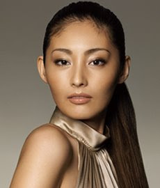
As I was looking through my recent Biteki and Voce seasonal makeup catalogues, I remembered that, when Coffret D’Or was launched last December, I was allured by the 3D Lighting Eyes palette in Gold Variation used on Tokiwa Takako. (The full-page ad appeared on Biteki (February 2008) and showed the makeup look a lot more clearly than the (same) image below.)

(Tokiwa Takako for Coffret D’Or)
(image from http://www.kanebo-cosmetics.jp/coffretdor)

Also, the texture and the finish of my Purple Variation appealed to me so much that I thought it would be great to pick up a second one. So I did.
(The sun was out, so I decided to take a few more shots.
Later I found that this photo shows the actual shades a lot better.)

From left to right:

The top two:
– a sheer off-white with fine sparkles
– a moderately pigmented pearlescent white with fine shimmer

The bottom three:
– a medium gold with smooth shimmer and fine sparkles (moderately pigmented)
– a very shimmery sheer pale champagne gold with slightly larger sparkles
– a subtly shimmery well-pigmented medium brown with some fine sparkles (which goes on a little cooler than it looks in the pan)

(All the sparkles and shimmer are multi-colored.)

The texture of the powder is wonderfully soft and silky. The application is effortless and blending is a breeze.

The look it creates is just like what you see in the ad above. The soft gold and the coordinating pale champagne enhance the dimensions of the eyes very effectively, but the whole look is still elegant and understated. (The soft gold is exactly what I wanted. It is a subtle but effective shading color.)

The colors from 3D Lighting Eyes are very long-lasting. Once I wore Purple Variation (without any eye primer) and my eye makeup surprisingly more or less survived heavy wind and rain (the kind where an umbrella is basically useless…well, it’s the unpredictable British weather…).

I am very pleased that I got this palette so that I can enjoy all the great things about 3D Lighting Eyes when I am not wearing lilac for the day!

(For the clear instructions on where each shade is applied, my thoughts on the eye-sculpting concept of the 3D Lighting Eyes series, the look of the palette case, and the other color variations, please refer to my post on the Purple Variation.)

Related Posts:

Coffret D’Or Late Summer/ Early Fall Collection
(with link to swatches)

Lunasol Sheer Contrast Eyes in Lavender Coral

Shiseido Maquillage Clean Contrast Eyes in SV844

{ 8 comments }

Coffret D’Or‘s late summer/ early fall collection will be launched in mid-June, but testers are already out in Japan and pre-ordering has started.

My post on this collection has been updated with a link to exciting photos of all the new palettes and their swatches. I am enjoying them at the moment!

There is a good chance that I will pick up one of them. (The blogger praises the superb quality of the powder, and she is usually spot-on.) I just need to decide which one to go for……

{ 6 comments }

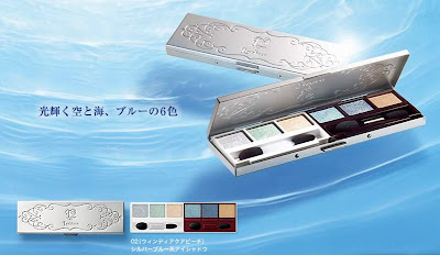
(Lavshuca Summer Gradually Compact in 01 Shiny Sandy Beach)
(image from www.kanebo-cosmetics.jp/lavshuca)

Lavshuca is releasing a gorgeous collection for summer 2008. Apart from two new shades of Rouge Essence Bar lipsticks (PK-4 and BE-3), the collection includes two limited-edition Summer Gradually Compacts, eye palettes with six coordinating shades.
(Lavshuca Summer Gradually Palette in 02 Windy Aqua Beach)
(image from www.kanebo-cosmetics.jp/lavshuca)

I think both palettes are equally pretty, and I was tempted to get both. But, since I had been interested in gold and taupe at the moment, I decided to go for 01 Shiny Sandy Beach. (The official release date is May 1st, but many brands in Japan tend to put out new collections earlier by a week or two.)

I just received it and I haven’t tried it yet, but here it is!
(Golden Loveliness…)

The palette features, from left to right, pale champagne gold, bronze gold, off-white with a pale gold undertone, soft warm taupe, medium brown, and beige-brown. The middle four shades look nicely shimmery. The pale champagne gold on the left is quite sparkling, and the beige-brown on the right is semi-matte.

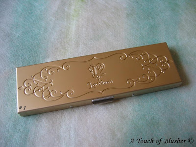
I am loving the look of the compact. It is made of metal and has a textured matte finish, so there won’t be any fingerprints. Like the eye/lip palette for holiday 2007, part of the fun is to put the colors into the compact.

I will try out the palette very soon, and I will be reviewing it in about two weeks’ time. Please do come back!

Updated on May 13, 2008

Please read my review of the palette here!

Other Lavshuca items:

Lavshuca Eye Color Select in PK-1, BU-1, and PU-2

Lavshuca Cheek Color in PK-1

Lavshuca Jewelry Lips in PK-1 & RS-1

{ 16 comments }

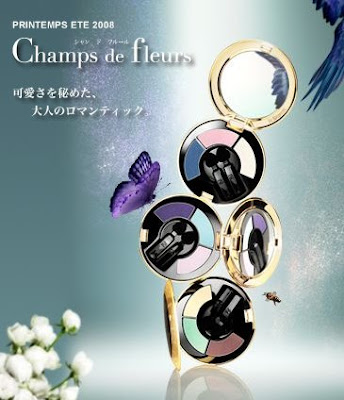
(Champs de Fleurs
Elégance Spring/Summer 2008 Collection)
(image from www.elegance-cosmetics.com)

From now on, I will be regularly talking about popular Japanese beauty brands that have been rarely mentioned in beauty blogs written in English.

Today I start with Elégance, a brand I personally really like.

As far as I know, Elégance is a French fashion brand. (Their boutique in London is just off New Bond Street and their Paris boutique is on rue Saint Honoré.) But, it seems the Elégance beauty line is only available in Asia.

The Elégance beauty line is developed and produced by Albion (which is currently owned by Kosé).

(Like Anna Sui, Paul & Joe, and Jill Stuart, I classify the Elégance beauty line as a Japanese line.) This high-end line has been doing consistently well in Japan. Over the years, their mascaras and base makeup items have proven to be especially popular. (Relatively, their skincare line doesn’t seem to enjoy as much attention.)


I have two items from Elégance. They were bought a few years ago, and they have been discontinued. One is Verytrue Lip, a natural-looking lip gloss, and the other is Purity Eyes, a cream-to-powder eyeshadow in pale blue.

Elégance consistently uses gold as the main color in the packaging. I think, with gold as the main color scheme, the rest is best kept simple. I think this simplicity has been well maintained throughout the line. As YSL uses straightforward square and rectangular shapes for their gold cases, Elégance opts for circular cases. While YSL looks chic and glamorous, Elégance has an extra touch of softness and femininity.

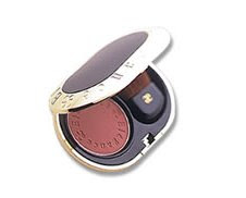
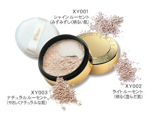
Two of the items from the current lineup that appeal to me are the powder blusher (in 9 shades) and the loose powder (in 3 shades):

(image from www.elegance-cosmetics.com)

I would love to have more items from Elégance, but they are quite pricey. The loose powder above costs 8400 yen (about 80 USD). But I think I will definitely consider adding one or two items to my collection later.

As Miss Elégance, Elégance’s very cute (and much more affordable) sister line, was discontinued in 2007, I really hope Elégance will do well for many years to come.

(The Elégance beauty line is currently available in Japan and Taiwan.)

Other Japanese beauty lines!

MAMEW

SUQQU

“Loving Japanese Brands” Series

{ 0 comments }

(Dior Golden Dior Luminizing Makeup Jewel)

As I mentioned yesterday, I got the Golden Dior pendant. At my local Boots Dior counter, the summer 2008 display was not out yet. But, to be honest, since this would be strictly a collector’s item for me (which I probably will never use), it didn’t really matter. (I also trusted Dior’s packaging enough to not have seen the actual pendant before buying it.) I picked Lamé Pink, one of the two shades available in the UK.

Let’s see the name on the outer packaging, which pretty much shows what this item is for:

Golden Dior
Luminizing Makeup Jewel
(Bijou Enlumineur D’Été)
Touch-on Luminizer for Eyes, Cheeks, and Lips
(Enlumineur Crème Yeux, Joues, Lèvres)
156 Lamé Pink
(Rose Lamé)

(Please note that this shade might not be available globally. 166 Lamé Gold (Or Lamé) is the shade sold in North America.)

This is a multi-purposed item that you can use wherever you want. On the look of it, Lamé Pink is a warm pink with frosty gold shimmer. (I will update this post when I have a chance to play with the testers.)

Today we will focus on the packaging. There are two things I particularly like about this pendant. First, the dark surface makes fingerprints less apparent. Usually, Dior’s limited-edition items have reflective silver or gold finishes throughout which make fingerprints very visible. But, with this one, I worry less about it.

Also, the pendant has a nice thickness, which I didn’t expected. It gives a more substantial look to it.

Here are two photos of the interior of the pendant and the shade of Lamé Pink:


I like the inside of the pendant as well, especially the shape of the mirror, which goes with the overall design.

At the moment, I am liking it more than I thought I would. It is less blingy and has a slightly more understated look, but it is bold enough not to look boring. Even though it cost me 3900 points on my Boots Card (it retails for £39), it was worth it.

Related Posts:

How I Get Dior “For Free”
(including Golden Dior)

DiorLight Jeweled Makeup Necklace
(from holiday 2007)

DiorLagoon Eyeshadow Duo
(the perfect turquoise)

{ 18 comments }

(Lunasol Scent Form Eyes in 02, under sunlight)


Lunasol‘s Scent Form Eyes palettes were released in fall 2006. The brand’s eye palettes have always been popular, but, as I remember, the beautiful Scent Form Eyes made Lunasol an even more coveted brand.

(Lunasol Scent Form Eyes)
(image from /www.kanebo-cosmetics.jp/lunasol)

Out of the five, #03, with olive green and dusty warm rose, has been by far the most popular. It was also voted as Biteki readers’ favorite eye palette in the annual survey (Biteki, February 2007).

I nearly decided to have #03, but I settled for #02 instead.

The colors:

Bottom left: white with a very faint lilac undertone
(with silver, pink, lilac, blue, green sparkles)
(cream-to-powder texture)

Top left: sheer and pale lilac
(subtly iridescent with very fine shimmer)

Top right: dusty rosy pink with a faint lilac undertone
(luminous matte with almost no shimmer)

Bottom right: dark grey with an eggplant undertone
(with sparse sparkles)

Below is the palette under artificial lighting. This is mainly to show the level of shimmer in each shade. (The colors look a lot warmer here. Please refer to the photo above for the actual shades.)

(under artificial lighting)
(Please click on the photo to see a large version.)


Out of all my lilac eye palettes, this is perhaps the most understated one. If you want intensely pigmented colors, then you will be disappointed with this palette. Apart from the dark eye-lining shade, the other three are relatively sheer. (The top-right dusty rosy pink, as a shadowing shade, goes on slightly darker and is more opaque than the top-left pale lilac.) But all the shades do stay on very well.

Even though the look is subtle, it has its range of versatility. Since two main shades are not particularly shimmery, I can create a soft luminous matte look with them. But when I do want shimmer, I can apply the highlighter to top up as much shimmer as I want.

The cream-to-powder highlighter can be applied with a brush or with fingers. When applied with fingers, it gives a more intense finish. The subtle lilac undertone of the highlighter wonderfully complements the other colors, which show through from underneath and merge seamlessly with the multi-color shimmering particles. (The highlighter can also be used as a base.)

Overall I like the elegant subtlety of this palette. My only minor complaint is that the rosy pink goes on slightly more red. But this is nonetheless a beautifully arranged palette, and I think the Scent Form Eyes series really shows that Lunasol is one of the most sophisticated and elegant brands in Japan.

(In case you are wondering, the powder does have a faint scent. But it is not as strong as the scent in the Jill Stuart eye palettes.)

Some of my other lilac palettes:

Lunasol Sheer Contrast Eyes in Lavender Coral

Coffret D’Or 3D Lighting Eyes in 04

Chanel Quadra Eye Shadow in Stage Lights

{ 6 comments }

(Shiseido Maquillage Clean Contrast Eyes 2 in SV844)

I haven’t really been very interested in Maquillage since it was launched in fall 2005. But sometimes, it only takes one item to start my interest in a makeup line, and you are looking at it now.

Maquillage replaced PN (the color makeup line) and Proudia (the base makeup line) and was what Shiseido called a “Super Brand”. The expectation at the time was extremely high, since PN, in particular, was very successful at bringing young people to Shiseido and rescuing the brand’s then aging image. Over the last couple of years, Maquillage, with a more mature image, has proven to be delivering the sales figures.

For those of you that might not be familiar with the multi-layered branding concept in Japanese cosmetics, Maquillage is not a fully fledged brand and is simply the name of Shiseido’s main color/base makeup line. It does not have its own counters and is sold at Shiseido counters in Japan and some other Asian countries (where you will find many other lines like Elixir Superior (skincare/base makeup), UVWhite (whitening), Anessa (suncare), Revital (anti-aging), and Beauty Voltage (youth skincare)).

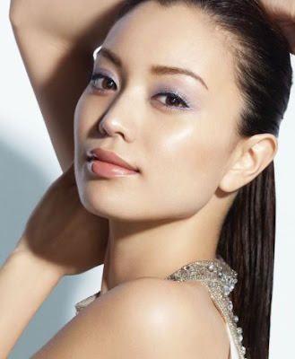
Back to Maquillage. Since I have been very interested in lilac for the past year or so, I am often excited to see lilac being featured as the main eyeshadow color for a seasonal collection. For spring 2008, this look (modeled by Ebihara Yuri, one of the four brand ambassadors for Maquillage) really grabbed my attention.

(image from www.shiseido.co.jp)


(from www.shiseido.co.jp
via xuzer at Dailymoiton)
After checking some more images of this palette on-line and on magazines, I decided to try it.

Initially, being (a bit overly) excited to try a lilac that was much cooler than most of the other lilacs I had, I used it as the main shade on my eyelids and I used the silvery grey around my lash line. It didn’t work well. Worn alone, the lilac is almost too pale for my eye area and the whole look is not optimally flattering.

When I tried the palette for the second time, I wore the silvery grey as the main color with most of the lilac showing through from underneath and around the silvery grey. This time, it worked a lot better.

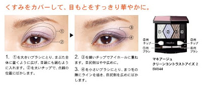
A couple of days ago, I happened to find the following application steps on the Shiseido website. They show more or less how I used the palette for the second time. (They are similar to those on the back of the outer packaging of the palette, but the images below give a clearer idea.)

(image from www.shiseido.co.jp)

My own shade descriptions:
1. sheer white with mainly pale multi-color shimmer and relatively little pigment
2. pale blue-ish lilac with very fine and subtle shimmer and an overall satiny finish
3. silvery grey with a semi-metallic shimmery finish and a very slight warm copper undertone
4. dark matte charcoal with very sparse shimmer

With some eye palettes from Japanese brands, the second darkest shade is usually meant to be worn under the crease. But I think one of the best ways to use this palette is to follow the steps above and use the second darkest shade (silvery grey) both under and around the crease and over most of the lilac applied beforehand. (If you don’t have a crease, use the silvery grey as the main shadowing shade over the lilac, which is applied on a slightly broader area on the lids.)

The key is to layer the two shades. Since the silvery grey has a touch of sheerness, the lilac is able to show through and the two colors together create a lovely and subtle depth for the eyes.

Since many eye palettes in Japanese brands are named after the main shade, I was later able to understand why this is a (well-justified) SV (Silver) palette and not a VI (violet), which I did wonder initially. (Note: Kanebo brands would use PU (purple) instead of VI.)

The practical strengths are there as well. The powder is smooth and goes on easily, and the colors are long-lasting.

Essentially, this is a silvery-grey palette with lilac as the accent color. The concept is different from that of my other lilac palettes with gradations of lilacs. For me as a lilac lover, this alone makes the palette worth purchasing. (But I do have to control my fondness for lilac and try not to over-layer it!)

The “silver-greyish lilac” look it creates is subtle and natural, as you see in the ads. It is very good for daily wear. If you want a more dramatic look, layering the silvery grey and putting more emphasis on the dark charcoal will easily give you a smoky effect.

(By the way, in the ad, Ebihara Yuri is also using the new Gel Liner in SV854.)

I did spend quite a few weeks deciding whether to buy this palette or not. But I am very glad I did!

My other two lilac palettes for spring 2008:

Coffret D’Or 3D Lighting Eyes in 04

Lunasol Sheer Contrast Eyes in Lavender Coral

Other related posts:

Must-Try Look for Spring 2008

Spring 2008 Makeup Trend Report

{ 4 comments }

(Chanel Quadra Eye Shadow in Stage Lights)

Lilac eyeshadows are some of the most on-trend items for spring 2008, and I have been a fan of them for a while. Today I bring you another lilac palette that can create this season’s hottest look.
.

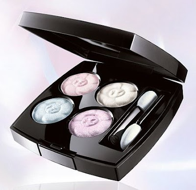
Chanel’s Quadra Eye Shadow in Stage Lights is perhaps the softest (in terms of color) and the sheerest lilac eye palette that I’ve had so far.

– Top left: white with substantial pearly shimmer
– Top right: pale lilac with soft shimmer
– Bottom left: medium lilac with soft shimmer
– Bottom right: a very pale pink with substantial pearly shimmer

Stage Lights is part of Chanel’s spring 2006 collection. While I distinctively remember liking the look of this, I had no intention of buying it at the time. My minty-green-and-turquoise phase was just about to start back then, and I picked up the Irréelle Duo in River-Light later that year.

My lilac phase started later that year and this palette was under the radar several months ago. After testing the shades many times recently and seeing the colors under different lighting conditions, I decided to have it.

The colors go on lighter than they appear in the container. Initially this was one of my reasons against buying it, but then I thought the soft and gentle finishes are great for a barely-there veil of lilac for the eyes. Also, I like the fact that the two lilacs and the pink are on the cool side and that they look more flattering on me than warmer ones.

Compared with many other eyeshadows from Japanese cosmetics brands, the texture of Chanel’s baked eyeshadows can be a little dry and the pigmentation level would disappoint many people. (The Irréelle range seems to fare better on these.) While a smoother texture would be more ideal, I don’t do a lot of layering for a daytime look so the sheerness is not a negative attribute. Obviously this palette can be worn wet for added intensity, but I simply reach for my other lilac palettes for that.

For spring 2008, Chanel released 4 Fleurs de Chanel, which is a very pretty item.
.
(4 Fleurs de Chanel,
from Chanel’s spring 2008 collection)
(image from www.chanel.com)
.
When I saw it for the first time last November (here), I thought I would definitely get it. But later on I got less and less excited, hearing that the colors are all very pale and very similar. (The collection was released a lot later in the UK than the US and Asia.) So I actually took a small risk and bought Stage Lights before 4 Fleurs de Chanel was released here. At least Stage Lights has two lilac shades, whereas 4 Fleurs de Chanel only has one.
.

When I finally got to try 4 Fleurs de Chanel, things I heard were confirmed. They are essentially white eyeshadows with various undertones (blue, lilac, and pink). While I do think the texture is very smooth and that the shimmer is quite intense but still sophisticated, I have no intention to buy it. I am still very happy with my Stage Lights.

Although, among all my lilac eye palettes, it does not rank as highly as my Coffret D’Or or Lunasol, the fact that the tones of the two lilacs are also spot-on for my skin-tone is enough for me to go back to it from time to time.

[A reader kindly reminded me that I didn’t actually describe my skin-tone in the last paragraph of my review. I have a medium-to-light skin-tone, with a pink undertone. The foundation I have been using in the past few years is ZA Two-Way Foundation in 22. It has a slight yellow undertone and I use it to neutralize my pink undertone. With foundation on, I would still describe my facial skin-tone as having a very slight touch of pink undertone.]

.

Related Posts:

Spring 2008 Makeup Trend Report
(not just about lilac…)

Jill Stuart Brilliance Eyes in Gem Amethyst
(diamond-dust shine)

Kanebo T’Estimo Frame Impact Eyes
(discontinued but not forgotten)

{ 16 comments }