makeup – eyeshadow


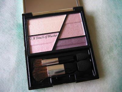
Last month, I mentioned that, being a lilac fanatic, I was very interested in trying Kesalan Patharan‘s Eye Color Palette in S007 from the brand’s fall 2008 collection. I have now tried it for quite a few times and I am ready to share my thoughts with you. (A very brief brand profile of Kesalan Patharan is towards the end of this post.)


From left to right:
– medium lilac with sparkles and some very slight iridescence
– light blue with fine shimmer
– semi-matte aubergine with sparse shimmer

(All shimmer and sparkles are multi-colored.)


First of all, I have to say I am disappointed with the lilac. The powder seems to be on the dry side and lacks adherence to the skin, and it takes some layering to get the color on the eyelids. After that, as I try to gently blend the color, the sparkles start to come off a little. Throughout the day, the finish gradually turns dull and somewhat muddy. It certainly does not look like what you see in the pan.

On the other hand, the other two shades actually perform a lot better. I usually wear a light wash of the blue to go with the lilac, and the color shows up nicely and stays well (no turning dull). I don’t have any problem with the application and the staying power of the aubergine lining shade either.

It is a huge pity that the lilac doesn’t have an optimally flattering finish. Otherwise, this would be a beautiful and easy-to-wear palette and the coloration of the lilac should be very similar to the stunning one in Lunasol’s Sheer Contrast Eyes in Lavender Coral (which still reigns supreme as one of my favorite lilac palettes).

I thought I might talk a little more about the brand here. Kesalan Patharan is one of the few Japanese beauty brands that have an image of a professional beauty line. One of their best-selling products, I believe, is Sheer Micro Powder. It was chosen by Biteki readers as their favorite loose powder (in the February 2007 issue). It also happens to be the loose powder I have been asked about the most by my readers.
(Kesalan Patharan Sheer Micro Powder)
(image from www.kesalanpatharan.co.jp)

I have not used it, but I have been interested in it for a while. (One of my readers, Tammy, left a comment on this powder last year. You can have a look here if you are interested.)

(Kesalan Patharan is sold in Japan and some other Asian countries. Its official website is for information only and does not offer on-line ordering.)

Related Posts:

Coffret D’Or 3D Lighting Eyes in Purple Variation

Chanel Quadra Eye Shadow in Stage Lights

I Love Colors – Lilting Lilac

{ 2 comments }

(Bobbi Brown Holiday 2008 Basics Eye Palette)
(all images from Bobbi Brown)

Bobbi Brown usually brings out a wide range of items for the holiday season. The shades are often slightly more glamorous but still wearable. Today I am reviewing one of Bobbi Brown’s holiday 2008 releases, Basics Eye Palette.

The palette features a base shade, two shadowing shades and a lining shade:

Eye Shadow in Navajo (exclusive): sheer matte off-white cream
Eye Shadow in Cement: moderately pigmented matte medium taupe
Shimmer Wash Eye Shadow in Heather Mauve: well-pigmented medium taupe with a soft metallic finish
Eye Shadow in Mahogany: densely-pigmented matte dark brown

(The shades are slightly darker and (pleasantly) warmer than how they appear in the photo above.)

Cement and Heather Mauve can be used interchangeably, depending on the overall finish you want for the day. The matte Cement really adds depth for the eyes, while the shimmery Heather Mauve can either be used alone or lightly on top of Cement where you want a bit of shimmer.

Navajo goes on very subtle and sheer. It can be a good base or a very subtle brow highlighter. Espresso glides well as an eyeliner. The effect can be as natural or intense as you want but the shade is very natural in itself.

All the shades, as expected of Bobbi Brown, have a nice texture. (Mauve Heather is particularly smooth and silky.)

Overall, the Basics Eye Palette should suit light and medium skin tones and can create both subtle and slightly more dramatic looks. If you want more intense shades, the new Velvet Plum Eye Palette (seen below), also from
Bobbi Brown’s Christmas 2008 Collection, should be a good choice.

(Velvet Plum Eye Palette)

(from left to right)
– Eye Shadow in Bone
– Eye Shadow in Naked
– Metallic Eye Shadow in Velvet Plum
– Eye Shadow in Espresso

Bobbi Brown will also release a double-decker Lip & Eye Palette for the holiday season. It features four Creamy Lip Colors and four Metallic Eye Shadows:

(Lip & Eye Palette)

Creamy Lip Colors:
– Berry Mauve
– Pink Sequin
– Dusty Mauve (exclusive)
– Ruby (exclusive)

Metallic Eye Shadows:
– Champagne Quartz
– Gold Dust
– Golden Bronze (exclusive)
– Galaxy (exclusive)

All three palettes will be available in the UK in October.

Other holiday 2008 collections:

Dior

Lancôme

NARS

{ 4 comments }

(Thi Cosmetics Eye Shadow in Dao
and Lip Gloss in Kanya)

Founded by professional makeup artist Taylor Pham, Thi Cosmetics aims to celebrate Asian beauty. According to its website, the line features colors “flattering yellow undertones with silky textures resulting in flawless application”. (See here for more information.) Today I am reviewing two of the line’s items.


Eyeshadow in Dao

Dao is a nice basic shade for most skin tones (not just Asian/Far-Eastern complexions). The warm pale pink has a slight gold undertone and shows on the skin more in the form of iridescence than actual color. It can be used as a base, alone, or on top of other eyeshadows. The talc-based formula is quite silky and easy to apply.

I think this is also a multi-purposed product that can work as a very subtle blusher or a highlighter. When applied with a fluffy powder brush, the iridescence is less intense and the finish doesn’t look too glowy. I find it to be a good cheek-bone highlighter, worn alone or on top of a blusher. (I would not suggest using it as a highlighter on any area with visible pores as iridescence can generally make pores look more obvious.)

Lip Gloss in Kanya

Kanya is a delicate sheer neutral peach-toned shade without obvious shimmer. (I prefer lip glosses with no or delicate shimmer to those with intense/frosty shimmer.) It can work well for a subtle neutral-lip look as it (worn alone) gently tones down the redness of the lips without making them look too pale. I think it should also work well with many neutral lipsticks.

While I am not really into neutral lips, I like the glossy shine from this shade. What might not appeal to everyone is the slightly dense texture, but sometimes it is the trade-off for a glossy and long-wearing shine. I don’t mind it personally and I find the formula moisturizing.

Overall, the line is currently very concise and highly-edited. (The Eye Shadow is available in seven neutral shades and, for lips, there is one Red Lipstick and five Lip Glosses.) Many of the shades appear to be universally wearable, and I think they should suit more skin tones than what the brand sets out to.

Related Posts:

A Splash of Color – Gorgeous Gold

Coffret D’Or 3D Lighting Eyes in Gold Variation

SUQQU Creamy Lipstick

{ 5 comments }

If you are looking for reviews of other palettes in the new Trance Deep Eyes range than the ones I’ve talked about (Rose and Grey Variation), here are reviews of two other palettes for you:

Khaki Green Variation on Beauty Anonymous

Blue Variation on Autumn Masquerade

Enjoy!

{ 4 comments }

(Paul & Joe Eye Color in 05)

More lilac for today…

Almost all Paul & Joe‘s eyeshadows are available in singles, and the occasional palettes are usually seasonal limited editions. As I am more of a palette person, this is the only Paul & Joe eyeshadow I have, and, yes, it is a lilac.

This is a sheer light lilac. The color only builds up minimally when layered. The powder is very soft and has almost a fluffy feel. I can also use my fingers to apply this eyeshadow and get a nice and natural look.

It has a low-key mildly shimmery finish. What is unique about this shade is the very subtle warm pink and gold shimmer. It adds some vibrancy to the overall finish and prevents the shade from looking one-dimensional when worn alone.

I can use this alone for a barely-there look, as the sheer lilac and the soft veil of shimmer can brighten my eyes. I can also use it to complement my lilac-based eye palettes as a base or where needed.

For me, this is a good time-saver when I want a quick and easy minimal lilac look. It is also nice for travelling when I don’t want to spend too much time putting on makeup but want to look refreshed. (Again, I can use my fingers to apply it, so there is more precious packing space.) I will obviously have to pair it with other colors if I want more depth, but, overall, this is a simple and foolproof basic in my lilac repertoire.

Related Posts:

Loving Japanese Brands – Paul & Joe

Paul & Joe Foundation Primer N

Paul & Joe Loose Powder

Paul & Joe Pressed Powder

{ 10 comments }

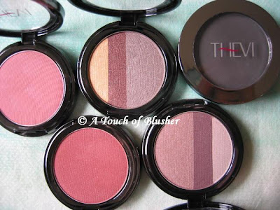
(From left: Sheer Matte Blush in Touch of Plum and Sheer Rouge,
Triple Split Shadow in Bistro and Venice,
Matte Eyeshadow in Charcoal)

The recently launched Thevi Cosmetics aims to provide makeup colors that suit people of all skin tones, particularly those with darker complexions. However, for those of you that have a fair skin tone, you can benefit from some of these items that I am reviewing below if you usually go for well-pigmented makeup items.

Triple Split Shadow (in Bistro and Venice)

Both trios include a highlighter, a shadowing shade and a lining shade. Upon looking at the colors, I thought Venice, with what appeared to be a muted medium beige pink, would suit me better than Bistro. But I was wrong.

The two shadowing shades in the trios are moderately pigmented and have a soft and flattering shimmery finish, but they go on warmer than they look. The beige pink in Venice goes on too warm for me, but the greyish-looking beige in Bistro doesn’t show up greyish on me and the soft beige-brown finish looks very natural.

The highlighting and lining shades in Bistro are very well pigmented, and the gold highlighter has quite a metallic finish. The deep brown and pale beige pink in Venice, on the other hand, seem uncharacteristically sheer.

Matte Shadow (in Charcoal)

I find this to be a great multi-purposed item. It is a good matte eyeshadow if you want the classic smoky-eye look. It can go on sheer as a light grey or heavier as a very dark grey. The silky powder is also suitable for lining the eyes and, again, the color intensity is adjustable. I also use it as a brow powder since I have black hair and brows (and need a brow powder that is grey-based rather than brown-based). A light-handed application can create defined but natural-looking brows. (In comparison, this shade is greyer than Medium Ash in Anatasia’s line reviewed earlier.)

Sheer Matte Blush (in Touch of Plum and Sheer Rouge)

“Rich” and “vibrant” are accurate descriptions of these blushers on Thevi’s website, as these are not “sheer” (as the name suggests). The matte Touch of Plum is a rich warm pink (which looks darker than it does on the photo above), while Sheer Rouge is even darker and warmer and has a hint of shimmer.

Both are very pigmented and have a pleasant texture. I think the finish is what Thevi sets out to achieve, as I’d imagine they can really show up on and complement darker complexions. (I have a light-to-medium skin tone, and I have to be very light-handed with them.) Overall they are worth a look if rich pigments in blushers are what you are looking for.

(Note on packaging: All Thevi’s eyeshadows and blushers are housed in very sleek and compact cases. But some of the lids are quite tight and I think they can be hard to open for people with long nails.)

Related posts:

Makeup Review: NARS

Coffret D’Or Trance Deep Eyes in Rose Variation

Lavshuca Summer Gradually Compact

{ 6 comments }

(Coffret D’Or Trance Deep Eyes in Grey Variation)

Two weeks ago, I talked about Rose Variation from Coffret D’Or‘s Trance Deep Eyes series for fall 2008. Today I am reviewing Grey Variation.

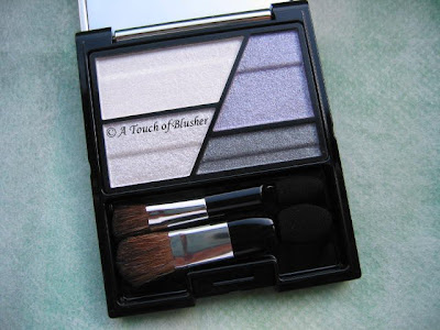
Grey Variation features a cool lilac as the shadowing shade along with a medium grey for lining the eyes. The four colors are (clock-wise from top-left):

A off-white (sheer, mildly shimmery)
B cool medium lilac (moderately pigmented, shimmery)
C medium-to-dark grey (well pigmented, luminous matte under the sparse shimmer)
D off-white silver (moderately pigmented, very sparkly)

(As with Rose Variation, all shades have fine multi-colored shimmer and a good staying power.)

(Please click on the image for a larger version.)

Compared with Rose Variation, Grey Variation is my preferred one since the cool medium lilac brings out the dimension of the eyes a lot more. This dimension-enhancement is twofold:

– The lilac is darker than the warm dusty pink (the shadowing shade) in Rose Variation. The dusty pink can be a little too subtle, particularly for the evening.

– The lilac’s tone changes when looked at from different angles (while the depth of the color remains the same). When seen straight-on (as seen in the photo), the lilac has a cool tone. However, when seen from the side (when the palette is held almost horizontally in front of my eye-line), the shade takes on a slightly warmer tone (particularly under sunlight). But I didn’t manage to really capture the difference on camera. (There is also such a tone variation with the dusty pink in Rose Variation, but it is extremely minimal.)

What is great is that this tone variation also shows up when worn and it gives a good eye-sculpting effect (even when the color is worn lightly). (But please note that this variation is different from (and much subtler than) the iridescence that we see in, for example, Lancôme’s L.U.C.I. collection in spring 2008.)

(image from www.kanebo-cosmetics.jp/coffretdor)


(Coffret D’Or TV commercial, via YouTube)

It is also worth mentioning that this palette does appear similar to Maquillage Clean Contrast Eyes 2 in SV844. However, the lilac in the Maquillage palette is quite pale and is a lightening color, whereas the lilac here is darker and performs as a shadowing shade.

As I mentioned, at the moment I prefer Grey Variation to Rose. But, compared with Purple Variation from the 3D Lighting Eyes series, I think I still like Purple better and I’d say I like Grey as much as I like Gold.

Overall I am quite happy with the two I have from the Trance Deep Eyes series. In an earlier post, I mentioned that I was also considering Beige Variation. It is still on my shopping list, but not anywhere towards the top. There is no limited edition in either of the two palette series, so for now I’ll look forward to spring 2009.

Updated on September 4th, 2008:

Please check out this blog post for swatch and FOTD photos of this palette.

Related posts:

Lunasol Sheer Contrast Eyes in Lavender Coral

Chanel Quadra Eye Shadow in Stage Lights

A Splash of Color – More Lilting Lilac

{ 10 comments }

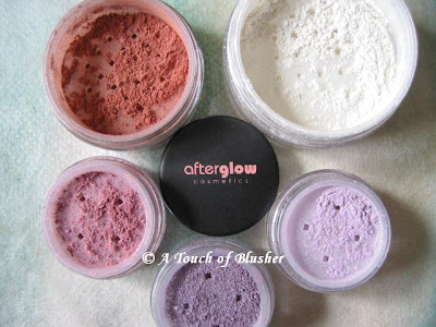
(Clock-wise from top-right:
Setting Powder in Translucent,
Eyeshadows in Pixie, Velvet, Gift,
Blush in Smitten)

Today I am bringing you another review of mineral makeup, this time from Afterglow Cosmetics. (Check here for the US website.)

Setting Powder (in Translucent)

This is a loose powder for setting your foundation. It is not totally translucent as the name of the shade suggests, as the white powder does have a bit of coverage. If you have darker skin tones, this might leave a white cast on you. On the other hand, if the foundation you are using is a little too dark for your complexion, this setting powder can be of some help.

This matte powder is fairly good in controlling shine, but it has little efficacy in covering pores.

Eyeshadows (in Velvet, Pixie, and Gift)

Velvet is a medium-to-dark warm purple, Pixie is a pale lilac, and Gift is a medium-to-warm muted pink. Velvet is slightly too dark for me as a shadowing shade, so I pair it with Pixie and use it as a lining shade while Pixie gently lights up the eyes. But my favorite shade among the three is Gift, which is a wearable pink and a nicely subtle shadowing shade for daytime.

All the three colors have sparse shimmering particles over a predominantly matte finish. While I like the softly matte finish, which doesn’t look too heavy or chalky, I feel that the shimmering particles look a little flat and they are slightly too big to go with the matte finish of the colors themselves.

Also, they are not very easy to blend, which is particularly problematic for the darker Velvet, but the saving grace is their satisfactory staying power.

Blush (in Smitten)

Afterglow’s (UK) website describes Smitten as a “cool medium pink with matte finish”, which doe not seem accurate. According to the photos on-line, Smitten does seem to be on the cooler end of the brand’s blushers, but the shade itself is definitely not a cool medium pink. It is a very warm peach with a slightly dark brick-red undertone. But it is indeed matte as described.

It is very pigmented, so make sure that you apply as little of it as you can and gradually build it up. The staying power is as good as the eyeshadows. If you like warm-toned heavily pigmented blushers, then those from Afterglow might be worth your consideration.

Like many other mineral makeup lines, Afterglow’s items can potentially be ideal for people with sensitive skin. (Full ingredient lists are available on the US website.) However, it would be great if the brand could work on the finish of the eyeshadows as well as come up with a couple of cool-toned blushers to suit more skin tones.

Other mineral makeup reviews:

Von Natur (Part 1 and 2)

Erth Minerals

Ferro Cosmetics

{ 2 comments }

(Coffret D’Or Trance Deep Eyes in Rose Variation)

Coffret D’Or‘s Trance Deep Eyes range, released in June, is the second eye palette series after the successful 3D Lighting Eyes. I have been pleased with my two 3D Lighting Eyes palettes (in Purple and Gold Variation) so the new range is a must-try for me.

Rose Variation is essentially a warm-pink palette with an aubergine lining shade. The four shades are (clock-wise from the lightest):

A off-white with shimmer (sheer, mildly shimmery)
B warm dusty pink with pearly shimmer (moderately pigmented, shimmery)
C dark aubergine with sparse shimmer (well-pigmented, luminous matte under the sparse shimmer)
D off-white pink with shimmer (moderately pigmented, very sparkly)

(All the shimmering particles are multi-colored. All shades have good staying powder.)

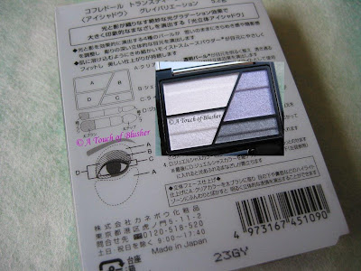
The cases are the same as those of the 3D Lighting Eye palettes, and, again, the instructions are printed on the back of the outer packaging:

(Please click on the image for a larger version.)

The main difference between the instructions of 3D Lighting Eyes and those of Trance Deep Eyes is that the second lightest shade in Trance Deep Eyes is applied all over the lid, not just towards the inner corner (as in 3D Lighting Eyes).

(image from www.kanebo-cosmetics.jp/coffretdor)

When I saw the colors in person for the first time, I thought the dusty pink looked very similar to the pink in Purple Variation. (I was somewhat expecting this when I saw the new palettes on the official website.) However, even though they do look very similar in the containers, the one in Rose Variation goes on warmer. It is also more subtle. (The pink hue does not show up very much under warm artificial lighting.)

When I follow the instructions, the overall finish is quite sparkly, largely down to the very shimmery/sparkly off-white pink applied over the lids. Even when I only apply it towards the inner corner of the eyes, I think the look can still be a little too sparkly for daytime (when I prefer a very softly shimmery look).

Color-wise, the white base shade (A) and the off-white pink (D) go on almost the same, as they only differ in the amount of shimmer. Therefore, I don’t think Rose Variation is as versatile as Purple Variation, which also creates more dimension for the eyes. But I’d think Rose Variation is probably the most wearable palette (out of the four Coffret D’Or palettes I currently have) for most people, as it is very hard to go wrong with these shades.

Between Purple and Rose Variation, I prefer Purple Variation, which has the beautiful combination of dusty pink and cool lilac. Also, the finish is subtly shimmery rather than sparkly. But if you like beaming sparkles and are not happy with what you get from 3D Lighting Eyes, the Trance Deep Eyes range might be worth a look.

I will be reviewing Grey Variation later this month.

Related Posts:

Fluffy Shine Eyes from Coffret D’Or’s Fall 2008 Collection

Coffret D’Or Full Styling Rouge Lipsticks

Foundation Face-Off – Lunasol vs. Coffret D’Or

{ 4 comments }


NARS always has a chic and fashion-forward image and a wide range of shades to go with it. Today, the review focuses on how well some of the brand’s warmer shades perform.

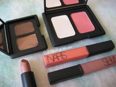
– Lip Glosses in Supervixen & Sunset Strip

Supervixen (bottom right) is a cool medium brown. It appears to have a very subtle mauve undertone, but it doesn’t show on the lips. Sunset Strip is peachy tangerine that is slightly more pigmented than Supervixen and has a frostier finish. Both have very subtle multi-colored shimmer.

Their texture is on the dense side and they don’t glide as easily as many other glosses. Also, if you like a very glossy finish, it will take a bit of layering. One layer gives a subtle sheen, two layers create a mild shine, and it takes three layers to achieve a full and glossy look. But, once applied, the staying powder is fairly good.

– Lipstick in Viva Las Vegas

Viva Las Vagas is a moderately pigmented warm brown with a bronze undertone. It has a very frosty finish that I rarely like, as I find that it often makes the lips look dry and can accentuate lip lines. (I tend to go for lipsticks with a soft satiny finish or a slightly wet/moist look, and I prefer minimal shimmer to intense metallic/frosty shimmer.)

I once tried laying the brown-toned Supervixen Lip Gloss on it (to take away the frosty finish), and I find that they actually work very well together. Shade-wise, they complement each other. Also, one layer of the gloss over the lipstick instantly creates a glossy finish. Even though the finish is very rich and luxurious, I would often prefer to have one product that does the job instead of two as I tend not to layer too many products on my lips.

– Duo Eyeshadow in Kalahari

Kalahari creates quite a sultry neutral look. Before I used the duo for the first time, I thought the shade on the left might be a little too dark for the lids. But I was surprised that, even though it is indeed darker than the neutrals I would go for, it is still natural and not overly heavy. The neutral brown (neither too cool or too warm) has a very subtle rose-gold iridescence and the overall finish is softly shimmery and flattering.

The slightly darker shade on the right is much warmer and has a more metallic finish. I wear it close to the lash line as a very subtle liner. Both shades have a very soft texture, while the darker shade seems particularly silky and has an effortless glide.

– Highlighting/Blush Duo in Albatross/Torrid

Albatross, the highlighter shade, has a metallic sheen, and I find that it is too metallic as a highlighter for the face. Even when it is very lightly dusted onto the skin with a fluffy brush, it can still make pores (and possibly fine lines) appear more obvious. However, with a soft gold undertone, it can work as a base for warm-toned eyeshadows.

Torrid is a warm-red blusher. In the container, it looks quite shimmery, but the gold-toned shimmer doesn’t look apparent when worn and the satiny finish looks natural on the skin. For me, it is a fairly wearable summer blusher and I think it will suit people with a warm complexion very well. (I tend to wear neutral-to-cool pinks, and this warm-red is probably as warm (and red) as I would go.)

Overall, I think the powder-based products here perform better. They have a very good texture and stay on well. The various finishes of the products reviewed above might not suit everyone, particularly the very metallic lipstick and highlighter. If you are planning to try out items from NARS, I would suggest looking especially into the finishes to make sure that they are flattering for you.

(
All the products reviewed above are fragrance-free.)

Related Posts:

Coffret D’Or 3D Lighting Eyes in Gold Variation

Dior Golden Dior Makeup Jewel


Lavshuca Summer Gradually Compact

{ 0 comments }