makeup – eyeshadow

Maquillage‘s Forming Shiny Eyes was part of the line’s fall 2008 collection, which radiates an international flavor. (The collection was created in collaboration with fashion designer Christopher Kane and the ad campaign featured model Agyness Deyn.) Among the five variations, I liked the combination of purple and gold in #52 (which happened to combine two major makeup trends in fall 2008) and I received this as a birthday gift last year from a dear friend.

The product comes in a two-tier pot with a storage slot for the sponge applicator at the bottom.


The top tier has the cream base and the bottom tier has the gold and purple.


The cream base is very easy to apply with a finger. It leaves a nice veil of off-white shimmer that softly glistens (rather than glitters), and it actually looks quite pretty on its own. It can be applied from the lashline and taken all the way under the brow bone.

The gold imparts a beautiful shimmer, which doesn’t look too frosty or sparkly. (There are also some fine multi-colored particles to help the shimmer look more vibrant and dimensional.) The flattering yellow-toned gold doesn’t look too white-ish or bronzy.

The purple is a well-pigmented muted medium-to-dark shade that has less shimmer than the gold. Used as a lining shade (which is more or less what the application instructions on the packaging suggest), it frames the eyes very well.

Once, I thought I’d bring it further from my lashline, but it didn’t work well mainly because it didn’t seem to be blendable enough. Unlike the gold, which is very soft and easy to blend, the purple seems to be purposefully made to have less movement and to set more quickly. My suggestion is to only wear it close to the lashline or as a lining shade. (It does hold very well overtime.) Since the shade is less intense than most eyeliner colors, it adds a nice definition to the eyes without making the look too dramatic.

The image below shows the look that this item can create. Again, the purple is worn quite close to the lashline to define the eye contour.

(image from image from www.shiseido.co.jp/mq)


Overall, I like this trio very much. (I almost slightly prefer it to Maquillage’s Clean Contrast Eyes 2 in SV844.) It should be a very nice daytime item if you want something easy to wear and something effective in adding dimension to the eyes. The gold is light and fresh enough for daytime but vibrant enough to brighten the eyes, and the gold and purple make a well-coordinated pair.

For another item that has a similar color combination (though the colors are worn differently) plus a gorgeous medium lilac, please take a look at my review of Lunasol’s Sheer Contrast Eyes in Lavender Coral.

Related posts:

Maquillage Lasting Climax Rouge in RS310

Coffret D’Or 3D Lighting Eyes in Gold Variation

Maquillage Spring 2009 Point and Base Makeup Collection


A Splash of Color: More Lilting Lilac

{ 10 comments }


Prescriptives has been releasing Colorscope Refillable Palettes for Eyes and Cheeks for the past few holiday seasons. Today I am reviewing the 2008 version in Cool.

The palette is packaged in a zip-up faux-leather pouch with a silvery finish. It includes six eyeshadows, two blushers and a double-ended eyeshadow brush.


The three darker shades are:
– matte dark grey
– iridescent plum red
– metallic medium taupe

All these shades are smooth and very well-pigmented.

The three lighter shades are:
– light blue (softly iridescent) with a lilac undertone
– light golden beige (very metallic)
– off-white cream (pearly)

The light golden beige is richly pigmented, while the other two are more softly pigmented.

(The blue/lilac and the plum red are existing shades in the Colorscope Eye Color range (Lilac Frost and Plum Smoke).The rest four are exclusive to this palette.)

My two favorite shades are Lilac Frost and the medium taupe. Lilac Frost looks slightly more blue than lilac and is a good subtle shade for brightening the eyes. The color comes mainly from the soft iridescence, so it doesn’t leave the eye area unnaturally pale or flat. The metallic taupe is a nice shadowing shade and is more of a brown taupe (which I prefer) than a grey taupe. The metallic finish lasts well and doesn’t turn ashy or muddy overtime.


The palette for 2007 contains a blusher and a highlighter. This year’s version has two blushers: a matte soft warm pink (the same blusher as the one in the 2007 palette) and a dusty pink with minimal shimmer and a subtly glowy finish. (The two shades are Petal and Apple Blossom, respectively, in the Colorscope Cheek Color range).

Both shades are well-pigmented. Do use them sparingly if you want a subtle look. I personally prefer Petal, which creates a natural flush for the cheeks. (It can also be built to a more vibrant finish.)

Even though this is the cooler version of the two palettes (see the Warm version here), it has a well-balanced selection of warm and cool shades to suit most complexions. It should work for both the party season and the rest of the year.

Other holiday 2008 posts:

Dior Night Diamond

RMK Christmas Palette 2008

Bobbi Brown Copper Diamond Shimmer Brick

{ 4 comments }


Shimmer Brick is probably one of
Bobbi Brown‘s most popular items. For holiday 2008, Bobbi Brown has released a limited-edition Copper Diamond Shimmer Brick Compact.

The five subtly different shades are packaged in a very glamorous gold case with a decent-sized mirror, although the case always seems slightly lighter than how I’d like it to be (especially when I compare it with Dior’s Night Diamond, which is smaller and thinner but a lot heavier).

The compact includes various shades of beige and light bronze. The combination of these shades is a warm beige with hints of gold that should suit most skin tones (unless you have a cool-toned fair skin tone, in which case a platinum-toned highlighter would be more complementary). When applied with a powder brush, the finish is shimmery with visible multi-colored shimmery particles. When used as eyeshadows, they can be built up to a metallic finish (with a low pigmentation level.)

I personally find this compact to be the most useful as a highlighter for cheek bones. (For me, it is almost too shimmery for the T-zone.) I use it over my powder foundation and under my (predominantly matte) loose powder. This way, the finish is more glowy than shimmery and suits me a lot better.

Apart from a face highlighter, it can be easily used as a body shimmer to add a bit of pizazz to your party looks.

For swatches and FOTDs, please check out this post by The Muse at Musings of a Muse.

Related Posts:

Bobbi Brown Basics Eye Palette

Bobbi Brown Metallic Eye Shadows

{ 2 comments }


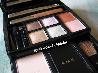
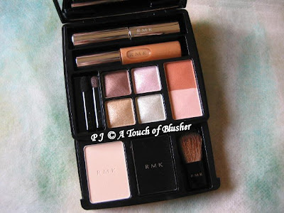
For the last few holiday seasons, RMK has brought out luxury makeup palettes that include items for eyes, cheeks, and lips. Today I am reviewing the 2008 version of the RMK Christmas Palette.

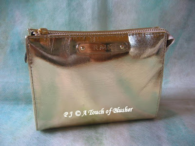
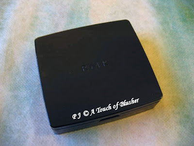
The holiday palette for this year is presented in a rectangular gold pouch with a chic metallic finish. The palette itself is black.


The palette includes four eyeshadows, a travel-sized mascara, a travel-sized lip gloss, face colors, and pressed powder. The pressed powder, powder puff and blusher brush are in the pull-out drawer on the bottom layer.

Eyeshadows

The three light shades (gold, pink, and green) are very sheer and mainly add (quite sparkly) shimmer to the eyes. The brown is less shimmery and a lot more pigmented. It can be a subtle eyelining shade or part of your smoky-eye look.

Face Colors

At first, I thought the coral-orange blusher would be too warm for my liking, but it goes on as a nice warm coral-pink that looks surprisingly natural. Both the blusher and the highlighter have shimmer. (The shimmer in the highlighter is more pronounced.)

Pressed Powder

It goes on luminously matte and has good pore coverage. However, compared with products like Kiss Mat Chiffon Powder and Lavshuca Face Powder in Lucent, it lacks shine control and will not suit those with oily skin.


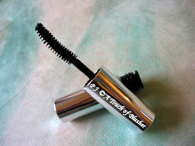
Separate Curl Mascara in 01 Black (travel-sized)

This waterproof mascara is part of RMK’s regular mascara lineup. The brush is slightly curled. For me, it creates more volume and definition rather than length. On my lashes, it doesn’t clump or smudge.


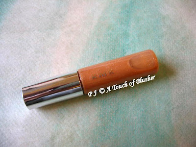
Gloss Lips in EX-11 (limited-edition shade, travel-sized)

This is a semi-sheer gloss with a hint of beige and should suit most complexions. It has very pretty multi-colored shimmer. As far as I remember, RMK’s lip glosses come with a brush applicator. This one has a sponge applicator.

Overall, this set creates a warm and glowy makeup look for the holiday season. How you use the pigmented brown eyeshadow will determine how dramatic the overall look is. If you have been thinking about trying items from RMK, this set (including the brand’s popular items like the mascara and Gloss Lips) is worth considering.

If you would like to see swatches and FOTDs of this palette, please head over here and here. Enjoy!

Related Posts:

Review: RMK Fall 2008 Collection

Can’t Live Without – RMK Cleansing Oil

Beauty City Guide – London

{ 2 comments }

(image from Shiseido)

For me, Japanese makeup is constantly innovative and progressive, and, on the whole, it is leading the rest of the field. Today I’d like to talk a little bit about the product development of point (color) makeup, and I’ll probably touch upon base makeup in a later post.

If you have been following Japanese cosmetics for the last decade, you will probably remember that, in the late 90s, a lot of the innovations were about creating lipsticks with a beaming watery shine. It was all about “gloss in a stick”. I still remember some ads from Shiseido PN featuring Arisa Mizuki with very glossy lips. The image you see above, from Shiseido PN’s spring 1999 collection, is what I remember the most from that period of time, and it really reflected what was then going on with Japanese makeup.

After the millennium, the development moved onto eyeshadows. The pigmentation level became more varied and there were more textures available (mousse, cream, liquid,…), both of which offered more choices for us. Also, the texture of the powder as well as blendability the staying power improved quite substantially. As far as trend is concerned, Japanese eyeshadows were getting more and more shimmery. They created dimension for the eyes, but it became increasingly difficult to find matte eyeshadows from Japanese brands. (It is almost hard to believe that Sofina’s Aube used to release eyeshadows that were completely matte.)

Now, we are back to lipsticks, as we have come full-circle within the last decade. While it was mainly about the finish ten years ago, it is now about the inner strengths. Major brands like Shiseido and Kanebo have been working on improving lipsticks’ moisture level and lasting power. Marketing-wise, lipsticks are often taking center stage as key items in seasonal collections, whereas, only a few years ago, they seemed almost secondary to all the eyeshadow palettes.

Lavshuca spring 2009 collection features
Dramatic Memory Rouge, which incorporates
“moisture wrapping oil” for continual moisture
and “fit stay oil” for lasting color
(image and info from www.nikkei.co.jp)


Unlike eyeshadows, I don’t think we are going to see a shift in the finish of lipsticks. (It seems that most Japanese customers still prefer moderately-pigmented lipsticks with a mildly glossy shine.) But we will hopefully be experiencing lipsticks that are even more lip-conditioning and with even better lasting power. So far I haven’t seen the drastic difference across major brands that I saw in eyeshadows (in terms of texture and staying power), but this is where the advancement of technology can potentially work its trick. We’ll see what happens.

Precursors of tomorrow:

Maquillage Lasting Climax Rouge

Coffret D’Or Full Styling Rouge Color

SUQQU Creamy Lipstick

{ 12 comments }

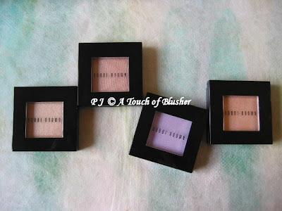
(Bobbi Brown Metallic Eyeshadows in (from left)
Gold Dust, Champagne Quartz, Lavender, and Gold Peach)


Bobbi Brown‘s Metallic Eye Shadows used to be limited editions for fall 2007, but they are now back as part of the permanent lineup. Today I am reviewing four from the seventeen shades in the range.


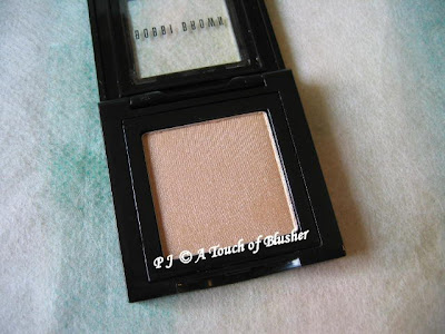
Gold Dust

All the three neutrals here are quite light and have a very metallic finish. Gold Dust is marginally the lightest of the three, and it also has the most yellow-gold undertone and looks the least warm. (I think this is what was used on the Bobbi Brown model for the Metallics Collection. Please refer to this post on Makeup Bag.) It offers more intense metallic shimmer than color, and it should work for most complexions as a good highlighter for the brow bones and the inner corners of the eyes.


Champagne Quartz (left) and Gold Peach

The two look very similar in the cases, and they have a similar peach undertone. (The both look warmer than Gold Dust). When applied, Champagne Quartz is the slightly darker one of the two and has slightly more pigment underneath the metallic finish.

Out of the four shades in this review, Champagne Quartz is the only one that can work as a shadowing shade (if you have a light complexion). The others are more for lighting up the eyes.


Lavender

Even though Lavender is in the Metallic Eye Shadow range, it looks more softly shimmery than metallic. I presume the metallic finish is dialled down purposefully for this shade, and I do like it better this way for lilacs. (I personally think shimmery soft lilacs look better on me than intensely metallic ones.) It is moderately pigmented, and the shimmer looks understated. This can work on its own or as a base to enhance the look for your other (darker) lilac/purple eyeshadows.

All the shades here have a smooth texture, although Lavender appears to be slightly more powdery than the rest. They are all easy to apply and blend, and the shimmery/metallic finish holds well overtime.

I have mentioned before that I tend to prefer softly shimmery eyeshadows to metallic ones. But after trying out Gold Dust and Gold Peach, I do think that, when applied on the immediate eye area, light metallic shades can work very well in brighting up the eyes and waking up the face.

(For those that have crepes in the eyelids, do be light-handed with metallic shades (especially very light ones), as they can make the lines look more obvious.)

For another review of the range (including Champagne Quartz, Lavender, and Cognac) and some lovely FTODs , do check out The Muse’s post on Musings of a Muse. For (very accurate) swatches of the Metallic Eye Shadow range, please visit Karla Sugar’s blog.

Related Posts:

Bobbi Brown Holiday 2008 Basics Eye Palette

Coffret D’Or 3D Lighting Eyes in Gold Variation

Lavshuca Summer Gradually Compact

Paul & Joe Eye Shadow in 05
(a soft (and slightly cooler) lilac)

{ 2 comments }

(image from www.suqqu.com/japan.html)

SUQQU‘s fall 2008 makeup collection, Kokoroiro – Himeaka (I very roughly translate it as “the mysterious red of the heart“), puts red on the center stage and shows what it can do for the eyes. For this season, many Japanese brands have come up with deep warm red eyeshadows, as we have seen in the lineups of Lunasol, Cosme Decorte AQ, and Magie Deco. Let’s now look at SUQQU’s red eyeshadow and some other items from the collection. (The second part of this review, which will focus on items for cheeks and lips, will be up next week.)


Dual Eyeshadow in 01 Koushi

I have mentioned before that the texture of SUQQU’s eyeshadows is among the smoothest and silkiest that I have ever come across. (The same description applies to SUQQU’s lipsticks.) The Dual Eyeshadow range is new to SUQQU, but the lovely texture remains the same.

01 Koushi is used for the print ad campaign (seen above). It includes a very pale warm beige (with mild shimmer) and a well-pigmented deep warm red (with subtle shimmer). The pale beige is quite sheer and can work as a base and a highlighter. The deep red actually doesn’t go on nearly as red as what you see in the ad. It is essentially a warm red-toned brown, with red as the main color of the subtle shimmer. It is also a lot more wearable than it looks. I find that it gives a very sensual look, which is not attention-seeking but still carries impact.

If you do want a deep-red shade for the eyes, this color might not be red enough for you. On the other hand, if you find most browns to be too greyish for your complexion, this neutral-with-a-twist is worth considering.

Dual Eyeshadow in 02 Chaki

This duo includes a very luminous and glowy off-white (which is more pigmented than the pale beige in 01 Koushi) and a well-pigmented medium-to-dark brown with subtle shimmer. I like the fact that the brown doesn’t turn ashy overtime and the richness of the color holds very well.

As shadowing shades, both the deep red-brown and the brown can be quite dark for those with light or light-to-medium complexions. (I tend to wear them quite close to the lashline.) But the shades can easily be blended into a smoky look if you want a more intensity.

For me, in terms of quality, SUQQU’s eyeshaows are some of the best I have come across. Regarding the dark shades, the well-pigmented powder works very efficiently, and a gentle dab of the brush into the powder picks up a lot of color. But when it comes to dispensing, the color is actually released very gently, evenly, and steadily. Also, the powder has what I call a fluffy adherence. During the application, the powder doesn’t stick too firmly on the lid, and layering and blending are wonderfully effortless. But once the application is completed, the finish lasts very well.


Eyelid Base

Currently available in one shade, this product works similarly to other eye-base products. However, because of its powder texture, it is applied after the (powder or liquid/cream) foundation. I also use it as a concealer elsewhere on my face after my powder foundation.

It has a matte finish with no hint of shimmer, but the light-reflective particles and the subtle coverage cancel out uneven skin tone and create a fresh canvas for the eyeshadow application. (It helps even out both redness and darkness, but I find it to be particularly useful in evening out redness). Even if you don’t wear eyeshadows, this product can help brighten up the eye area. (It can also be used in the under-eye area.)

However, I wouldn’t recommend this product if you have noticeable lines around the eyes, as this powder-type product can emphasize the look of them.

SUQQU’s makeup products used to be in white cases. When the brand brought out dark ones, I thought they were almost black at the very beginning. But they are actually in a deep violet shade, which I find beautiful, sophisticated and quite unique. I tried to capture the color of the case in the photo above. (The inner panels of the cases are black.)

On the other hand, some SUQQU’s cases are in dark red, such as those for the spring/summer 2008 base makeup collection.

I will return with the second part of the SUQQU fall 2008 review next week. Do come back!

Related Posts:

SUQQU Brand Profile

SUQQU Spring 2008 Collection

Foundation Face-Off: Chanel vs. SUQQU

{ 2 comments }

(CARGO Essential Eyeshadow Palettes)

CARGO‘s Essential Eye Palettes are part of the brand’s fall 2008 collection, which focuses on wearable basics for the eyes. Today I am reviewing two of the three neutral palettes from the collection.

Essential Eyeshadow Palette in Warm Neutral

The palette includes:
– sheer matte ivory
– sheer pale beige with moderate shimmer
– matte light brown with very sparse shimmer
– matte dark brown with sparse shimmer

The powder is very fine, goes on relatively easily, and lasts well. The two light shades are very sheer. The ivory smoothes out the skin rather than highlighting it, and the pale beige adds shimmer more than color. The two dark shades are well-pigmented and add nice depth to the eyes. The overall look is softly matte without looking chalky. This palette will suit those with light and light-to-medium complexions.

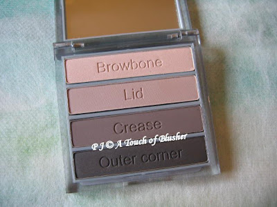
Essential Eyeshadow Palette in Cool Neutral

The palette includes:
– sheer pale beige with a subtly luminous finish
– light taupe with very sparse shimmer
– matte cool chocolate brown
– matte dark charcoal grey

The tones in this palette are generally a lot cooler. The shades for the crease and outer corner are also a lot darker, and the lid color here is slightly more pigmented than the one in the Warm Neutral palette above. Again, the finish is matte instead of shimmery. Overall this palette creates a more intense look and is a lot more suitable for evening makeup.

I personally prefer the Warm Neutral palette, since I tend to prefer medium neutrals to darker ones and I like slightly warmer neutrals better. The light brown crease color also suits me well. But if you have a medium or medium-to-dark complexion and prefer cooler neutrals, I would recommend the Cool Neutral palette.

More neutral palettes:

Coffret D’Or 3D Lighting Eyes in Gold Variation

RMK Fall 2008 Makeup Collection

Lavshuca Summer Gradually Compact

{ 6 comments }

(Clockwise from top:
Color Balancing Powder in Buttercup,
Satin Finishing Powder in Keiko,
Satin Matte Blush in Tulip,
Pearluster Eyeshadow in Taupe
Luminous Shimmer Eyeshadow in Aubergine)


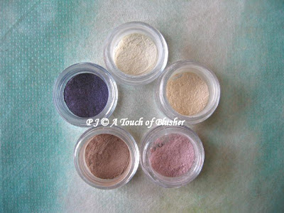
Among so many mineral makeup brands that have been trying to be part of the mineral movement, Alima is one of those that seem to have been noticed by many. Today I am reviewing its items for face, cheeks, and eyes.

Color Balancing Powder in Buttercup

It is supposed to work as a primer and is applied before the (mineral) foundation. It is available in tinted yellow, lavender, pink, and green. Buttercup is the tinted-yellow one, and I’ve tried applying it as a primer before my ZA Two-Way Foundation. The powder does have a little bit of coverage and evens out the complexion to some extend, which means my foundation does not have to work that hard. However, like many mineral items for the face, it can dry out my skin, which I can feel after I take my makeup off in the evening. I prefer using it as a setting powder after my foundation. The matte finish helps control the shine although it does not happen to have any noticeable pore coverage.

Satin Finishing Powder in Keiko

This is a fairly decent setting powder with a very softly luminous finish that doesn’t look shimmery. It is less matte and has less coverage than Color Balancing Powder but it has slightly more pore coverage. Keiko will suit light complexions.

Satin Matte Blush in Tulip

Tulip is another item that will suit light complexions. It is nicely moderately pigmented, unlike some other mineral blushers which are too densely pigmented and are difficult to work with. The finish looks very natural, but I think it might look ashy on darker skin tones.

Pearluster Eyeshadow in Taupe

Among all the mineral makeup items I have tried, I tend to like eyeshadows more than anything else. The two Alima eyeshadows I’ve tried continue the postive experience. (On the other hand, I think mineral foundations still have a lot of room for improvement in many respects.) Taupe has a very pearly and almost metallic shimmer. I usually wouldn’t go for such a finish, but, since this shade goes on only slightly darker than my skin tone without looking either too ashy/greyish or too bronze, the very pearly finish actually works fine for me. As a very subtle shading color, it gently adds depth to as well as brightens up my eyes.

Luminous Shimmer Eyeshadow in Aubergine

Aubergine is a deep violet that works well as a lining shade and it can also be used to create an intense smoky-eye look. It is quite shimmery but noticeably less pearly/metallic than Taupe, which I will take to be the difference between the two eyeshadow ranges. Some violet shades can go greyish in hours, but I am relatively pleased with how Aubergine’s color and shimmery finish last.

Overall, I think the eyeshadows are good items to try if you are interested in testing out the brand. The good things about Alima’s on-line shop are that small samples are available for purchase and that the color swatches seem fairly accurate (based on the items reviewed above). Also, you can check the ingredient lists of all the products, which is particularly useful if you have very sensitive skin.

Related Posts:

My “Mineral Makeup” category

ck Calvin Klein Subliminal Purity Mineral Based Loose Powder

Foundation Face-Off: Lunasol vs. Coffret D’Or

{ 4 comments }
(image from www.rmkrmk.com)

The Kanebo-owned RMK is the creation of Japanese makeup artist Rumiko. Its main consumer group includes those in their thirties and late twenties who tend to go for trendy colors with a sophisticated edge. For fall 2008, RMK’s ’80s Color collection places emphasis on neutral shades for the eyes and injects vibrancy into them. Today I am reviewing items from this collection.

(Jelly x Powder Eyes in 01 Natural Coral Beige
and 04 Silver Gold Beige)

Jelly x Powder Eyes in 01 & 04

Jelly x Powder Eyes is a new creation from RMK for fall 2008. Those familiar with RMK might know that the brand has been carrying Jelly Eye Color (available in 6 (mainly pastel) shades) for some time. For this season, new eye duos are created with one shade of the same (jelly) texture and another complementing powdery shade. (The jelly shade is on top and the powdery shade is at the bottom.)

The two shades in the duo are designed to be layered. The jelly shade goes on first as a base color and the powder is layered on top. As you can see, the base shade is not necessarily lighter than the powder shade. As with 01, 02, 03, and 06, the jelly shade is the main shadowing color and the powder adds a veil of shimmer.

01 (Natural Coral Beige, left in photo) and 04 (Silver Gold Beige) are the lightest two duos of the six, and both have a nice light-neutral finish that will flatter those with fair and light complexions. The coral in 01 Natural Coral Beige can look too orange when worn alone, but, paired with the pale beige, the overall finish is a delicate shimmery warm gold.

Both shades in 04 Silver Gold Beige are quite sheer, but the shimmery particles in the gold powder shade are larger and much more sparkly than those in the pale beige in 01. I think this would be a good duo for evening makeup, as it creates a sparkly pale gold finish that looks nice alone or over darker neutrals.

I really like the texture and the staying power of the jelly shades. They are dense but are very easy to apply. (A great way to apply them is simply to use the sponge tip (marked J as seen in the photo), which dispenses and blends the powder effortlessly.) They basically feel like a gently wet powder that quickly dries up to a smooth finish with an impressive staying powder. I strongly recommend using a cleansing oil or a bi-phase eye/lip makeup remover to remove them.

(Jelly x Powder Cheeks in 02 Soft Rose
and 03 Soft Coral)

Jelly x Powder Cheeks in 02 & 03

Again, Jelly Powder Cheeks are existing items, and RMK has come up with three new colors and paired a sheer powdery shade with each of them to create Jelly x Powder Cheeks. The jelly shades are easily applied with fingertips and the powder sets the color. The powder can also be applied slightly above the cheek bone to create definition for the face. (Both shades in the duo have shimmer.)

02 (Soft Rose) can look very dark (and almost too shimmery) when swatched on the back of the hand, but the finish is surprisingly natural on the cheeks and the shimmer doesn’t look obvious. (This is again a typical example of blushers from Japanese brands.) I usually use matte blushers and I can happily live with the subtle shimmer. The soft rose tone should suit most skin tones, and there is a natural transparency to the finish (as if the flush came from within the skin). 01 (Soft Coral) is my less preferred one, as it is a little too warm for me and does not have enough pink undertone to look natural.

Because of the creamy texture, I recommend putting on the jelly shade before your powder foundation or after your liquid/cream foundation.

(Irresistible Lips C in 22 Natural Rose)

Irresistible Lips C in 22

RMK revamped its lipstick lineup a couple of years ago and launched three ranges. With Irresistible Lips B as the core range, Irresistible Lips M offers a satiny-matte finish while Irresistible Lips C creates a natural watery shine. (I bought 03 (a bright neon pink) from the Irresistible Lips C range when it was launched. I might review it a bit later. Before that, you can catch a glimpse of it here.)

22 Natural Rose is a muted rose-toned red that looks very elegant and is a great shade for fall and winter. It goes well with neutral eyeshadows as well as plums and warm purples, which are very on-trend for fall 2008.

What I like about Irresistible Lips C is its controllable color pay-off. One layer gives an ultra-natural tinted look that softly unifies the lip tone, an extra layer instantly imparts more color and shine, and a third layer creates extra volume for the lips with rich color. Typical of lipsticks from Japanese brands, all the different degrees of color pay-offs offer the beautiful sense of transparency (with no overly opaque finishes). The color wears well and doesn’t dry out the lips. The added scent is unusual among Japanese lipsticks (which are usually scent-free), but I like the very light cassis scent, which is never over-powering.

Overall, I think this is a very wearable collection and the shimmery neutral-toned colors are far from boring. It is particularly worth looking into if warm neutrals are your type of eyeshadow colors, and you will find shades for cheeks and lips that go very well with them.

(RMK is currently available in Japan, Korea, Taiwan, Singapore, Thailand, Maylasia, Hong Kong, and Macau. UK is the only country outside Asia where RMK is available. Please check here for all the RMK retail points.)

Related Posts:

Can’t Live Without – RMK Cleansing Oil N

Japanese Beauty Brands in the UK

Beauty City Guide – London

{ 6 comments }