makeup – blusher

(Prescriptives Lip Strips in Techno Cool
& Blush More or Less in Thai Orchid)

Prescriptives’ spring 2008 collection, The Technotropics, features vibrant-looking but very wearable colors. Here I review two items from this collection.


Lip Strips
in Techno Cool (limited-edition)

This compact includes five lip glosses with mostly cooler pinks. (Tropical Warm features five warmer shades.) The darkest shade (second from the top) is relatively pigmented as a lip gloss while the rest four are quite sheer. The top shade has no shimmer, and the middle three shades have subtle shimmer. The bottom white-ish shade has a lot of quite sparkling shimmer, and the finish is too intensely shimmery for my liking. But the product design does allow the user to easily mix two or more colors together, particularly any two adjoining shades.

My observation of most lip glosses in this semi-solid form is that they don’t usually give a watery or glassy shine. The finish tends to be more of a luminous sheen, which sometimes can look a little oily. While the finishes of these glosses are more balmy than greasy, personally I’d prefer a more watery shine.

Blush More or Less Creamy Cheek Color in Thai Orchid

I find that the Prescriptive website seems to have quite an accurate description of the texture of this product. This cream blusher is described to have “the smoothness of a cream and the lightness of a mousse”. Indeed, this is not like most cream blushers which can feel a little greasy, and the texture is light and almost mousse-like. (But it is not as mousse-y or spongy as, for example, Maybelline’s Dream Mousse Cheek Color.)

What impresses me about this formulation is that the mousse-like texture makes blending very easy, which is particularly vital for a blusher. It dries to a smooth semi-powdery finish with very subtle luminosity. It has a fairly satisfactory staying powder.

Thai Orchid appears to be a very intense rosy red. But it can easily be worn with varying intensity and it looks very natural worn sheer.

Between the two items, I much prefer the blusher. But the lip compact, which is the size of a typical round foundation case, can be a competent space-saver during traveling and go with various eye and cheek looks if you enjoy the balmy finishes.

Related Posts:

Blushers:

Albion Eprise Water Cheek Color
(another non-powder formulation that works well)

Ayura Aura Veil α in Sweet Pink

(perfect for spring)

Lip Glosses:

Lunasol Full Glamor Gloss in Bright Pink
(one of my favorites)

Rimmel Underground Light Beam Lip Gloss
(natural watery sheen)

{ 4 comments }
(French graffiti artist Fafi at Henri Bendel)
(from www.nypost.com)

The Fari for MAC collection might have a bright and funky image with its fair share of vibrant colors. But, there are some very wearable shades and several bright-looking items that are not too difficult to work with. Even though the packaging is obviously targeted at a young audience, I feel that many shades have a more universal appeal.

Here are my favorites from the Fafi for MAC collection:

(Clock-wise from upper right:
Powder Blush in Hipness & Fashion Frenzy,
Lipstick in Fun ‘n’ Sexy & Strawbaby,
and Lipglass in Totally It)


My favorite items by far are the two blushers (Powder Blush in Fashion Frenzy & Hipness). Fashion Frenzy, my preferred one out of the two, has the kind of cool pink shade that I know would suit me. But because it is on the vibrant side and the blush is very pigmented, I do have to be very light-handed with it. (I also like the turquoise Fafi logo on the lid against the pink blusher.) Hipness initially appeared to be a peachy shade that might not suit me, but I was pleasantly surprised by its wearability as it turned more pink after a few hours’ wear. Both blushers have a fair lasting power.

Totally It is my favorite Lipglass from this collection. It is a bright pink with cherry pink and purple shimmer. Even though two of the other Lipglasses, Cult Fave and Sugar Trance, have more wearable shades, the shimmer is too frosty for my liking. On my lips, one sheer layer of Totally It actually looks relatively natural and this is how I’d wear it most of the time. With a second layer, the brightness of the pink really intensifies. Apart from the lovely pink and purple shimmer, I also enjoy the lasting shine.

The Lipstick in Strawbaby is a very wearable warm-rose with some delicate blue-green shimmer and should suit most skin-tones. On the other hand, Fun ‘n’ Sexy is a similar bright pink to the Totally It Lipglass with purple and bright pink shimmer.

I think the wearability of many items in the Fafi for MAC collection also appeals to some younger customers that have just started to experiment with makeup and want something easy to use. The Fafi Eyes palette in #1 is a very basic palette that would suit a beginner in makeup, and it actually reminds me of Chanel’s 4-color eyeshadow palette in Influences, which is one of the first eye palettes I bought. (The actual shades and finishes do vary, but the concepts are similar.)

(left: MAC Fafi Eyes #1;
right: Chanel Quadra Eye Shadow in Influences)


Despite MAC Paint Pots‘ rich colors and long-lasting quality, I am not really a fan of them. The colors are difficult to blend and none of the finishes featured in the Fafi for MAC collection (cream, satin, and frost) looks optimally flattering. This is a bit of a shame, because Rollickin’ and Girl Friendly could have potentially been shades I’d constantly reach for. (Rollickin’ is a turquoise with pale gold shimmer, which is better than the distracting yellow and green shimmer commonly seen in turquoise eyeshadows. Girl Friendly is a dusty rose-petal pink that is subtly elegant.)

Overall, the Fafi for MAC collection offers something for most people, from eye-catching lip shades to subdue neutrals for eyes. I still find it hard to like most of the packaging and the Fafinettes, but the two lovely blushers (which, for me personally, pleasantly don’t feature the Fafinettes) will potentially be very active members in my blusher family.

Related Posts:

MAC for A-Mei Collection
(perfectly in tune with her heritage)

Alexander McQueen for MAC Eyeshadow in Haunting
(loving this turquoise)

{ 12 comments }

(Albion Eprise Water Face Color in 100)

Before talking about my first ever Albion purchase, I’d like to briefly mention the brand itself.

Albion is one of the largest cosmetics brands in Japan. I have also occasionally come across passing mentions of Albion as a brand favored by the Japanese royalty. Few can really be sure of this, but it is true that Albion has always had a very upmarket image. [The Albion website is for information only and doesn’t offer on-line ordering.]

Albion’s most popular products are mainly skincare and foundation items. The Essential Skin Conditioner and Exage powder foundations are almost permanent fixtures on most best-selling and magazine readers’ favorite product lists.

One unique aspect of all Albion’s various skincare ranges is a creamy skin-softening emulsion that is applied in circular motion with a cotton pad before the toner and the moisturizer. The Albion sales assistants often remind customers that this moisturizer-like emulsion is not a moisturizer and that it is used to help the absorption of all the subsequent skincare products.

I have tried samples from Albion’s skincare routines but I personally didn’t enjoy using the skin-softening emulsions. They felt quite filmy on the skin and I didn’t feel like using any other product afterwards. Plus the circular motion during the application left my skin slightly red, not to mention that most of them had alcohol. (So do many of the toners.) But I am aware that some people swear by Albion’s unique skincare routines and can’t imagine using anything else.

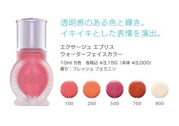
So, with Albion, their makeup ranges are much more suitable for me to get a taste of the brand. I had long been interested in trying out Eprise, one of Albion’s makeup ranges. (Albion’s website is completely in Flash, so do click on the Albion link above to find the Eprise line.) As someone that loves blushers, when I saw Water Face Color from the spring 2008 collection, I almost instantly decided that this would be my first-ever Albion purchase.

(Eprise Water Face Color)
(image from www.albion.co.jp)

This item still features alcohol, which is third on the ingredient list (after water and cyclomethicone (a kind of silicone) and before talc). But, since this is applied after my toner and daytime mosturizer/sunscreen (occasionally after a makeup base and/or a liquid foundation as well), it doesn’t irritate my skin.

The bottle is shaken before application. The blusher liquid has a watery consistency and glides with ease. (But this is not a cheek stain and has a slightly milkier consistency than a typical water-based cheek stain.) It is very easy to blend and layers well for more intensity. The finish is softly luminous and non-greasy, without any visible shimmer. After the blending is done, it almost feels as if the color came from within the skin.

#100 is quite a natural pink for me. It has a bouncy feel but doesn’t make my cheeks look overly flushed.

Another aspect that impresses me is that the color is very long-lasting. I usually use a powder foundation so this liquid blusher would go underneath it. There were twice when I had it on for about 12 hours, and the fading was very minimal and barely noticeable. I was initially slightly worried that, like a couple of cheek/lip staining items I tested, the color wouldn’t easily come off with a cleanser, but it came off swiftly and effortlessly with my RMK Cleansing Oil.

Overall, this is a very good blusher for me. A little goes a long way, so this 10ml liquid blusher will last a long time and create a lot of long-lasting rosy cheeks. I have a feeling that it won’t be long before I am interested in trying another makeup item from Albion.

Related Posts:

Chanel Irréelle Blush in Tea Rose
(one of my absolute favorites)

Boots No. 7 Cheek Colours
(home favorites)


Budget Princess: Majolica Majorca
(featuring two blushers from the line)

{ 16 comments }

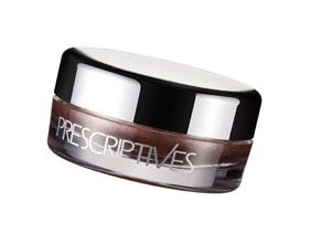
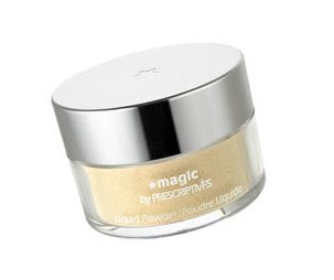
(Prescriptives Magic Liquid Powder in Red Neutralizer,
Creamy Eye Color in Moonstone,
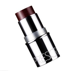
Plush Blush for Cheeks and Lips
in Ibiza Sunset (left) and Balinese Peach (right))


Here is the report of my latest Prescriptives trials. Please enjoy!

Creamy Eye Color in Moonstone

(Prescriptives Creamy Eye Color)
(image from www.prescriptives.com)


This product has quite a thick cream texture. It dries up very quickly upon application, so swift blending is vital. Moonstone is a white with a pearly sheen and some shimmering particles.

What impresses me the most is how the color and shimmer stay put. Once it dries, the color really sets on the lids. It doesn’t smudge or move. Also, with Moonstone’s bright hue, I am surprised to see that the finish stays fresh for hours. Throughout the day, it always appears that I’ve just put it on and there is very little fading.

Plush Blush for Cheeks and Lips in Balinese Peach and Ibiza Sunset


(Plush Blush for Cheeks and Lips)
(image from www.prescriptives.com)


On the Prescriptives website, this product is accurately described as providing “a sheer wash of dewy color” for the cheeks. The finish is indeed very sheer. Even for someone like me, who likes medium-to-sheer blushers, I think they are a bit too sheer. (The color won’t show very well unless you have a very light skin-tone.) What the product adds is mostly a dewy sheen to the cheek area. Used for the lips, they offer a semi-matte finish with a soft metallic sheen. Again, there is only a very sheer veil of color.

Balinese Peach has a slight tinge of warm pink, while Ibiza Sunset is a very sheer warm gold with a little more shimmer.

Magic Liquid Powder in Red Neutralizer

(Magic Liquid Powder in Red Neutralizer)
(image from www.prescriptives.com)

This product claims to minimize lines, pores, and wrinkles and to mute redness. For me, it doesn’t minimize pores. (It certainly doesn’t minimize my pores nearly as well as some of my other loose powder.) Also, it doesn’t neutralize redness. It does provide a golden sheen, which is supposed to even out redness. But, at least on my face, it doesn’t do what it is supposed to do. The powder mainly gives a bit of soft luminosity to the skin. For me, I’d like my loose powder to do more.

Part of the powder does melt in contact with skin and provides a pleasantly cooling sensation. Usually I use a powder puff to apply loose powder, but, with this, the application is much more successful with a fluffy powder brush.

Other Prescriptives Reviews:

Flawless Skin and AnyWear Foundations

Magic Illuminating Potion in Red Neutralizer, Better Off Fast-Acting Makeup Remover, and Site Unseen Brightening Concealer

Related Posts:

Lavshuca Face Powder in Lucent

(It has everything I want from a loose powder!)

Makeup Essentials: White Eyeshadows
(Brighten your eyes with them!)

Anna Sui Face Color Accent

(Beautifully packaged and gives you rosy cheeks.)

{ 0 comments }

A Touch of Boots No. 7 Blusher

by PJ on Thursday, January 24, 2008

in -Boots, makeup, makeup - blusher

(My two Boots No. 7 Cheek Colour:
Soft Damson (left) and Petal (right))
.

Apart from my lovely Boots points, another thing I love about Boots is that they regularly give out £5 vouchers to be used on a variety of brands (with a transaction over 10 pounds), which usually include No. 7. So, I often use my vouchers to stock up my No. 7 favorites and to try new items.

I got both of these blushers with my vouchers. The retail price is 7.5 pounds so I only paid 2.5 pounds for each of them.

I like the blushers from Boots No. 7 mainly because they are matte and because they are medium-pigmented. The two I have got, Soft Damson and Petal, are both very wearable colors.

(Left: Soft Damson; right: Petal)


I got Soft Damson first. It is a dusty pink that shows very well on my cheeks. It is a very nice shade with a sophisticated edge. But after I used it for a couple of times, I was thinking about getting a slightly lighter shade. So I got Petal, which is indeed like the shade of petals of a pink rose. This is a really flattering shade for me and I think I slightly prefer this to Soft Damson.

Another thing I like about No. 7 blushers is that the powder is nicely pressed. It is not pressed so hard that it is difficult to pick up the powder with a brush, and it is not too softly pressed that the brush can pick up too much powder and that the powder flies around. Also, the shape of the compact makes it very easy for the blusher to rest in the palm while I concentrate on using my brush and applying the color.

Overall, I like these two blushers and these are two more reasons why No. 7 is a wonderfully affordable and dependable line from the trusted Boots.

Related Posts:

No. 7 Gentle Renewing No Grains Exfoliator
(another of my No. 7 favorites…see how it actually works)

Chanel Irréelle Blush in Tea Rose
(one of my all-time favorite blushers)

Ayura Aura Veil α in Sweet Pink
(a cutie in my blusher world)

{ 4 comments }

(Ferro Ultimate Foundation)


Ferro Cosmetics is one of the many mineral makeup lines in the market today. I have been particularly interested to see if their Ultimate Foundation does create a matte finish and a medium-to-full coverage, which I personally look for in a foundation.


— Ultimate Foundation
(pictured above)


“Full coverage with matte finish” is what is stated on the packaging, so the stakes are high. Upon application, this foundation, out of all the mineral makeup foundations I have tried so far, is the only one that gives a truly matte finish. It is also the one that has the best coverage and the most convincing pore-diffusing property. (The medium-to-full coverage is more easily achieved with a dense flat-top brush, which, compared with a kabuki brush, also gets to the awkward areas around the nose and the eyes more thoroughly.)

However, while the matte finish does maintain for a couple of hours, one drawback is the finish later in the day. As my face gets oily, an unnatural metallic sheen starts to appear and it is hard to blot it completely off with my usual blotting paper.

This seems to be a general problem with mineral foundations. My observation is that the powder itself doesn’t really absorb facial sebum and that the sebum tends to float on top of the foundation. (But if you don’t have oily skin, then this might not be a concern.)

— Blushers

(Blusher in Bashful (left) and Pinkie Swear (right))


Bashful looks like a dusty pink in the container and it goes on as a nice cool pink. Pinkie Swear looks like a soft warm pink and it goes on with an orange undertone. While Bashful would be a good shade for me all-year-round, Pinkie Swear would probably be a wearable summer shade.

The powder is well-pigmented, so a tiny bit goes a long way. The finish is nicely luminous. The staying power is fair but I do wish it could be slightly better.

Eyeshaodws

(Eye Candy Pearl in Secret (left),
and Eye Candy Shimmer in February (right))

Eye Candy Shimmer in February is a very pretty lilac shade with noticeable shimmer and fine sparkles. A very trendy shade for spring 2008.

Eye Candy Pearl in Secret has a champaign hue with a pale skin-beige undertone. I think it is a good multi-purpose item. It is a great shade to be worn alone to brighten up the eyes. It can also be used sparingly in the immediate under-eye area for the same purpose. I also think this is a nice and subtle highlighting shade for the brow bone and the T-zone.

Both shades are quite well-pigmented and long-lasting. (As with other loose powder eyeshadows (mineral or non-mineral), the eye areas should be properly primed with enough moisture so the color shows up better and stays on longer.


— Bronzer


(Glow Bronzer in Glow Baby)

Glow Baby is a natural bronzing shade with a luminous finish for people with light and light-to-medium skin-tones. It can also be worn as a blusher for people who like beige-tone blushers. (A couple of other shades, like Spring Kiss and Autumn Kiss, are perhaps too orange for most skin-tones.)

Compared with the other mineral makeup lines that I have tried, I think the quality of Ferro is fairly good. I particularly like the two eyeshadows and the blusher in Bashful that I mentioned above. But, at the moment, I still can’t see myself switching to mineral foundations. They seem to share many traits that don’t go along with my oily skin. As a whole, they pale in comparison with many other non-mineral foundations that I have used. Only time will tell if there will be improvements in this particular aspect…


Other mineral makeup reviews:

Von Natur (Part One)

Von Natur (Part Two)

Erth Minerals

{ 10 comments }

(Chanel Irréelle Blush in 80 Tea Rose)

Merry Christmas everyone!

Today I share my thoughts with you about one of my favorite makeup items. Chanel’s Irréelle Blush in Tea Rose is undoubtedly one of my favorite blushers.
(I really like the Chanel Irrèelle items, and I have the eyeshadows (single and duo), bronzing/shading powder, highlighter, and this lovely blusher.)

Tea Rose was out in spring 2005. I decided to use my Boots points on this after I tested it at the counter for many times. Initially, it looked either a bit too pink or a bit too pale. (I don’t really like putting counter testers on my face.) But, after even more testing, I decided that this shade should look good on me. (This is the Chanel blusher I mentioned in the post where my friend thought I was hypnotizing the sales assistant, who gave me all the skincare samples I asked for.)

When I put this blusher on my face for the first time, it actually looked better than I thought, and I wished I had made my decision a little sooner. It is a sheer and delicate pink with an essentially matte finish and a very subtle luminosity. It looks very natural and the finish doesn’t appear chalky.

For my complexion, this blusher stands on a great position in the cool-warm spectrum, and this is usually the blush I go for when I want a soft and effortlessly natural look. (I tend to go for soft matte pinks just slightly on the cool side anyway, but this shade suits me particularly well.)

One small complaint about this blusher is that the powder seems almost too firmly pressed, and, after a while, my blusher brush is not really able to pick up the powder very well. So, even for a sheer finish, it needs a bit of building up. But, simply because of this, the look is almost always very natural, as the powder goes on a little bit at a time. So the finish is even and seamless.

The brush that comes with the compact is quite coarse and I never use it. I hope Chanel will improve this.

Overall I love this blusher, and this is the one I usually travel with. The compact is not the slimmest by far, but, for me, I can’t go wrong with the look it gives me. Plus, the pouch protects the compact from scratches. A win-win for me indeed!

Related Posts:

Lavshuca Cheek Color in PK-1
(another very delicate pink)

Ayura Aura Veil α in Sweet Pink
(a slightly warmer pink)

Anna Sui Face Color Accent in 400
(looks naughty, but surprisingly wearable)

Chanel: The Perfect Black
(my personal take on Chanel)

{ 6 comments }

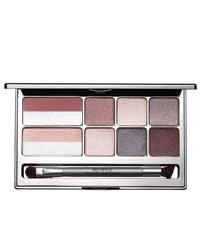
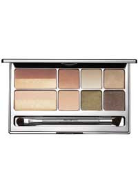
(Prescriptives Colorscope Refillable Palette
for Eyes and Cheeks in Cool)
(image from www.prescriptives.com)


Prescriptives has come up with two wearable and good-value makeup palettes for holiday 2007. The palette in Cool I am reviewing here includes six pink and plum-based shades for eyes and two shades for cheeks.

For the eyeshadows, I have categorized them into highlighting, main, and eye-lining shades:

Highlighting
Chiffon: cream white with pearlescent shimmer, suitable as a base or a highlighter

(Chiffon)


Main (from left to right/ light to dark) –
Shell: pale dusty pink with pearlescent shimmer
Hocus: light taupe with pearlescent shimmer
Aubergine: brownish plum with metallic shimmer

(Shell, Hocus, and Aubergine)


Eye-lining
Indigo: dark charcoal grey with minimal shimmer
Plum: brownish plum with minimal shimmer

(Indigo and Plum)


(Color-wise, Aubergine is almost as dark as Plum, but it has a lot more shimmer and, for me, it doesn’t bring much depth to my eyes as an eye-lining shade.)

The six shades blend well and can be easily coordinated to create simple and sophisticated daytime looks and intense evening looks.

Cheek Colors:
Petal: a matte warm pink
Highlighter Cool Light: a very pale pink with frosty shimmer

(Petal and Highlighter Cool Light)

Petal is a very wearable blusher shade. Highlighter Cool Light can be worn with Petal to bring a veil of shimmer to the matte finish of Patel. Another great way to wear this cheek highlighter is to layer it right on the center of cheeks to make the cheeks pop and to bring out the dimension of the face.

All the shades are quite well pigmented, with Highlighter Cool Light being sheer and shimmery. (These are all regular shades and not limited-edition ones. The silver stripes on the cheek colors featured in the palette in the top photo are spray-ons.)

The palette comes with a nicely big mirror. The limited-edition double-ended eyeshadow brush features a soft medium brush for eyeshadow application and a slightly slanted flat-tip brush, which is good for blending. You will need another brush to line your eyes with the darker shades.

The sizes of the eyeshadows and blushers are the same as the usual sizes they come in. The palette itself is refillable, so you can also add in your favorite shades to customize your own palette. (The slots for blushers will hold two eyeshadows each.)

The palette also comes in Warm:

(Prescriptives Colorscope Refillable Palatte
for Eyes and Cheeks in Warm)
(image from www.prescriptives.com)


Overall, the palettes offer good ranges of shades and further flexibility of customization. Retailed at 38 pounds in the UK, it is relatively good value considering all the shades are worth around 100 pounds when bought separately. This is also a good starter palette to consider if you are interested in trying wearable shades by Prescriptives.

Related Posts for Holiday 2007:

Lavshuca Christmas 2007 Makeup Palette

(cute and affordable)

DiorLight Jewelled Necklace
(sparkling with Swarovski crystals)

Paul & Joe Lip Gloss N
(perfect berry-red lip gloss)

{ 8 comments }

(Lunasol Contrasting Cheeks in #03 Light Orange)


Since its launch in 1999, Lunasol has been among my favorite brands. I love the good quality and the polished and sophisticated packaging and brand image.

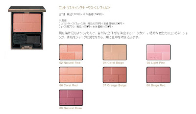
One of the Lunasol items I have is Contrasting Cheeks in #03 Light Orange. It is not peachy or coral. It is, as the name indicates, a soft light orange. (But this shade has actually been discontinued. You can see the currently available shades below.)

(Lunasol Contrasting Cheeks)
(image from www.kanebo-cosmetics.jp/lunasol/)


I suppose it is called Contrasting Cheeks because every shade comes in two finishes. The two squares on the top left and bottom right in the pan have shimmer, while the rest is basically matte with very little shimmer. When I use the blusher brush to sweep across the pan and apply the color, the finish is still predominantly matte. I can also use the shimmery portion on the center of the cheek areas to impart an accent glow, which adds a very subtle dimension to the cheeks.

I chose this shade because I had quite a few of pink-tone blushers and I wanted something different. After testing it at the counter, I found that it was relatively sheer and thought I could “work” this. Indeed I can. It gives a healthy sun-kissed glow and the color merges with the pink undertone of my face very well. It does not make my cheeks look too orange at all.

For me, this is more of a summery shade. But it is certainly natural enough to be used all year round. Another great member of my blusher family…

More touches of blusher:

AYURA Aura Veil α

Lavshuca Cheek Color

Anna Sui Face Color Accent

{ 0 comments }

(another of my favorite blushers)

AYURA is one of my all-time favorite brands and it would be the brand of my choice if I could only live on one cosmetics brand. I will certainly bring you more AYURA items one by one later on. (See the Japanese site for all the more current information and images of the products. Both sites, like most other websites for Japanese cosmetics brands, are for information only and don’t offer on-line ordering.)

AYURA Aura Veil α was out in spring 2006 to replace the previous AYURA blushers. It comes in four shades and mine is PK-11 Sweet Pink. It is a gradation blusher with the shade running from a light peach on the right to a soft coral pink on the left.

The blusher is fairly well-pigmented and with minimal shimmer.

I love the very understated and elegantly curvy packaging (which is always the case with AYURA products):

(the tulip-shape packaging)

There is a separate compartment for the brush. It is a good-quality brush and I can sometimes simply use this one to apply the blusher instead of my usual blusher brush. (The case/brush set is sold separately and the quality doesn’t disappoint.)

The blusher goes on the bottom layer:

The colors stay fresh, don’t darken overtime, and last well. They are girlie and playful shades that I enjoy using from time to time to create a warm complexion. Also, in recent issues of some Japanese cosmetics magazines, I have noticed that soft warm blushers like this are often used to accompany minty green eyeshadows to create a very fresh look. Overall, like Anna Sui’s Face Color Accent, it scores good points in many aspects!

Do have a look at my personal take on AYURA if you are interested.

More posts on my blushers later!!

Some of my other blushers:

Budget Princess: Majolica Majorca
(featuring two Majolica Majorca blushers)

Lavshuca Cheek Color in PK-1

{ 6 comments }