makeup – blusher

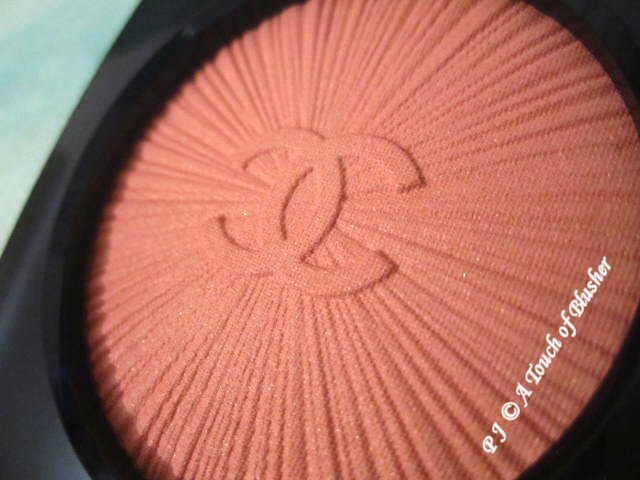
(Les Tissages de Chanel)
(image from www.iswii.net)

I came across some items I was looking forward to testing out in shops earlier this week, and here are my thoughts in brief. (I only tested them on the back of my hands, not on my face.)

Chanel (Les Tissage de Chanel)

Those of you who find the Irréelle Blush range to be too sheer might be interested in knowing that the powder of this new range is soft and more pigmented. Among the four shades available at the moment, Pink (seen above) and Rose are more of my shades. But Pink is a little too Barbie-pink for me (it is brighter than the color seen above) and Rose is a little too warm for me. Plus, all shades come with gold flecks (I prefer matte blushers). I personally still prefer the Irréelle range and Les Tissages de Chanel is now off my shopping list for the moment.

Even though they are priced at 29 GBP, which is expensive, I think the smooth texture and the shimmer should still tempt many people.

Paul & Joe (Moisturizing Foundation Primer)

As I was expecting, 01 and 02 seem similar to the previous versions (Foundation Primer N in 01 (reviewed earlier) and 02). I was under the impression that 03, the new shade, would be sheerer and more shimmery, but I wasn’t totally right. It goes on sheer, but it has more or less the same level of (subtle) shimmer as 01 and 02, which is good to know. It is supposed to further condition the skin without adding any color before your foundation and to help the foundation stay on longer.

However, even though the texture of all three shades are basically the same, 03 is formulated differently and has alcohol. It is a real shame. (I nearly decided to buy it.)

Laura Mercier (Eye Basics)

I tried Eyebright (light blue) and Cotton (off-white cream). I was delighted with the light and almost fluffy texture. It was very easy to blend and I was impressed by how quickly and firmly it set. Also, it didn’t seem to budge, even under a bit of rain. It does seem to be water-resistant, as the Laura Mercier website claims.

Bulgari (Jasmin Noir)

I like Bulgari’s Voile de Jasmin, and I was looking forward to the new Jasmin Noir. It is deeper and more intense, and it is more of an evening scent that is launched for the right season. It seems to be more complex than Voile de Jasmin and overall it feels less floral. It also smells far less of jasmine than Voile de Jasmin, which I think I like a lot better. (By the way, Harrods was launching B de Boucheron in the fragrance hall. I didn’t like it enough to want to buy it, but to me it was quite appealing.)

You can read more about both Jasmin Noir and B de Boucheron on Now Smell This. (It seems that the reviewer also thinks Jasmin Noir’s jasmine note is faint.)

Related Posts:

Chanel Irréelle Blush in Tea Rose

Paul & Joe Fall 2008 Base Makeup Collection

Bulgari Eau Parfumée au Thé Vert

{ 0 comments }

(It’s more than just A Touch of Blusher, it seems…)

One of the things I try to do on my blog is to share my thoughts on beauty items from both East (mostly Japan) and West. Today I’ll be talking about blushers and, specifically, how pigmented western and Japanese blushers tend to be.

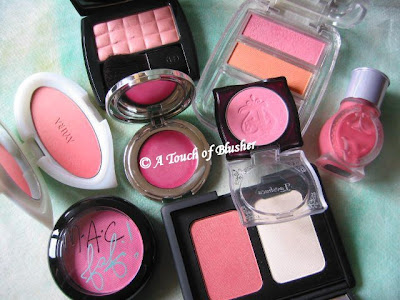
Very generally, there seems to be a wider range of pigmentation levels in blushers from western brands than in Japanese brands. For example, among the ones you see in the photo, Chanel’s Irréelle Blush is quite sheer, while the ones from MAC and NARS are very pigmented. Japanese blushers, like those from Majolica Majorca, Lavshuca and AYURA, are more towards the sheer side.

One of the reasons seems to be that many western makeup brands cater to a wide variety of skin tones (in terms of dark/light as well cool/warm). On the other hand, most major Japanese brands are either sold locally in Japan or within East Asia where there isn’t such a wide range of skin tones. I think people with darker skin tones will find that some blushers from Japanese brands are simply too sheer and don’t really show up on the skin.

Another reason, I think, is that Japanese customers seem to see the role of blushers slightly differently. This is reflected by the fact that some Japanese brands either categorize blushers as part of base makeup (along with primers and foundations) or release new blushers along with new base makeup items.

In most cases, for them, and many customers in Asia, blushers, when worn, just like foundations or concealers, are not to be seen. Like a freshly powdered face that should look ultra-natural (which is something Japanese base makeup excels at), blushers should simply make the face look healthy and slightly flushed, and nothing more. I think this is the main reason why most Japanese blushers are softly pigmented with relatively basic but natural colors. (The shade range is often small.) Even though some of them have shimmer, they still look natural and glowy, not glittery.

But there are of course exceptions. The shimmery particles in Canmake’s Loose Cheek are bigger than the norm in Japanese cosmetics and I think it definitely appeals more to a younger consumer group. (Many thanks to my friend Lynn for having me try this item.) Also, as Shu Uemura has been a professional beauty brand available globally, its blusher range features a very wide variety of shades.

I think, overall, I have been enjoying using Japanese blushers more. It is much harder to go wrong with the shade choices, mainly because most shades are quite natural anyway and they are not that pigmented. Also, since I can be quite heavy-handed at times, I tend to find it easier to apply blushers from Japanese brands. Even for someone like me, who likes to wear blushers relatively sheer, I can still enjoy the fun of slowly building up the color intensity to the level I want.

What about you? Have you tried blushers from both sides of the world? What would be your verdict?

Blushers featured in the photo above:

From Japanese brands-

Majolica Majorca Cheek Customize in PK333 and OR211

Lavshuca Cheek Color in PK-1

AYURA Aura Veil α in Sweet Pink

Albion Eprise Water Face Color in 100

From western brands-

Chanel Irréelle Blusher in Tea Rose

Fafi for MAC Powder Blush in Fashion Frenzy

Prescriptives Blush More Or Less Creamy Cheek Color in Thai Orchid

NARS Highlighting/Blush Duo in Albatross/Torrid

{ 16 comments }

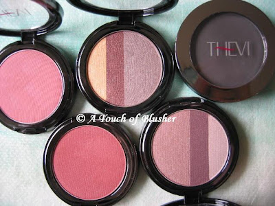
(From left: Sheer Matte Blush in Touch of Plum and Sheer Rouge,
Triple Split Shadow in Bistro and Venice,
Matte Eyeshadow in Charcoal)

The recently launched Thevi Cosmetics aims to provide makeup colors that suit people of all skin tones, particularly those with darker complexions. However, for those of you that have a fair skin tone, you can benefit from some of these items that I am reviewing below if you usually go for well-pigmented makeup items.

Triple Split Shadow (in Bistro and Venice)

Both trios include a highlighter, a shadowing shade and a lining shade. Upon looking at the colors, I thought Venice, with what appeared to be a muted medium beige pink, would suit me better than Bistro. But I was wrong.

The two shadowing shades in the trios are moderately pigmented and have a soft and flattering shimmery finish, but they go on warmer than they look. The beige pink in Venice goes on too warm for me, but the greyish-looking beige in Bistro doesn’t show up greyish on me and the soft beige-brown finish looks very natural.

The highlighting and lining shades in Bistro are very well pigmented, and the gold highlighter has quite a metallic finish. The deep brown and pale beige pink in Venice, on the other hand, seem uncharacteristically sheer.

Matte Shadow (in Charcoal)

I find this to be a great multi-purposed item. It is a good matte eyeshadow if you want the classic smoky-eye look. It can go on sheer as a light grey or heavier as a very dark grey. The silky powder is also suitable for lining the eyes and, again, the color intensity is adjustable. I also use it as a brow powder since I have black hair and brows (and need a brow powder that is grey-based rather than brown-based). A light-handed application can create defined but natural-looking brows. (In comparison, this shade is greyer than Medium Ash in Anatasia’s line reviewed earlier.)

Sheer Matte Blush (in Touch of Plum and Sheer Rouge)

“Rich” and “vibrant” are accurate descriptions of these blushers on Thevi’s website, as these are not “sheer” (as the name suggests). The matte Touch of Plum is a rich warm pink (which looks darker than it does on the photo above), while Sheer Rouge is even darker and warmer and has a hint of shimmer.

Both are very pigmented and have a pleasant texture. I think the finish is what Thevi sets out to achieve, as I’d imagine they can really show up on and complement darker complexions. (I have a light-to-medium skin tone, and I have to be very light-handed with them.) Overall they are worth a look if rich pigments in blushers are what you are looking for.

(Note on packaging: All Thevi’s eyeshadows and blushers are housed in very sleek and compact cases. But some of the lids are quite tight and I think they can be hard to open for people with long nails.)

Related posts:

Makeup Review: NARS

Coffret D’Or Trance Deep Eyes in Rose Variation

Lavshuca Summer Gradually Compact

{ 6 comments }

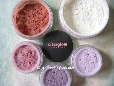
(Clock-wise from top-right:
Setting Powder in Translucent,
Eyeshadows in Pixie, Velvet, Gift,
Blush in Smitten)

Today I am bringing you another review of mineral makeup, this time from Afterglow Cosmetics. (Check here for the US website.)

Setting Powder (in Translucent)

This is a loose powder for setting your foundation. It is not totally translucent as the name of the shade suggests, as the white powder does have a bit of coverage. If you have darker skin tones, this might leave a white cast on you. On the other hand, if the foundation you are using is a little too dark for your complexion, this setting powder can be of some help.

This matte powder is fairly good in controlling shine, but it has little efficacy in covering pores.

Eyeshadows (in Velvet, Pixie, and Gift)

Velvet is a medium-to-dark warm purple, Pixie is a pale lilac, and Gift is a medium-to-warm muted pink. Velvet is slightly too dark for me as a shadowing shade, so I pair it with Pixie and use it as a lining shade while Pixie gently lights up the eyes. But my favorite shade among the three is Gift, which is a wearable pink and a nicely subtle shadowing shade for daytime.

All the three colors have sparse shimmering particles over a predominantly matte finish. While I like the softly matte finish, which doesn’t look too heavy or chalky, I feel that the shimmering particles look a little flat and they are slightly too big to go with the matte finish of the colors themselves.

Also, they are not very easy to blend, which is particularly problematic for the darker Velvet, but the saving grace is their satisfactory staying power.

Blush (in Smitten)

Afterglow’s (UK) website describes Smitten as a “cool medium pink with matte finish”, which doe not seem accurate. According to the photos on-line, Smitten does seem to be on the cooler end of the brand’s blushers, but the shade itself is definitely not a cool medium pink. It is a very warm peach with a slightly dark brick-red undertone. But it is indeed matte as described.

It is very pigmented, so make sure that you apply as little of it as you can and gradually build it up. The staying power is as good as the eyeshadows. If you like warm-toned heavily pigmented blushers, then those from Afterglow might be worth your consideration.

Like many other mineral makeup lines, Afterglow’s items can potentially be ideal for people with sensitive skin. (Full ingredient lists are available on the US website.) However, it would be great if the brand could work on the finish of the eyeshadows as well as come up with a couple of cool-toned blushers to suit more skin tones.

Other mineral makeup reviews:

Von Natur (Part 1 and 2)

Erth Minerals

Ferro Cosmetics

{ 2 comments }

Update: Les Tissages de Chanel

by PJ on Tuesday, July 15, 2008

in -Chanel, makeup, makeup - blusher

My post on Chanel’s new blusher range, Les Tissages de Chanel, has been updated to include a new image to show the textured look of the product. Have a look!

{ 0 comments }

Les Tissages de Chanel

by PJ on Thursday, July 10, 2008

in -Chanel, makeup, makeup - blusher

(Les Tissages de Chanel)
(image from i-voce2.com)

First of all, I know this is a tiny image, but I managed to find a post on bellezapura.com where you can see larger ones.

One of my favorite blushers is Chanel’s Irréelle Blush in Tea Rose. I love its shimmer-free and satiny matte finish, and Tea Rose is an ultra-natural shade for my light-to-medium complexion. The new range of blushers, Les Tissages de Chanel, is inspired by how tweed is brought into high fashion by the House of Chanel.

As a blusher person (obviously…), I have a feeling that one of them will end up on my dressing table as soon as this range is out…

Updated on July 15, 2008:

Another image of Les Tissages de Chanel:

(image from www.iswii.net)

Related Posts:

The Perfect Black – Chanel

Chanel Quadra Eyeshadow in Stage Lights

Chanel Irréelle Eyeshadow Duos

{ 2 comments }


NARS always has a chic and fashion-forward image and a wide range of shades to go with it. Today, the review focuses on how well some of the brand’s warmer shades perform.

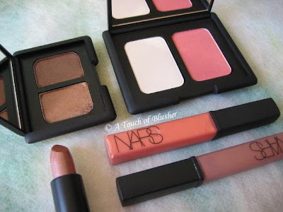
– Lip Glosses in Supervixen & Sunset Strip

Supervixen (bottom right) is a cool medium brown. It appears to have a very subtle mauve undertone, but it doesn’t show on the lips. Sunset Strip is peachy tangerine that is slightly more pigmented than Supervixen and has a frostier finish. Both have very subtle multi-colored shimmer.

Their texture is on the dense side and they don’t glide as easily as many other glosses. Also, if you like a very glossy finish, it will take a bit of layering. One layer gives a subtle sheen, two layers create a mild shine, and it takes three layers to achieve a full and glossy look. But, once applied, the staying powder is fairly good.

– Lipstick in Viva Las Vegas

Viva Las Vagas is a moderately pigmented warm brown with a bronze undertone. It has a very frosty finish that I rarely like, as I find that it often makes the lips look dry and can accentuate lip lines. (I tend to go for lipsticks with a soft satiny finish or a slightly wet/moist look, and I prefer minimal shimmer to intense metallic/frosty shimmer.)

I once tried laying the brown-toned Supervixen Lip Gloss on it (to take away the frosty finish), and I find that they actually work very well together. Shade-wise, they complement each other. Also, one layer of the gloss over the lipstick instantly creates a glossy finish. Even though the finish is very rich and luxurious, I would often prefer to have one product that does the job instead of two as I tend not to layer too many products on my lips.

– Duo Eyeshadow in Kalahari

Kalahari creates quite a sultry neutral look. Before I used the duo for the first time, I thought the shade on the left might be a little too dark for the lids. But I was surprised that, even though it is indeed darker than the neutrals I would go for, it is still natural and not overly heavy. The neutral brown (neither too cool or too warm) has a very subtle rose-gold iridescence and the overall finish is softly shimmery and flattering.

The slightly darker shade on the right is much warmer and has a more metallic finish. I wear it close to the lash line as a very subtle liner. Both shades have a very soft texture, while the darker shade seems particularly silky and has an effortless glide.

– Highlighting/Blush Duo in Albatross/Torrid

Albatross, the highlighter shade, has a metallic sheen, and I find that it is too metallic as a highlighter for the face. Even when it is very lightly dusted onto the skin with a fluffy brush, it can still make pores (and possibly fine lines) appear more obvious. However, with a soft gold undertone, it can work as a base for warm-toned eyeshadows.

Torrid is a warm-red blusher. In the container, it looks quite shimmery, but the gold-toned shimmer doesn’t look apparent when worn and the satiny finish looks natural on the skin. For me, it is a fairly wearable summer blusher and I think it will suit people with a warm complexion very well. (I tend to wear neutral-to-cool pinks, and this warm-red is probably as warm (and red) as I would go.)

Overall, I think the powder-based products here perform better. They have a very good texture and stay on well. The various finishes of the products reviewed above might not suit everyone, particularly the very metallic lipstick and highlighter. If you are planning to try out items from NARS, I would suggest looking especially into the finishes to make sure that they are flattering for you.

(
All the products reviewed above are fragrance-free.)

Related Posts:

Coffret D’Or 3D Lighting Eyes in Gold Variation

Dior Golden Dior Makeup Jewel


Lavshuca Summer Gradually Compact

{ 0 comments }

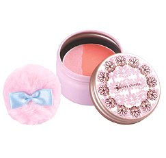
(Sony B&C Laboratories
Love Clover PonPon Cheek PC N)
(image from woman.excite.co.jp)

Love Clover, like Makemania and Vecua, is a Japanese beauty brand co-owned by Sony. The drugstore brand has a very young and girlie feel.

Love Clover currently features two adorable-looking blushers, PonPonCheek N and PonPonCheek PC. On June 5th, the brand released PonPonCheek PC N, which is a two-toned blusher. It is available in 4 shades.

Love Clover is a brand that I have been interested in but haven’t bought from. I will certainly share my thoughts on their products if I pick up some later!

Related Posts:

My Makeup Shopping List for Japan
(featuring Love Clover and other brands)

Maybelline Dream Mousse Blush

Albion Eprise Water Face Color

{ 4 comments }

(Dior Golden Dior Luminizing Makeup Jewel)

As I mentioned yesterday, I got the Golden Dior pendant. At my local Boots Dior counter, the summer 2008 display was not out yet. But, to be honest, since this would be strictly a collector’s item for me (which I probably will never use), it didn’t really matter. (I also trusted Dior’s packaging enough to not have seen the actual pendant before buying it.) I picked Lamé Pink, one of the two shades available in the UK.

Let’s see the name on the outer packaging, which pretty much shows what this item is for:

Golden Dior
Luminizing Makeup Jewel
(Bijou Enlumineur D’Été)
Touch-on Luminizer for Eyes, Cheeks, and Lips
(Enlumineur Crème Yeux, Joues, Lèvres)
156 Lamé Pink
(Rose Lamé)

(Please note that this shade might not be available globally. 166 Lamé Gold (Or Lamé) is the shade sold in North America.)

This is a multi-purposed item that you can use wherever you want. On the look of it, Lamé Pink is a warm pink with frosty gold shimmer. (I will update this post when I have a chance to play with the testers.)

Today we will focus on the packaging. There are two things I particularly like about this pendant. First, the dark surface makes fingerprints less apparent. Usually, Dior’s limited-edition items have reflective silver or gold finishes throughout which make fingerprints very visible. But, with this one, I worry less about it.

Also, the pendant has a nice thickness, which I didn’t expected. It gives a more substantial look to it.

Here are two photos of the interior of the pendant and the shade of Lamé Pink:


I like the inside of the pendant as well, especially the shape of the mirror, which goes with the overall design.

At the moment, I am liking it more than I thought I would. It is less blingy and has a slightly more understated look, but it is bold enough not to look boring. Even though it cost me 3900 points on my Boots Card (it retails for £39), it was worth it.

Related Posts:

How I Get Dior “For Free”
(including Golden Dior)

DiorLight Jeweled Makeup Necklace
(from holiday 2007)

DiorLagoon Eyeshadow Duo
(the perfect turquoise)

{ 18 comments }


Maybelline Dream Mousse Blush
(in 04 Mauve) was the first Maybelline item that I bought in quite a long time. (I later bought the Dream Mousse Eye Color in Divine Lilac and Fabulous Turquoise, which I have reviewed.)

When I tested this in the shop, I was impressed by the natural and almost transparent finish and the wearable color. 04 Mauve is a soft medium pink. The finish is quite sheer, which I like, but it can be built up to a slightly more intense finish with minimal efforts.

It has some pink and pale gold shimmer. But it is fine and sparse enough so it doesn’t bother me.

Apart from the wearable shade for my skin-tone (light-to-medium with a slight pink undertone), what I really like about this blusher is the texture. The mousse-like texture is light and almost spongy, and it makes blending very easy. The formula is mainly silicone-based, which explains the velvety feel the blusher dries up to.

The only drawback is that the staying power is not the most impressive that I have experienced. However, touching up is easy, provided that my hands are clean of course.

(My face can get oily during the day. Even after blotting out the shine, I usually still find it hard to use a powder blusher to touch up and get a fresh and pristine finish. The powder sinks in too quickly to be blended evenly. It is much easier for me to use a liquid/cream/mousse based blusher for touch-ups. (Apart from silicones, one of the main ingredients in this blusher is jojoba oil, which contributes to the good slip.)

Overall, this is a fuss-free blusher that is easy to apply and gives a very natural glowy finish. A good value for money for sure if this is the kind of finish you want.

[The names given to items in the Maybelline Dream Mousse line are different from those in the US. It appears that the shade I have is named Soft Plum (#40) in the US.]

Related Posts:

Blushers that are also relatively affordable:

Lavshuca Cheek Color in PK-1

Boots No. 7 Cheek Colours in Soft Damson and Petal

Majolica Majorca Cheek Customize in PK333 & OR211

{ 16 comments }