My post on Chanel’s new blusher range, Les Tissages de Chanel, has been updated to include a new image to show the textured look of the product. Have a look!
{ 0 comments }
Makeup, Skincare, Fragrance and a Bit of Fashion
My post on Chanel’s new blusher range, Les Tissages de Chanel, has been updated to include a new image to show the textured look of the product. Have a look!
{ 0 comments }
 (Les Tissages de Chanel)
One of my favorite blushers is Chanel’s Irréelle Blush in Tea Rose. I love its shimmer-free and satiny matte finish, and Tea Rose is an ultra-natural shade for my light-to-medium complexion. The new range of blushers, Les Tissages de Chanel, is inspired by how tweed is brought into high fashion by the House of Chanel.
As a blusher person (obviously…), I have a feeling that one of them will end up on my dressing table as soon as this range is out…
Updated on July 15, 2008:
Another image of Les Tissages de Chanel:
Related Posts:
{ 2 comments }
 (part of Chanel’s fall 2008 collection)
Chanel’s fall 2008 collection is Peter Philips’ first creation since he took over the role of Chanel’s creative director of makeup in January 2008 from Dominique Moncourtois and Heidi Morawetz.
Gold takes center stage in both collections, and part of the fall 2008 collection (out in July) includes:
– Gold Fiction nail polish
– Facettes D’Or (gold loose powder)
– Gold Light Glossimer lip gloss
Part of the Chanel Holiday 2008 collection (out in October) includes:
– Poudre Precieuse Or (gold highlighting powder)
– Gold Shine Glossimer lip gloss
– Haute Chocolate nail polish (brown gold nail color)
(The WDD article has more information on the two collections.)
I have to say that if I had got to know about these two collections a month ago, I would probably have had virtually no interest at the time. But, interestingly, I just got Dior‘s Golden Dior pendant yesterday. Also, perhaps slightly more relevantly, after weeks of going back and forth in my mind, I decided to get another Coffret D’Or 3D Lighting Eyes palette (in Gold Variation) earlier this month (which I adore).
(I will bring you the Golden Dior pendant tomorrow and the Coffret D’Or palette in a couple of weeks’ time. Do come back!)
Personally, the shades we see in the photo above are a little bit on the warm side for me, and they are not the shades I’d go for at the moment. (But it does remind me of my own Chanel Ombre D’Eau in Bay.) Nevertheless, I look forward to seeing the full lineups in July and October and having some good testing at the counter…
Related Posts:
The Perfect Black – Chanel
(my personal take on Chanel)
Chanel Irréelle Blush in Tea Rose
(one of my favorite blushers)
Chanel Mat Lumière
(against SUQQU Powder Foundation Glow)
{ 8 comments }
Chanel’s Quadra Eye Shadow in Stage Lights is perhaps the softest (in terms of color) and the sheerest lilac eye palette that I’ve had so far.
– Top left: white with substantial pearly shimmer
– Top right: pale lilac with soft shimmer
– Bottom left: medium lilac with soft shimmer
– Bottom right: a very pale pink with substantial pearly shimmer
Stage Lights is part of Chanel’s spring 2006 collection. While I distinctively remember liking the look of this, I had no intention of buying it at the time. My minty-green-and-turquoise phase was just about to start back then, and I picked up the Irréelle Duo in River-Light later that year.
My lilac phase started later that year and this palette was under the radar several months ago. After testing the shades many times recently and seeing the colors under different lighting conditions, I decided to have it.
The colors go on lighter than they appear in the container. Initially this was one of my reasons against buying it, but then I thought the soft and gentle finishes are great for a barely-there veil of lilac for the eyes. Also, I like the fact that the two lilacs and the pink are on the cool side and that they look more flattering on me than warmer ones.
Compared with many other eyeshadows from Japanese cosmetics brands, the texture of Chanel’s baked eyeshadows can be a little dry and the pigmentation level would disappoint many people. (The Irréelle range seems to fare better on these.) While a smoother texture would be more ideal, I don’t do a lot of layering for a daytime look so the sheerness is not a negative attribute. Obviously this palette can be worn wet for added intensity, but I simply reach for my other lilac palettes for that.
When I finally got to try 4 Fleurs de Chanel, things I heard were confirmed. They are essentially white eyeshadows with various undertones (blue, lilac, and pink). While I do think the texture is very smooth and that the shimmer is quite intense but still sophisticated, I have no intention to buy it. I am still very happy with my Stage Lights.
Although, among all my lilac eye palettes, it does not rank as highly as my Coffret D’Or or Lunasol, the fact that the tones of the two lilacs are also spot-on for my skin-tone is enough for me to go back to it from time to time.
[A reader kindly reminded me that I didn’t actually describe my skin-tone in the last paragraph of my review. I have a medium-to-light skin-tone, with a pink undertone. The foundation I have been using in the past few years is ZA Two-Way Foundation in 22. It has a slight yellow undertone and I use it to neutralize my pink undertone. With foundation on, I would still describe my facial skin-tone as having a very slight touch of pink undertone.]
Related Posts:
Spring 2008 Makeup Trend Report
(not just about lilac…)
Jill Stuart Brilliance Eyes in Gem Amethyst
(diamond-dust shine)
Kanebo T’Estimo Frame Impact Eyes
(discontinued but not forgotten)
{ 16 comments }
I have always liked Chanel’s Irréelle range. The powder is delicately pigmented, and the texture is silky smooth and easy to work with.
I bought Désert-Rose when the Irréelle Duo range was launched in fall 2005. It is a very wearable basic duo. The pink goes on subtly and has peach and gold undertones. The chocolate brown is a nice shade for lining the eyes. Both have exceptionally fine multi-color shimmering particles. This is a great duo to be used alone or with other items to create a soft daytime look.
I bought River-Light (out in spring 2006) during the summer of 2006. (That summer was all about finding the nicest minty green and turquoise. More discoveries from that era later on my blog…) Overall this duo is slightly more matte than Désert-Rose. The minty green on the left is quite sheer and is noticeably less shimmery than the pink in Désert-Rose. It goes on with a very slight touch of pale blue undertone, which makes this shade very appealing to me. The beautiful light turquoise on the right doesn’t have any distracting yellowish shimmer seen in many other turquoise-based eyeshadows. This duo can be very suitable for people who haven’t tried turquoise and want to start with a more delicate turquoise hue.
I love both duos equally, but I use Désert-Rose much more often since it is very naturally flattering and easy to use. On the other hand, I reach for River-Light when I want some gentle vibrancy for my eye makeup. (Even when I am not using it, the two soft green/turquoise shades are simply beautiful to look at in the case……)
Related Posts:
Chanel Irréelle Blush in Tea Rose
(one of my favorite blushers)
Spring 2008 Makeup Trend Report
(featuring Chanel’s spring 2008 collection)
Chanel Ombre d’Eau Eyeshadow
(A joint report with Beauty Anonymous)
The Perfect Black: Chanel
(my personal take on Chanel)
{ 6 comments }
Tea Rose was out in spring 2005. I decided to use my Boots points on this after I tested it at the counter for many times. Initially, it looked either a bit too pink or a bit too pale. (I don’t really like putting counter testers on my face.) But, after even more testing, I decided that this shade should look good on me. (This is the Chanel blusher I mentioned in the post where my friend thought I was hypnotizing the sales assistant, who gave me all the skincare samples I asked for.)
When I put this blusher on my face for the first time, it actually looked better than I thought, and I wished I had made my decision a little sooner. It is a sheer and delicate pink with an essentially matte finish and a very subtle luminosity. It looks very natural and the finish doesn’t appear chalky.
For my complexion, this blusher stands on a great position in the cool-warm spectrum, and this is usually the blush I go for when I want a soft and effortlessly natural look. (I tend to go for soft matte pinks just slightly on the cool side anyway, but this shade suits me particularly well.)
One small complaint about this blusher is that the powder seems almost too firmly pressed, and, after a while, my blusher brush is not really able to pick up the powder very well. So, even for a sheer finish, it needs a bit of building up. But, simply because of this, the look is almost always very natural, as the powder goes on a little bit at a time. So the finish is even and seamless.
The brush that comes with the compact is quite coarse and I never use it. I hope Chanel will improve this.
Overall I love this blusher, and this is the one I usually travel with. The compact is not the slimmest by far, but, for me, I can’t go wrong with the look it gives me. Plus, the pouch protects the compact from scratches. A win-win for me indeed!
Related Posts:
Lavshuca Cheek Color in PK-1
(another very delicate pink)
Ayura Aura Veil α in Sweet Pink
(a slightly warmer pink)
Anna Sui Face Color Accent in 400
(looks naughty, but surprisingly wearable)
Chanel: The Perfect Black
(my personal take on Chanel)
{ 6 comments }
Two major makeup trends for spring 2008:
– blue eye colors
– lilac eye colors
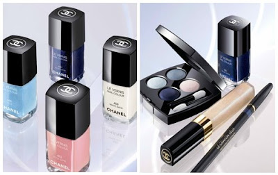 (part of Chanel’s spring 2008 collection, Aurora Blues Accent)
(images from Bjooti.Net)
The new Chanel eyeshadow palette, Les 4 Ombres in Blue Cèlestes, includes a dark cold blue and a pastel blue. It also features grey, which is carried over from the makeup trend from fall 2007. The collection has a distinctive look, but I personally feel that it lacks a bit of warmth.
Givenchy‘s new denim-themed spring 2008 collection, Denim Fétiche, is also blue-oriented, right from the packaging to the shades.
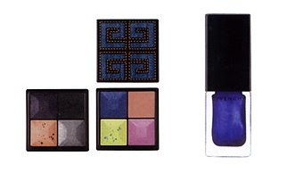 (part of the Givenchy spring 2008 makeup collection,
Coincidentally, the MAC for A-Mei collection, out in January 2008, includes a brighter, bolder, and slightly warmer blue. I have to say this is the kind of blue that I enjoy playing with more.
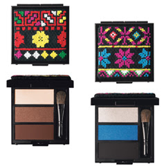 (MAC for A-Mei Eye Palettes)
Let’s move on to purple. I have always loved soft purple shades like lilac/lavender as well as darker purples like violet. Since this fall, we have seen rich bright purples in fashion, especially in accessories. Mulberry‘s Bayswater patent leather bag in purple is just one example of a hot fashion trend in fall 2007.
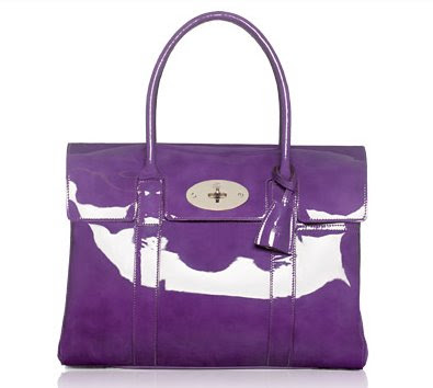 (Mulberry Bayswater bag in purple)
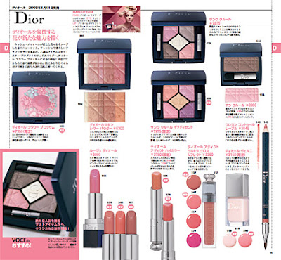 (Dior spring 2008 collection)
Apart from blue, Givenchy‘s spring 2008 collection also incorporates elements of purple. I will be interested in seeing the actual color and finish of the blusher (pictured in the middle).
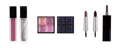 (part of Givenchy’s spring 2008 collection)
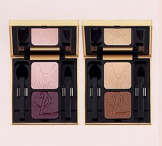 (YSL Ombre Duo Lumière)
(image from uma.chanel.com)
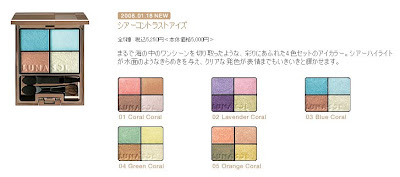 (Lunasol Sheer Contrast Eyes)
I am probably going to pick up some (more) lilac eyeshadow palettes, and I will be reviewing them later on!
What about you? Are you happy with these spring 2008 makeup trends?
A Splash of Color – Lilting Lilac
(one of my favorite colors)
T’Estimo Frame Impact Eyes in Purple
(out this spring and even more on-trend in spring 2008)
{ 8 comments }
Among all my favorite colors, pastel purple (lilac/lavender) has always been near the top of the list. Thanks to the delicate mixture of red and blue, purple, to me, is an elegant color with the right amount of warmness and coolness.
It has been a great accent color in my wardrobe for years (be it pastel lilac or rich violet), but it is only fairly recently that I discovered that soft lilacs look good on my face as well!
Keep pretty:
-Jill Stuart Brilliance Eyes in 04 Gem Amethyst
-T’Estimo Frame Impact Eyes in 03
-Lavshuca Eyecolor Select in PU-2
-Chanel Contraste Lumière palette in Aquarelles
-Maybelline Dream Mousse Eye Color in Divine Lilac
-Clinique Glosswear for Lips in 333 La La Lilac
-AYURA Pure Nails (limited-edition lilac shade)
Keep clean:
-Radox Clean & Pamper Handwash with lavender & magnolia
Keep warm:
-Hat by Fred Bare
(My teddy bear pulls this off much better than I do…)
-Sweater by Sisley
Keep organized:
-Beauty Diary by Biteki & Albion
(from Biteki January 2007 issue)
I have noticed that Chanel, Lunasol, and Guerlain are featuring lilac in their spring 2008 collections, and I am predicting that lilac is a key spring 2008 makeup trend!
I have more lilacs on my spring 2008 shopping list, and I am sensing an arrival of Lilting Lilac Part II!
More splashes of colors!
{ 6 comments }
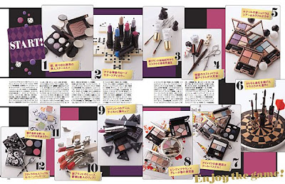 Exciting spring 2008 makeup preview!
I see Dior, Chanel, Jill Stuart, Lunasol, Anna Sui, Givenchy, Guerlain, Coffret D’Or, Beauté de Kosé, and perhaps Helena Rubinstein, Sofina Est and Shu Uemura…just to name a few.
I think I have already seen some items I want…and it is still November!
I am loving the look of the Chanel and Lunasol lilac eyeshadow palettes (as if I didn’t have enough lilac palettes…with my T’Estimo, Jill Stuart, and Lavshuca lilac bonanza).
What has grabbed your attention?
Updated on Friday, November 23, 2007:
Bjooti has kindly confirmed that the zebra-printed one towards the top left is indeed from the Helena Rubinstein spring 2008 collection. Take a look at the full collection on her blog!
Related Posts (let’s go back to holiday 2007):
Dior DiorLight Jewelled Makeup Necklace
(another beautiful Dior seasonal item)
Lavshuca Christmas 2007 Makeup Palette
(as cute as a box of chocolates…)
{ 8 comments }
Today, Beauty Anonymous and I are joining together to bring you our thoughts on Chanel’s Ombre d’Eau Eyeshadows. I will focus on #50 Bay and there is a review of #10 Glacier and #20 Fountain over on Beauty Anonymous.
A couple of years ago, I was in a phase of neutral shades for eyes. Chanel’s Ombre d’Eau Bi-Phase Eyeshadow grabbed my attention, with many wearable shades. (They are called Ombre d’Eau Fluid Iridescent Eyeshadow in the US.)
I bought (or, to be more precise, used my Boots advantage points on) #50 Bay, which is a warm bronze with quite a lot of fine iridescent shimmer to create an almost soft metallic finish.
Before taking out the sponge applicator, I shake the container vigorously to mix the pigment and the liquid. (There is a small stainless steel ball inside to help the mixing. It reminds me of using a Liquid Paper correction pen.)
The sponge applicator makes the application easy and fuss-free. The slanted facet of the sponge helps sweep the color onto the eyelids, and I can also line the eyes with the tip of the angled sponge (without blending afterwards). (It won’t be a very thin line. The thinnest line you can create is around 2-3mm.)
Once the color is applied on the eyelids, speedy blending is vital as the liquid does dry up rather quickly. If you leave it to dry, the slip disappears. When the color is in place, it is quite long-wearing.
One thing I have recently observed is that the pigment is not water-resistant at all. I was surprised to find that, when I applied the color on the back of my hand and place my hand under running water, the color was completely gone, with no rubbing, within seconds. (On the other hand, it is usually hard to rub off a powder eyeshadow just with water alone.)
But on my eyelids, under usual circumstances, I have never noticed fading, creasing, or transferring.
Overall, I enjoy using it. Even though the shimmer can be slightly too much for daytime, the fact that most of the shades are very low-key still makes them wearable in any time of the day.
Do head over to Beauty Anonymous, where you can read about two other lovely shades: #10 Glacier and #20 Fountain.
Related posts:
– Read about my personal take on Chanel.
– I compare Chanel Mat Lumière & SUQQU Powder Foundation Glow. See who wins!
– Find out why I won’t buy Les 4 Camélias de Chanel.
{ 4 comments }