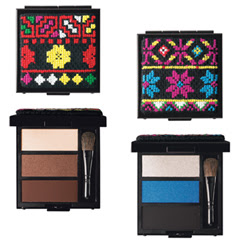
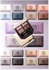
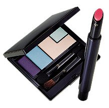
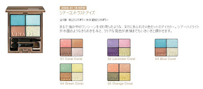
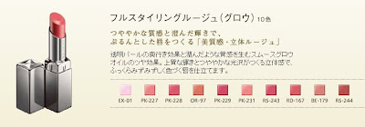
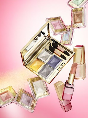
 (Kanebo Coffret D’Or 3D Lighting Eyes)
(image from http://www.kanebo-cosmetics.jp/coffretdor)
However, as I saw more and more sneak-peek photos of the collection, Coffret D’Or’s debut lineup started to grow on me. I decided that I would try something from the line.
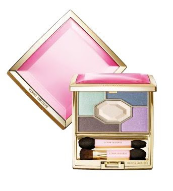
In many Japanese brands, I think the eyeshadow palettes play an important part in defining the image of the brand, in terms of both packaging and shade combinations. Their 3D Lighting Eyes in 04 Purple Variation really caught my eye. So there was no question which item I would want to try first.
I like the packaging of the palette. It is like a small gift box wrapped in jeweled ribbons. (Many Japanese brands are able to do cute and elegant at the same time without ever appearing tacky.)
04 Purple Variation faces severe competition with my other lilac-based palettes.
The individual shades deserve a detailed mention. First of all, the upper white strip consists of two finishes. (In the photo, you can see that the left half is slightly whiter than the right half.) The right half is a medium pigmented white with very fine multi-color sparkles. The left half is sheerer and has slightly larger multi-color sparkles. The two parts are meant to be used together as a base (swept across with a brush or a wide sponge-tip) but they can still be used individually. I think the reason the two halves are packaged like this is to showcase the variation of sizes of sparkles and the multi-dimensional effect that they can create together (the namesake 3D effect, I suppose).
On the second row, from left to right:
— a dusty pink with very smooth shimmer and very fine sparkles (medium pigmented)
— a sheer and very pale blue with mild shimmer and slightly larger multi-color sparkles (not glitters)
— a well-pigmented muted violet with sparse multi-color sparkles
The dusty pink has a very mild warm mauve undertone and the pale blue has a hint of cool pale lilac undertone.
The palette is a joy to use. The texture of the powder is very smooth, the shades go on very easily, and blending is effortless.
What some people like about eyeshadow palettes of some Japanese makeup lines is that there are step-by-step instructions on how to use a palette to create the look that it is designed to create and to achieve the look in the promotional image.
(Please click on the image to see a larger version)
These instructions are very useful for people who may be wary of using 4 or 5 colors on the eyes at the same time and for people who might not feel comfortable asking sales assistants for application tips.Before I explored other possibilities, I decided to follow the instructions to see what this palette can do for me. I was very pleased. The main idea of this range of palettes is to use the B shade (please refer to the photo above), which is slightly darker and less sparkling, in the outer 2/3 above the eyes to create subtle shadowing and the C shade (paler and more sparkling) in the inner 1/2 above (which overlaps the B shade) and below the eyes to make them pop.
I put the two photos together so you don’t need to refer back and forth:
The finish look is very soft, natural, and sensual, as the B and C shades are both relatively light. But the palette manages to very effectively enhance the dimension of the eyes. I think the delicate variation in shades, pigmentation, shimmer, and sparkles in this palette is a success. Every single element in this palette is doing something that you can see.
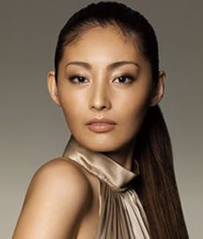
(Please note that Tokiwa Takako is using the 3D Lighting Eyes in 05 Gold Variation.)
The instructions seem to aim for a fresh and elegant daytime look. For a more intense evening look, smudging the violet shade further (instead of using the shade to simply line the eyes) will add more drama. (I tried that and it worked very well too.)
Overall, I adore this palette and the soft and understated look that it creates. The shimmer is smooth and velvety, and the multi-color sparkles are delicate but vibrant.
If you prefer a lot of impact for the eye makeup, then this range of palettes might not appeal to you as much. But perhaps Coffret D’Or will bring out more intense color combinations later this year. Judging by the quality of this palette, I think it is worth the wait…
Updated on January 28, 2008:
If you are interested, there are reviews of 02 Blue-Green Variation on My Women Stuff and Mostly Make Up.
My other lilac-based palettes, along with a very short comparison (please click on the links for full reviews):
Jill Stuart Brilliance Eyes in 04 Gem Amethyst
(The shades are sheerer and there are larger sparkles.)
T’Estimo Frame Impact Eyes in 03
(The lilac shades are cooler and there is a wider range of lighter and darker shades for a more intense look.)
Lavshuca Eye Color Select in PU-2
(This palette from Lavshuca’s fall 2007 collection is overall a slightly darker and warmer version of the Coffret D’Or one.)
Please feel free to leave your comment if you’d like to ask me for more comparisons among these palettes and shades!
{ 22 comments }
