by PJ on Monday, August 1, 2011
in _I Love Colors, -Givenchy, -Jill Stuart, -MAC, -Maquillage, -Shiseido, -SUQQU, 2008 Fall, 2008 Spring, 2009 Summer, all about Japanese cosmetics, makeup, makeup - eyeshadow, makeup - lip color, stash focus

.
It has been a very long time since I brought you the last A Splash of Color post (Sensuous Plum). Today I am finally back with more, and of course it has to be lilac.
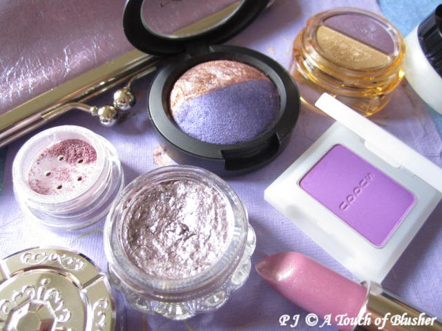
My More Lilting Lilac was back in May 2008. In the last year or so, I have been in my warm-neutral phase and one of my only new purple purchases is the new 3D Glossy Eyes in 04 Pink Violet from Coffret d’Or (which I will review later). But I have got quite a few purple items in the last three years. Here are some of the new additions of lilac, mauve, and violet:
[Click to continue reading…]
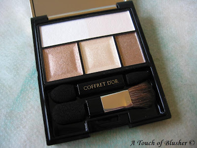
(Kanebo Coffret D’Or 3D Lighting Eyes
in 05 Gold Variation)
I like a bit of variety in my makeup collection. I tend to pick up one shade from an eye palette series and that is it. No matter how much I like what I have, I often look elsewhere for my next gem. There usually has to be a compelling reason for a second purchase.
I have quite a few eyeshadows in blue, purple, turquoise, and pinks. But when it comes to neutral tones, what I had were mostly either very pale or quite dark. It didn’t bother me before, since I like a bit of color. But, sometimes, to go with what I wear, soft neutrals are by far the best choices. So, weeks ago, I finally decided not to make do with dusty pink and soft peach and get some nice neutrals.
The color I decided to look for is a medium gold with subtle shimmer (not overly metallic shimmer) that is not bronze or orangey, and I planned to pick up a palette with the shade and other coordinating ones.
As I was looking through my recent Biteki and Voce seasonal makeup catalogues, I remembered that, when Coffret D’Or was launched last December, I was allured by the 3D Lighting Eyes palette in Gold Variation used on Tokiwa Takako. (The full-page ad appeared on Biteki (February 2008) and showed the makeup look a lot more clearly than the (same) image below.)

(Tokiwa Takako for Coffret D’Or)
(image from http://www.kanebo-cosmetics.jp/coffretdor)
Also, the texture and the finish of my Purple Variation appealed to me so much that I thought it would be great to pick up a second one. So I did.
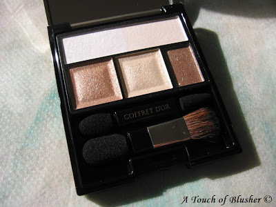
(The sun was out, so I decided to take a few more shots.
Later I found that this photo shows the actual shades a lot better.)
From left to right:
The top two:
– a sheer off-white with fine sparkles
– a moderately pigmented pearlescent white with fine shimmer
The bottom three:
– a medium gold with smooth shimmer and fine sparkles (moderately pigmented)
– a very shimmery sheer pale champagne gold with slightly larger sparkles
– a subtly shimmery well-pigmented medium brown with some fine sparkles (which goes on a little cooler than it looks in the pan)
(All the sparkles and shimmer are multi-colored.)
The texture of the powder is wonderfully soft and silky. The application is effortless and blending is a breeze.
The look it creates is just like what you see in the ad above. The soft gold and the coordinating pale champagne enhance the dimensions of the eyes very effectively, but the whole look is still elegant and understated. (The soft gold is exactly what I wanted. It is a subtle but effective shading color.)
The colors from 3D Lighting Eyes are very long-lasting. Once I wore Purple Variation (without any eye primer) and my eye makeup surprisingly more or less survived heavy wind and rain (the kind where an umbrella is basically useless…well, it’s the unpredictable British weather…).
I am very pleased that I got this palette so that I can enjoy all the great things about 3D Lighting Eyes when I am not wearing lilac for the day!
(For the clear instructions on where each shade is applied, my thoughts on the eye-sculpting concept of the 3D Lighting Eyes series, the look of the palette case, and the other color variations, please refer to my post on the Purple Variation.)
Related Posts:
Coffret D’Or Late Summer/ Early Fall Collection
(with link to swatches)
Lunasol Sheer Contrast Eyes in Lavender Coral
Shiseido Maquillage Clean Contrast Eyes in SV844
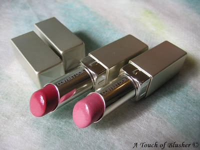
(Coffret D’Or Full Styling Rouge Color
in RS-242 (left) and RS-241 (right))
.
Coffret D’Or has been growing on me more and more, and today I bring you two lipsticks from their launch collection.
.
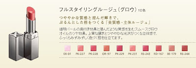
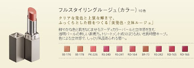
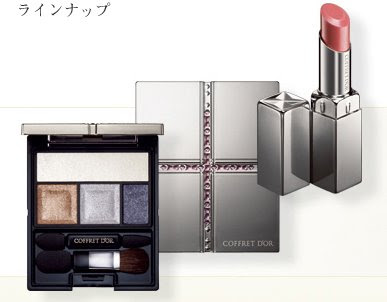
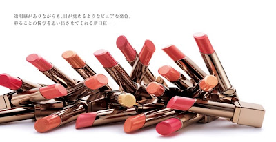
Coffret D’Or currently has two ranges of lipsticks. Full Styling Rouge Glow is a range of sheer lipsticks with a glossy shine, while Full Styling Rouge Color features more pigmented lipsticks with a natural watery sheen.
.

(Coffret D’Or Full Styling Rouge
Glow,
packaged in glossy and reflective cases)
(image from www.kanebo-cosmetics.jp/coffretdor)
.

(Coffret D’Or Full Styling Rouge
Color,
packaged in textured matte cases)
(image from www.kanebo-cosmetics.jp/coffretdor)
.
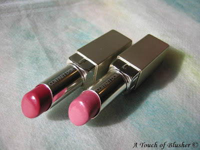 (RS-242 (left) and RS-241 (right))
.
RS-241 and RS-242 are from the Color range. They are well-pigmented and have a beautiful natural sheen. There is very fine shimmer in both shades, and it doesn’t look obvious when worn. Both stay on well and are fairly non-drying. (But I always wear a lip balm before I wear any lipstick or lip gloss.) Like most lipsticks from Japanese brands, they are scentless (which I like).
RS-241 is a soft and feminine rose petal shade. It is the shade used on Nakatani Miki, one of the five brand ambassadors for Coffret D’Or (and one of my two favorites of the five, along with Tokiwa Takako). (Below, Nakatani Miki is also wearing 3D Lighting Eyes in 04 Purple Variation.)
.

(Nakatani Miki for Coffret D’Or )
(image from www.kanebo-cosmetics.jp)
.
RS-242 is a much deeper rose shade that looks slightly more vibrant and a tad warmer when worn. This more dramatic shade is great for an evening look.
In many Japanese beauty brands (particularly major ones like Shiseido, Kao, Kanebo, and Kosé), lipsticks are named according to various color families (PK (pink), RD (red), OR (orange/peach), RS (rose/cool pink), BE (beige), and BR (brown)). When I started buying makeup, I often bought PK shades. But, later on, I began to pay more attention to RS shades and the more muted and rosier PK shades.
Even though I slightly prefer the lighter RS-241, my favorite way to wear them is to gently dab the darker RS-242 onto my lips and then softly glaze RS-241 on top. The mixture of the two gives me the kind of rose coloration I like. (The Full Styling Rouge Color lipsticks seem to be more pigmented than most lipsticks I have, and I try to be light-handed with them.)
Overall these two shades will suit people who love lipsticks in rose tones and enjoy pigmented lip colors with a natural sheen and very subtle shimmer. They will give you a sophisticated and feminine look.
(One of my friends kindly gave these two lipsticks to me, so I was able to enjoy them. (I know you are reading this, and thank you very much!))
.
Related Posts:
Lavshuca Jewelry Lips
(another two great lip shades,
slightly less pigmented than the two reviewed above)
Coffret D’Or 3D Lighting Eyes in 04
(one of my favorite items for spring 2008)
Coffret D’Or Beauty Lasting Pack UV
(a great powder foundation for the warmer months)
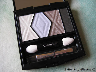
(Shiseido Maquillage Clean Contrast Eyes 2 in SV844)
I haven’t really been very interested in Maquillage since it was launched in fall 2005. But sometimes, it only takes one item to start my interest in a makeup line, and you are looking at it now.
Maquillage replaced PN (the color makeup line) and Proudia (the base makeup line) and was what Shiseido called a “Super Brand”. The expectation at the time was extremely high, since PN, in particular, was very successful at bringing young people to Shiseido and rescuing the brand’s then aging image. Over the last couple of years, Maquillage, with a more mature image, has proven to be delivering the sales figures.
For those of you that might not be familiar with the multi-layered branding concept in Japanese cosmetics, Maquillage is not a fully fledged brand and is simply the name of Shiseido’s main color/base makeup line. It does not have its own counters and is sold at Shiseido counters in Japan and some other Asian countries (where you will find many other lines like Elixir Superior (skincare/base makeup), UVWhite (whitening), Anessa (suncare), Revital (anti-aging), and Beauty Voltage (youth skincare)).
Back to Maquillage. Since I have been very interested in lilac for the past year or so, I am often excited to see lilac being featured as the main eyeshadow color for a seasonal collection. For spring 2008, this look (modeled by Ebihara Yuri, one of the four brand ambassadors for Maquillage) really grabbed my attention.

(image from www.shiseido.co.jp)
After checking some more images of this palette on-line and on magazines, I decided to try it.
Initially, being (a bit overly) excited to try a lilac that was much cooler than most of the other lilacs I had, I used it as the main shade on my eyelids and I used the silvery grey around my lash line. It didn’t work well. Worn alone, the lilac is almost too pale for my eye area and the whole look is not optimally flattering.
When I tried the palette for the second time, I wore the silvery grey as the main color with most of the lilac showing through from underneath and around the silvery grey. This time, it worked a lot better.
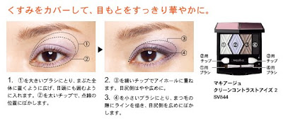
A couple of days ago, I happened to find the following application steps on the Shiseido website. They show more or less how I used the palette for the second time. (They are similar to those on the back of the outer packaging of the palette, but the images below give a clearer idea.)

(image from www.shiseido.co.jp)
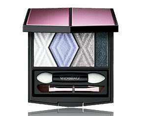
My own shade descriptions:
1. sheer white with mainly pale multi-color shimmer and relatively little pigment
2. pale blue-ish lilac with very fine and subtle shimmer and an overall satiny finish
3. silvery grey with a semi-metallic shimmery finish and a very slight warm copper undertone
4. dark matte charcoal with very sparse shimmer
With some eye palettes from Japanese brands, the second darkest shade is usually meant to be worn under the crease. But I think one of the best ways to use this palette is to follow the steps above and use the second darkest shade (silvery grey) both under and around the crease and over most of the lilac applied beforehand. (If you don’t have a crease, use the silvery grey as the main shadowing shade over the lilac, which is applied on a slightly broader area on the lids.)
The key is to layer the two shades.
Since the silvery grey has a touch of sheerness, the lilac is able to show through and the two colors together create a lovely and subtle depth for the eyes.
Since many eye palettes in Japanese brands are named after the main shade, I was later able to understand why this is a (well-justified) SV (Silver) palette and not a VI (violet), which I did wonder initially. (Note: Kanebo brands would use PU (purple) instead of VI.)
The practical strengths are there as well. The powder is smooth and goes on easily, and the colors are long-lasting.
Essentially, this is a silvery-grey palette with lilac as the accent color. The concept is different from that of my other lilac palettes with gradations of lilacs. For me as a lilac lover, this alone makes the palette worth purchasing. (But I do have to control my fondness for lilac and try not to over-layer it!)
The “silver-greyish lilac” look it creates is subtle and natural, as you see in the ads. It is very good for daily wear. If you want a more dramatic look, layering the silvery grey and putting more emphasis on the dark charcoal will easily give you a smoky effect.
(By the way, in the ad,
Ebihara Yuri is also using the new Gel Liner in SV854.)
I did spend quite a few weeks deciding whether to buy this palette or not. But I am very glad I did!
My other two lilac palettes for spring 2008:
Coffret D’Or 3D Lighting Eyes in 04
Lunasol Sheer Contrast Eyes in Lavender Coral
Other related posts:
Must-Try Look for Spring 2008
Spring 2008 Makeup Trend Report
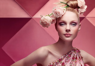
 (image from www.dior.com)
Dior’s makeup collections tend to capture the trend very well, and this season’s release has done it again, with gorgeous pinks, lilacs, and warm neutrals to add depth.

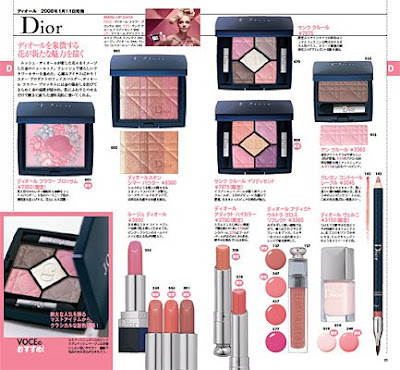
(Dior spring 2008 collection)
(image from www.joseishi.net/voce/)
Visually stunning as well as wearable, the collection is a feast for the eyes. I always like a seasonal collection with a strong identity, and all the variation of pinks, along with the ad campaign, create a distinct look for this collection.
Dior’s eye palettes have been getting more and more shimmery. (Almost all the shades in this season’s two palettes are very shimmery.) Even though I am not sure I like this direction, the finishes of these shades are still flattering.
2nd: Coffret D’Or

(part of Coffret D’Or’s spring 2008 collection)
(image from www.kanebo-cosmetics.jp/coffretdor)
Like EST, Coffret D’Or‘s spring collection is another sublime debut collection. I know some people were not looking forward to seeing T’Estimo being discontinued and replaced by Coffret D’Or. But I simply chose to see Coffret D’Or as the same line (plus base makeup products) being marketed under a new name and new packaging.
I do like the new packaging. It looks more gown-up than T’Estimo and I like the jeweled details on the eye palettes.
The 3D Lighting Eyes palettes are definitely the core of this collection. I have read more reviews where people choose not to buy the spring 2008 palettes from Maquillage or Aube (both of which are similarly priced) and go for Coffret D’Or instead (than the other way around). Even though the color combinations are not particularly unique or striking (see one of my other Coffret D’Or posts for the image of the five palettes), the texture, finish, and lasting power are what make them stand out.
(Please check out my review on 3D Lighting Eyes in 04.)
Overall, this is a very exciting debut collection, and Coffret D’Or has probably already created many future loyal followers.
1st: Lunasol

(Lunasol Full Glamor Lips G)
(image from www.kanebo-cosmetics.jp/lunasol/)
Since Coffret D’Or is already so good, why makes Lunasol’s spring 2008 collection even better?
It is the core concept, which is what makes a collection memorable. It is also the visual impact of the whole lineup and how it translates to daily wear.
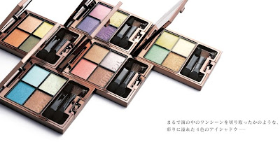
The colors of the sea and the shades of coral reefs provide the inspiration for this collection. The five Sheer Contrast Eyes palettes are simply gorgeous.

(Lunasol Sheer Contrast Eyes palettes)
(image from www.kanebo-cosmetics.jp/lunasol/)
While the Sheer Contrast Eyes palette in Blue Coral (above, bottom left) is used for Lunasol’s main ad campaign and is heavily featured in Japanese beauty magazines, I chose Lavender Coral, which I reviewed earlier. The superb quality has consolidated Lunasol’s position as one of my favorite cosmetics brands.
With a distinctive concept and a beautifully wide range of vibrant yet wearable colors, this is the best collection for me in spring 2008.
This concludes my seasonal roundup for spring 2008. What about you? Which spring 2008 collection/item is your favorite?
More Thoughts on Spring 2008
When I was doing my “seasonal top ten” features in the last few seasons, I did feel that the brands I talked about might be a little repetitive for my readers. Since the top-ten countdown is only meant to reflect my own preferences, I never intend to feature a widely varied selection of brands from season to season.
But it is very refreshing to see Eprise, Clinique, Clé de Peau, and Maquillage come up with appealing collections. Also, Coffret D’Or‘s and EST‘s strong debut color makeup lineups prove to be serious competitors.
On the other hand, for me, the spring 2008 collections from Chanel, YSL, Jill Stuart, and Lavshuca are relatively disappointing. But I am sure these favorite brands of mine will wow me later this year.
Related Posts:
Coffret D’Or’s Spring/Summer 2008 Base Makeup Collection
(The loose powder is on my shopping list.)
Foundation Face-Off – Lunasol vs. Coffret D’Or
(Is Lunasol still winning?)
Loving Japanese Brand – Lunasol
(my personal take on Lunasol)
(continued from Part 1)
6th: Clinique
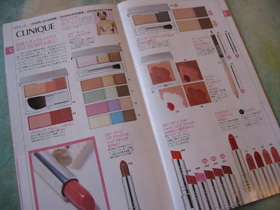
(Clinique spring 2008 collection)
(from Voce February 2008
Spring 2008 Makeup Catalog, p. 14 – 15)
I did surprise myself initially by liking this collection. But as the Color Surge Trios have been looking lovely for the past few weeks, I’ve decided to include Clinique‘s spring 2008 collection in my top ten.
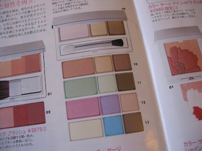
(Clinique Color Surge Trios)
(from Voce February 2008
Spring 2008 Makeup Catalog, p. 14)
With brands like Chanel and Givenchy featuring dark and ashy blues for spring, which don’t really appeal to me, Clinique’s soft and cheerful pastels are unexpectedly welcoming. The color combinations are straightforward and wearable, and the lilac and pink look especially dreamy. As someone who doesn’t wear green very much, I actually find the green palette very tempting too.
5th: Eprise
 (part of the Albion Eprise spring 2008 collection)
(image from www.albion.co.jp)
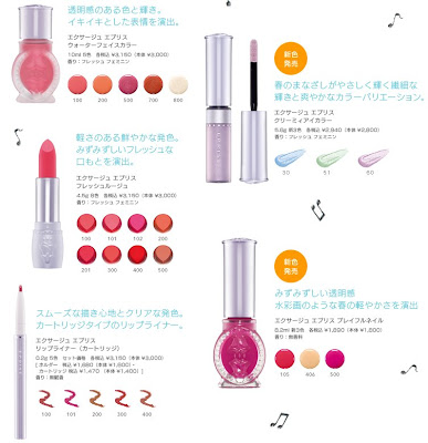
Eprise‘ spring 2008 collection is not hugely extensive but still includes items for eyes, cheeks, lips, and nails. Most of the shades have a gentle and girlie feel. Like Clinique, Eprise’ Creamy Eye Colors also feature pastel blue, green, and lilac.
(Eprise spring 2008 collection)
(image from www.albion.co.jp)
What instantly attracted my attention upon seeing this collection was the Water Face Color, which is a range of liquid blushers. I picked up the shade in 100, a very natural pink. Easy to use and long-lasting, it is definitely a great makeup purchase for this season.

(image from www.kao.co.jp/est)
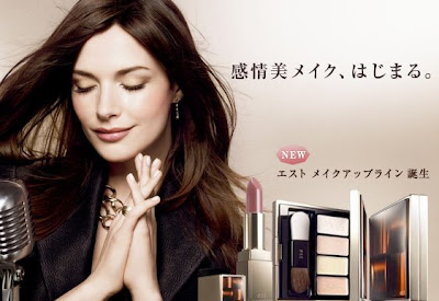
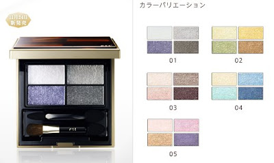
The EST debut color makeup collection was launched on November 24th, 2007. But Biteki’s spring 2008 makeup catalog (March 2008 issue) includes this collection, so I am counting it as a spring 2008 release.

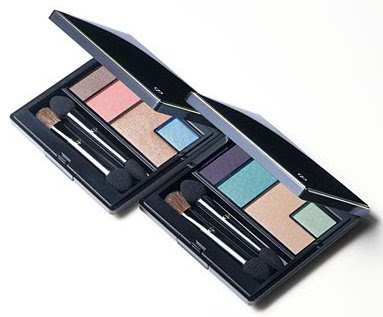
(EST Emotional Aura Eyes palettes)
(image from www.kao.co.jp/est)
As should a debut color collection, it includes all the basics. I think the highlights of the collection are the Emotional Aura Eyes (above) and Emotional Aura Pack (featured in the ad image above), which is a selection of highlighters for different parts of the eye area. (Please see my brand profile on EST for more on this item.)
Overall, this is a triumphant debut collection with a very feminine and sophisticated feel. I look forward to seeing how this color makeup line evolves.
Do come back for Part 3!
Other spring 2008 collections worth checking out:
Lavshuca Spring 2008 Collection
Kate Spring 2008 Collection
Every season, I count down my ten personal favorite makeup collections. This week, I present my top ten for spring 2008. In reverse order:
10: Clé de Peau

(Eye Color Quad in 116 (left) and 117 (right))
(image from www.shiseido.co.jp/cpb)
This is Clé de Peau‘s first time in my top ten in the last few years. I love the ad image and the gentle and feminine look with the blue eyeshadow. The Eye Color Quad in 117 is a delicious combination of purple, aqua blue, and mint green. Apart from capturing the trend, I think this versatile palette can take you right through the summer months.
9. Maquillage

(image from www.shiseido.co.jp/mq)
Maquillage is another line that hasn’t been featured in my seasonal top ten very much. But there is something very striking about their latest seasonal look, which is my favorite look for spring 2008. One of the key items of the collection is Clean Contrast Eyes 2 in SV844, which is used to create the soft lilac eyes we see above:

(Maquillage Clean Contrast Eyes 2 in SV844)
(image from www.shiseido.co.jp/mq)
This shade combination is not the first for Maquillage. Contrast Eyes in SV862, released in spring 2006, is quite similar (but the lilac looks warmer). T’Estimo’s Grande Shine Eyes in 02, from summer 2007, also has a similar concept. But the release of this color combination in spring 2008 as a key item of the collection reflects Maquillage’s attempt to interpret the current trend. (Teaser: A full review of Clean Contrast Eyes 2 in SV844 is coming up next week!)
8: Ayura

(part of the Ayura spring 2008 collection)
(image from www.ayura.co.jp)
Ayura‘s spring 2008 collection is very visually appealing. I am sure some of the people familiar with Ayura were delighted to see the brand take on a new color scheme for the packing. The intricate patterns against the black cases look exquisitely classy.
The collection includes 4 blushers, 21 lipsticks, and 18 nail colors. There is no item for eyes, but it is almost certain that we are going to see some beautiful eye colors in the new black cases.
7. Anna Sui
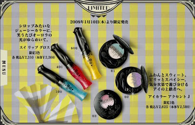
(part of the Anna Sui spring 2008 collection)
(image from www.annasui-cosmetics.com)
Anna Sui is probably the princess of vibrant colors. The spring 2008 collection features bright hues for eyes and nails. The three limited-edition Sui Lip Glosses (above) appear to be very bright, but they all go on naturally sheer. (Have a look at my review of the blue-tinted Sui Lip Gloss in 100.)
This is one of the more memorable seasonal collections from Anna Sui in the last couple of years, and I hope there will be more lovely items to come!
See you in Part 2!
Related Posts:
Magie Deco Spring 2008 Collection
(A great collection that just missed the cut…)
Spring 2008 Makeup Trend Report
(before we move into summer…)
— Originally scheduled to launch on March 6th in the UK, Calvin Klein Beauty will launch on March 31st, according to the customer service at House of Fraser on Oxford Street, London.
— Banana Republic’s UK/Europe launch has also been delayed. According to the sign (outside the construction site on Regent Street, London), the launch date is March 20th.
— SUQQU’s spring 2008 collection has been launched in Selfridges Oxford Street. The texture of the eyeshadows is smooth as usual, and the Eye Lucent loose eyeshadow has intense but fine shimmer. Kyokkou (in silvery white) is particularly bright and shimmery. It is definitely one of the least matte seasonal collections from SUQQU.
— For those following Jill Stuart’s Launch in Taiwan, see the initial price list of some of the items. As predicted, the retail prices in Taiwan are cheaper than those (including sale tax) in Japan. Most items are about 7% cheaper.
— Have a look at a large photo of Anna Sui’s new Oil Control Paper case on a Japanese blog. Check out the details and the enclosed mirror.
— Uno is Shiseido’s well-known male haircare/skincare drugstore line. Recently, Orlando Bloom has been their spokesperson and you can see some of the TV commercials on Uno’s website. Here is the latest mini-movie version:
